
HOW EFFECTIVE IS THE COMBINATION OF YOUR MAIN PRODUCT AND ANCILLARY PRODUCTS?

INTRODUCTION
Question 2 wants us to discuss how effectively our media products (Film Trailer, Film Poster, Film Magazine Front Cover and Team Website) work together as a promotional package for a new movie. We are required to point out how our media products look similar and possibly represent a brand identity and continuity. We plan to show examples of real media products that belong in a marketing campaign, and then show some examples of brand continuity within our media products and create a range of visual products such as apps, games, and billboards in order to answer the question and display the brand identity within our media products.
SYNERGY/CONTINUITY/CMC/BRAND/IDENTIFY
|
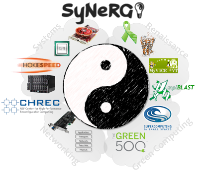
Synergy is the interaction or cooperation of more than one organization to come together and produce a combined effect greater than the sum of their separate effects.
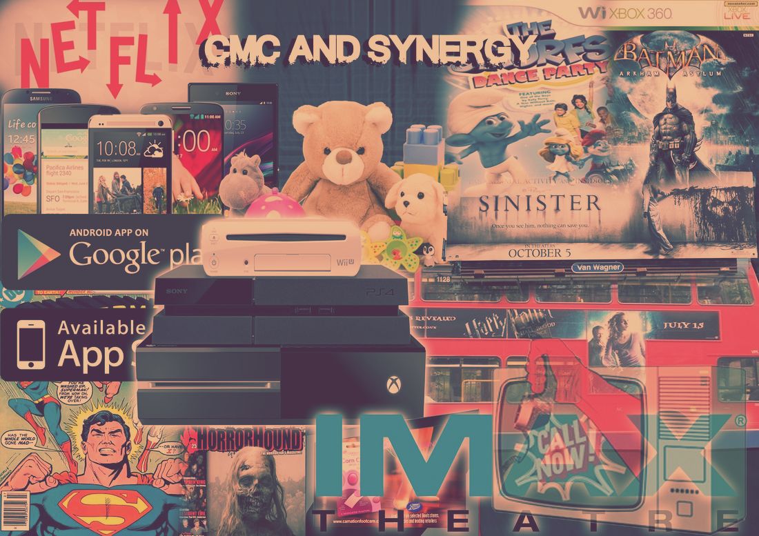
CMC relates to one text (Film) products that are consumed across different media platforms. These platforms can range from mobile phones, laptop, console, magazine etc. CMC and Synergy is achieved through cross-promotions with different partner companies working together. Achieving synergy through continuity. A company's brand identity is how that business wants to be perceived by consumers. Logos, Taglines, Typeface etc. all reflect the company, making the company easily identified by the public. |
.
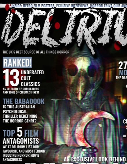
Examples of CMC and Synergy
|
Examples from the horror genre
|
EXAMPLES OF FILM MARKETING CAMPAIGNS
A marketing campaign is an organized course of action to promote and sell a product or service.

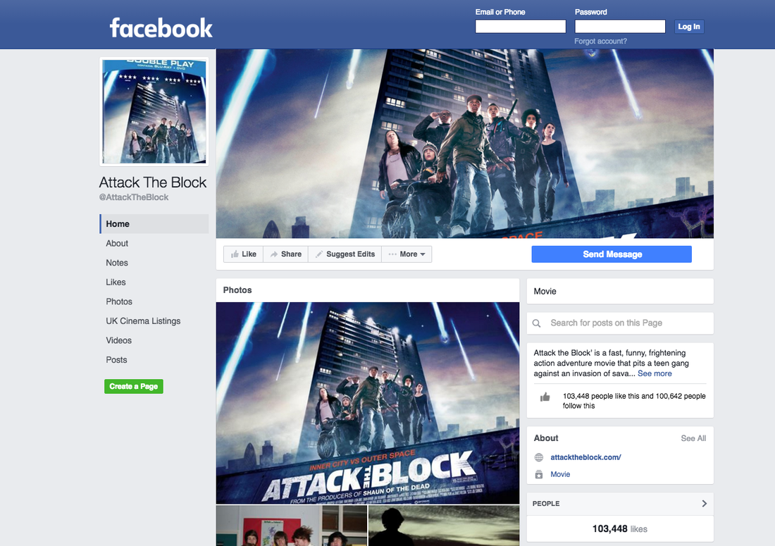
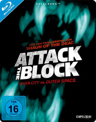
Attack the block Is an Indie movie that is a good example of film marketing campaign and CMC despite its low budget. Directed by Joe Cornish and distributed Big Talk Productions, Attack the Block follows an unlucky young woman and and a gang of tough inner-city kids who make an unlikely alliance to try to defend their turf against an invasion of savage alien creatures, turning a South London apartment complex into a war-zone. Attack the block uses CMC to advertise and market the film through numerous ways.
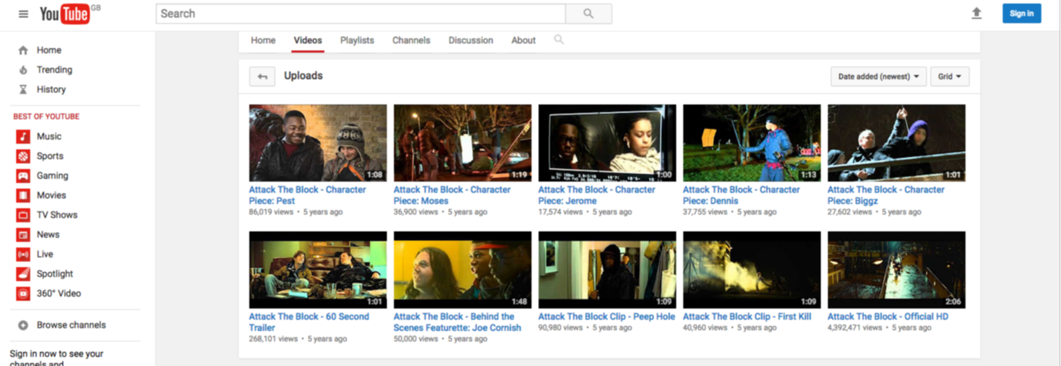
YOUTUBE CHANNEL
|
|
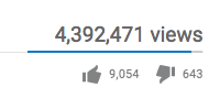
Attack the block had a Youtube channel where they were able to upload clips and behind the scene/ characters, Youtube has 1 Billion Active Users Each Month which was a good site to use as there is a high probability in gaining new viewers who would potentially go and view the movie. The trailer reached over 4.3 Million views world wide with over 9K likes, showing that the audience approved of the trailer and liked it.
|
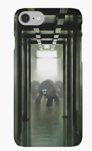
MERCHANDISE
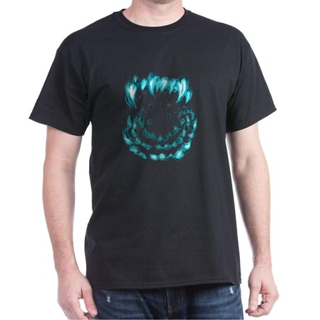
|
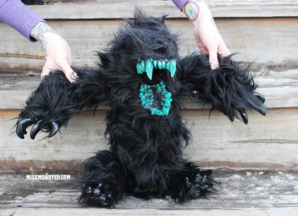
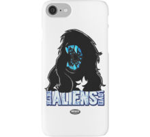
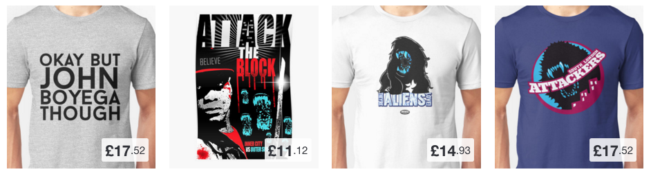
Attack the block had developed merchandise to further promote their movie. These would range from T-shirts to phone cases to dolls of the movie's "creatures". Attack the block's Identity brand are the "creatures" which are identified by their trademark dark fur and neon green teeth. These monsters are used in almost all their merchandise as it is original to the movie and very iconic, making the movie distinguishable from others. Additionally, Atttack the block had 365 different T-shirt designs available.
|
SOCIAL NETWORK
|
|
|
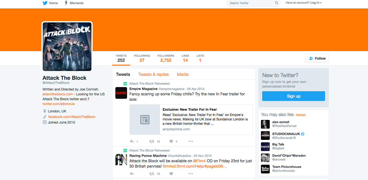
Attack the block created a Twitter and Facebook account in hopes to communicate with fans and see their responses. The cast also had accounts where they would reveal more things about the character they play as. occasionally, competitions and give away would be announced on these social networking sites, allowing fans to win merchandises and goodies. The use of social newtwork was effective due to the fact that People of all ages and races can be found on social networks, which means the marketing opportunities are endless and free. these networks are filled with much broader demographics than they were just a few short years ago.
|
|
BLU-RAY/ DVD
|
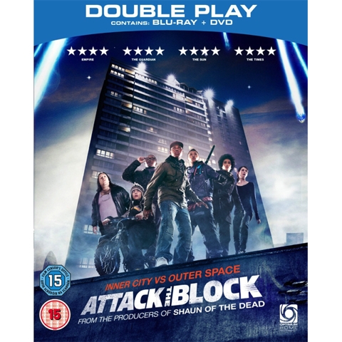
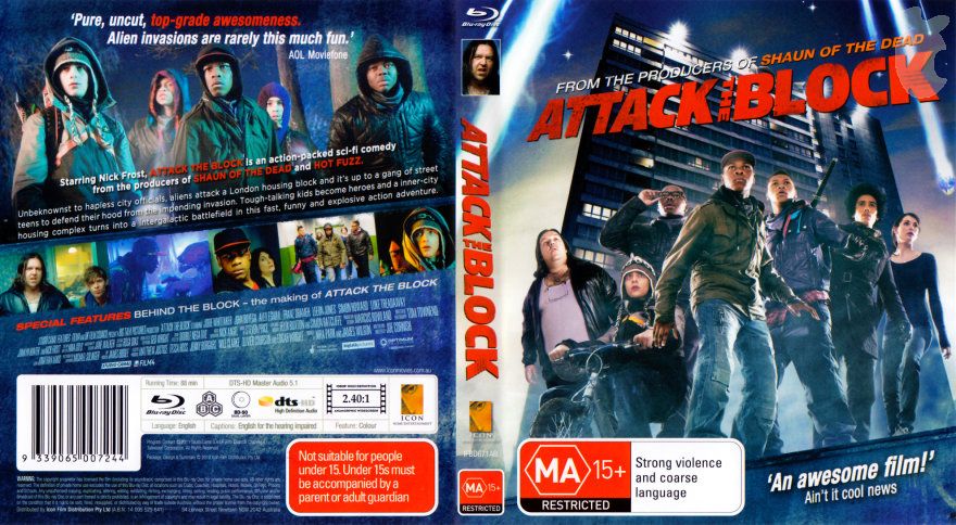
Attack the block released the movie in both BLU-RAY and DVD formats. The box art reinforces the colour scheme of red, blue and white which is shared with the poster and parts of the trailer, highlighting continunity. The Box art also varied where it featured the movies 'Creatures' which is one of the main identity of the movie.
|
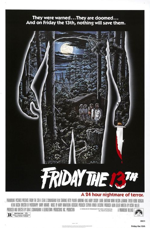
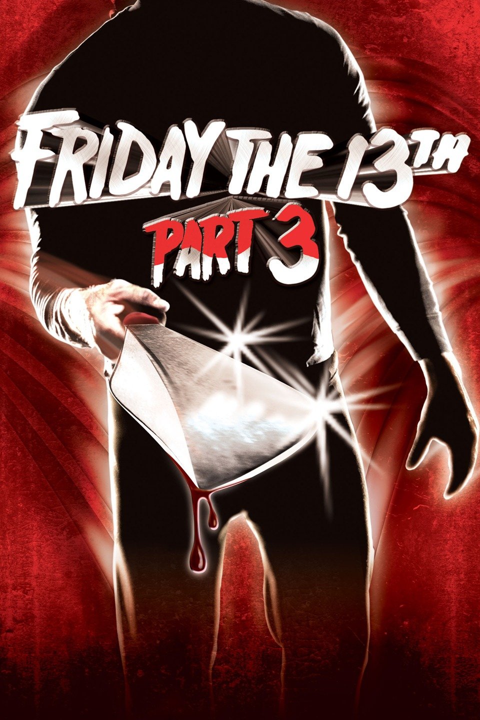
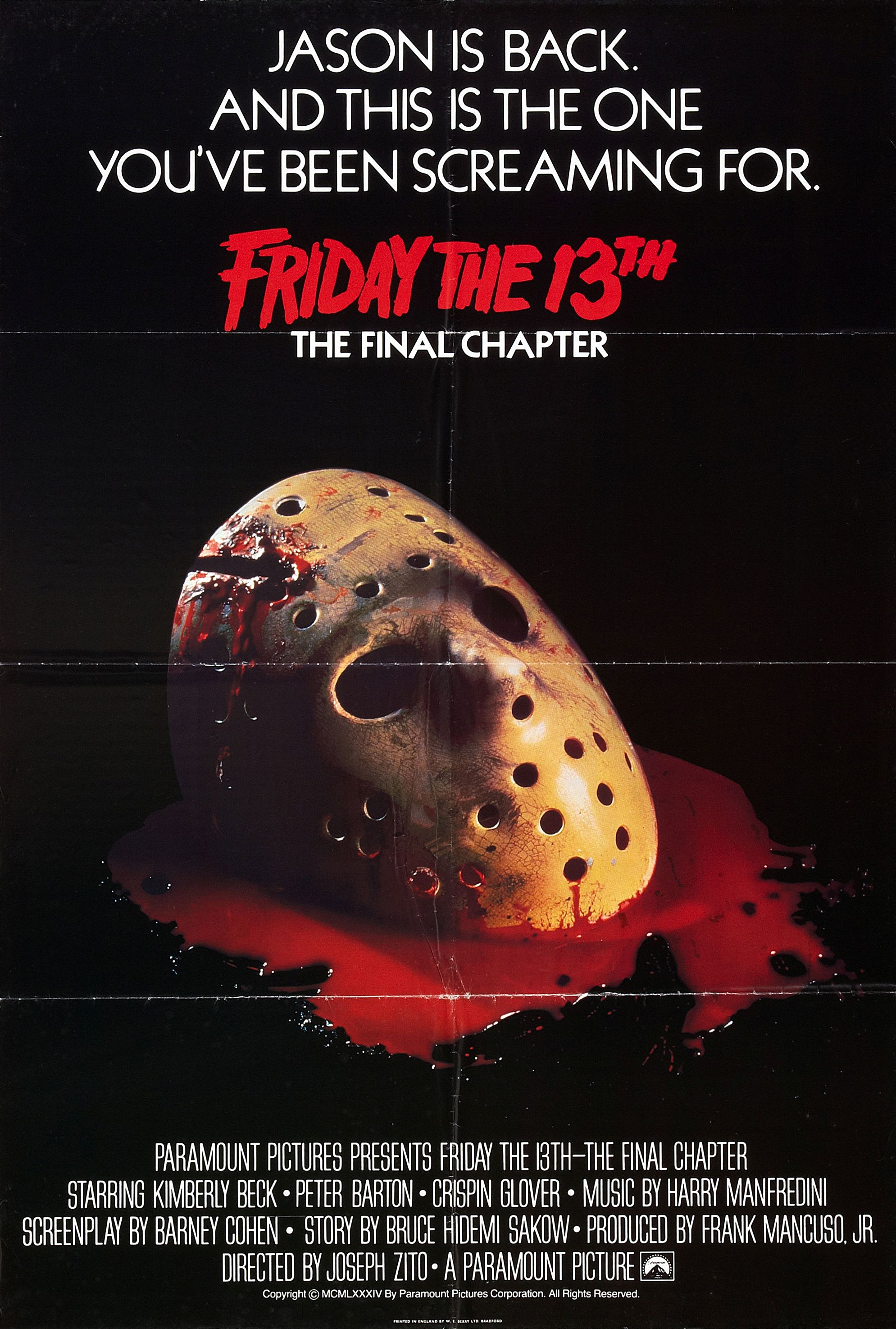
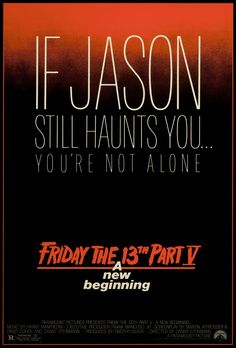
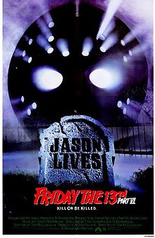
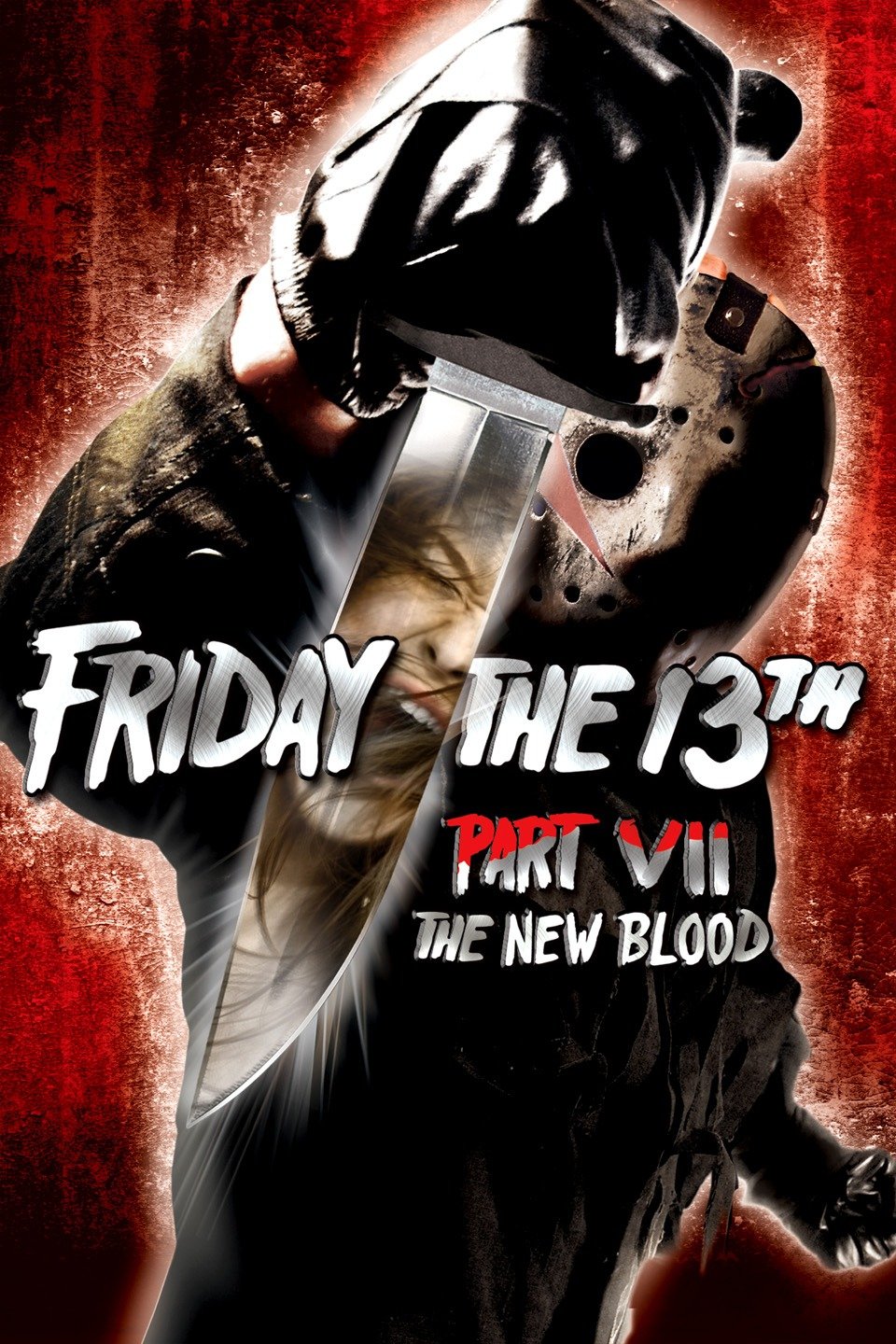
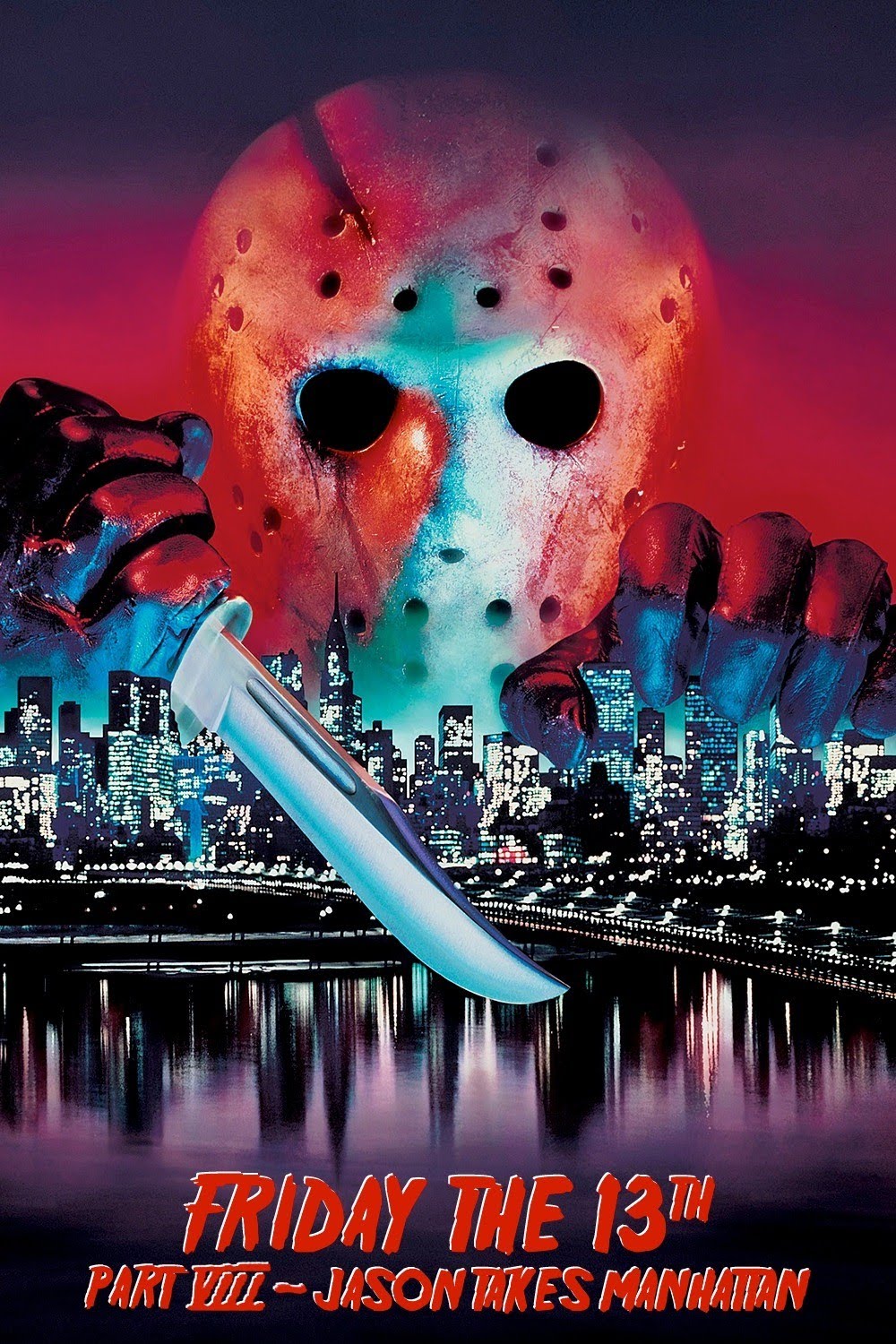
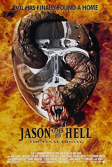
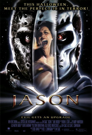
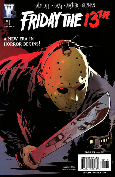
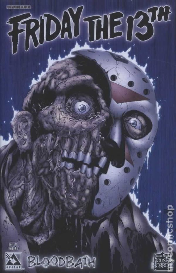
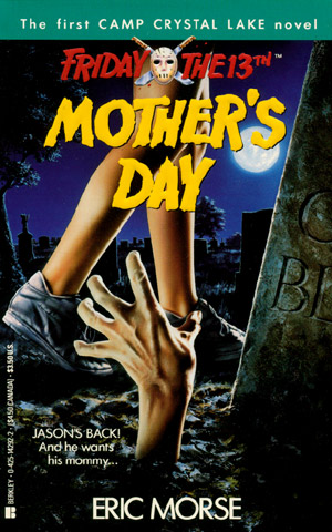
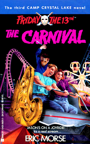
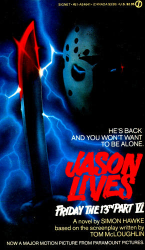
Friday the 13th is an American horror franchise that comprises twelve slasher films, a television show, novels, comic books, a video game, and tie‑in merchandise, as of 2016. The franchise mainly focuses on the fictional character Jason Voorhees, who drowned as a boy at Camp Crystal Lake due to the negligence of the camp staff. Created by Victor Miller and has a successful franchise.It is a perfect example of film marketing campaign and CMC.
FRIDAY THE 13TH SERIES
|
|
|
|
|
The second-popular oldest slasher franchise created by Paramount Pictures since 1980. The Friday the 13th franchise has released over twelve slasher films which all feature the antagonist 'Jason' in various scenarios. The franchise and Jason has grew so popular that Jason has beren featured in movies where he has a face off with other antagonist such as Freddy and Ash. The first movie had a remake in 2009 due to its success and made £1,198,653 in its opening weekend. Due to all this, Jason has become one of the iconic face of slasher with iconic ice hockey mask.
|
|
|
|
|
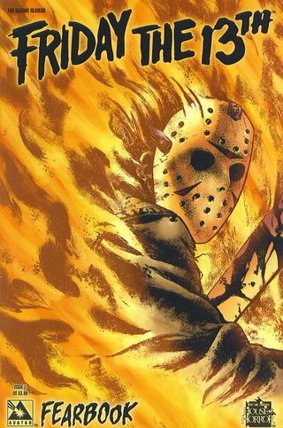
COMIC BOOKS
Friday the 13th’s Jason Voorhees has been part of pop-culture for decades, meaning that him being featured in different media platforms is expected. Jason has starred as a super villian in his own comic multiple times, the earliest Jason comic was created in the 90s which was a comedy where Jason is summoned by the demonic Odious Kamodious. Several comics where soon made after this which drew in the attention of comic book readers leading them to checking and consequently becoming fans of the main franchise.
|
|
|
|
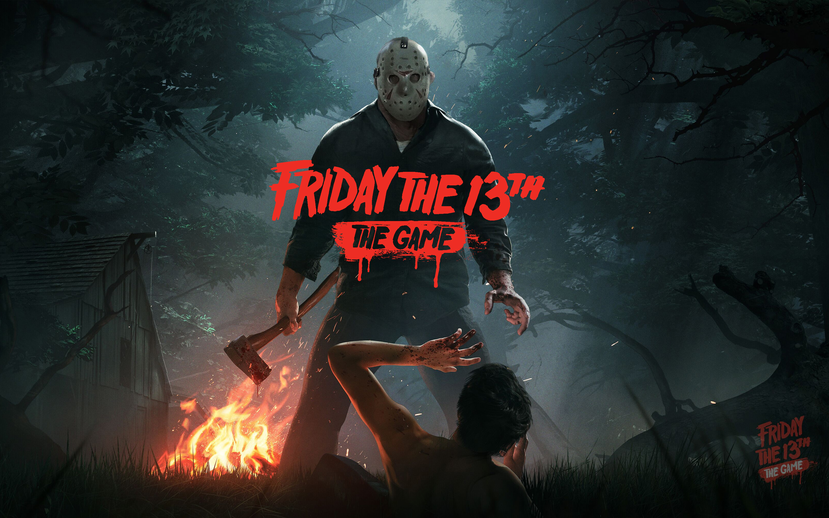
GAMES
|
|
The franchise had a game dedicated to it developed by Gun Media and IllFonic, and published by Gun Media. It is scheduled for release in Early 2017 for Microsoft Windows, Xbox One, and PlayStation 4. The Game is a third-person horror, survival game where players take on the role of a teen counselor, or for the first time ever, Jason Voorhees. You and six other unlucky souls will do everything possible to escape and survive while the most well-known killer in the world tracks you down and brutally slaughters you. The creation of the game opens up to gamers to reel in more fans of the series.
|
|
|
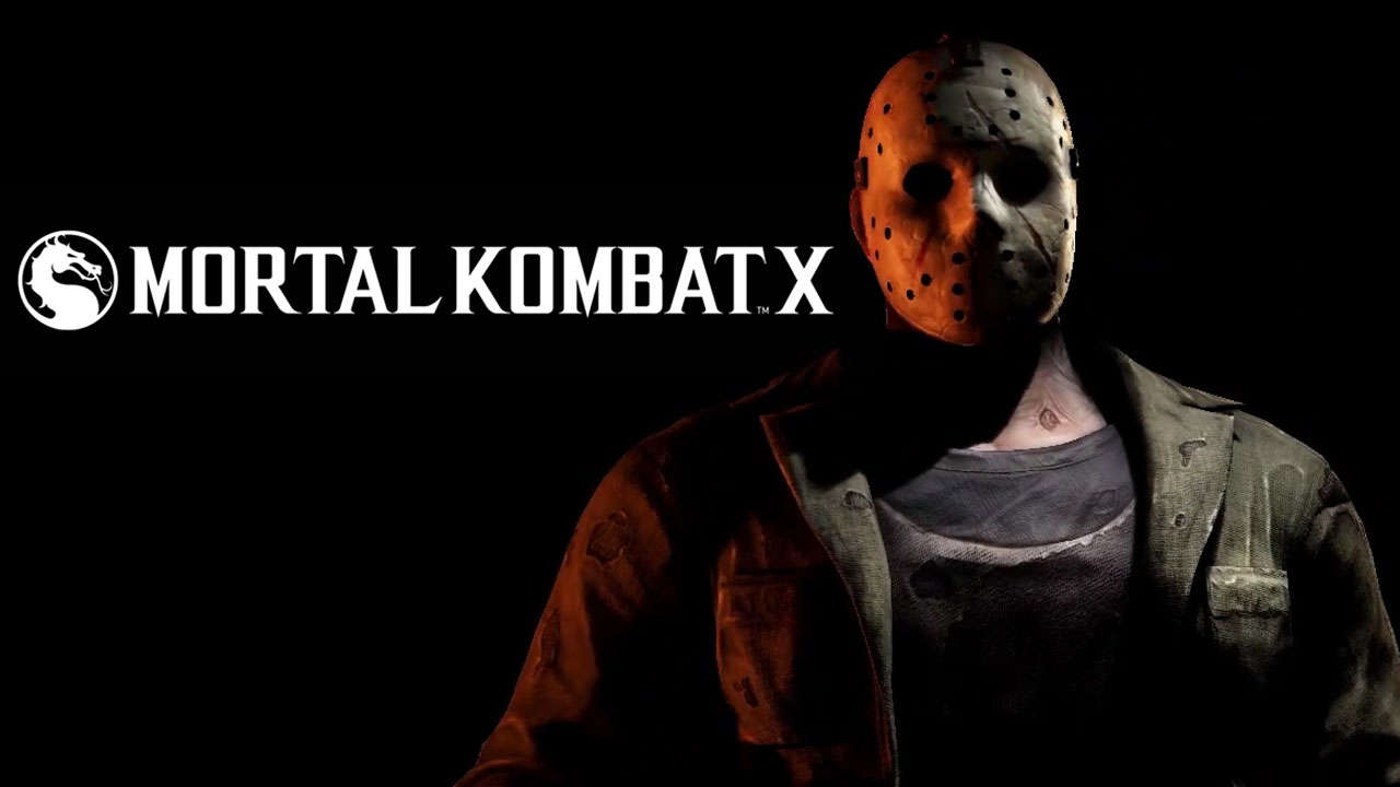
Jason was featured as a paid playable DLC character in Moortal Kombat X- a popular fighting game that has developed multiple games over the years.
BOOKS AND NOVELS
|
|
|
Six of the 12 films have been adapted into novels—Friday the 13th 1 – 3, Jason Lives, Jason X, and Freddy vs. Jason—with Friday the 13th Part 3 being adapted twice. By widening thier productions to the novel book industry, consequently opening up to a new audience.
OTHER EXAMPLES OF FILM MARKETING CAMPAIGNS

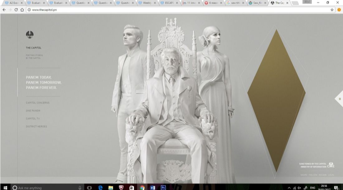
VIRTUAL WORLD WEBSITE
|
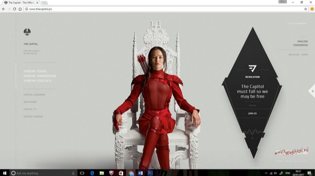
|
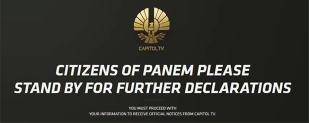
|
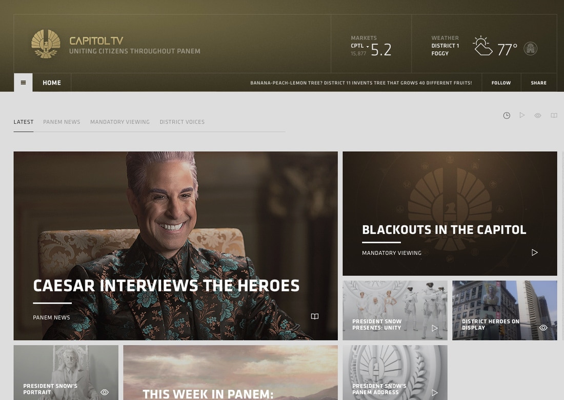
|
Capitol TV is the main television network within The Capitol, which is the franshise's antagonist from the main characters perspective. Capitol TV was created for promotional purposes in regards to the film The Hunger Games: Mockingjay - Part 1, where President Snow addresses the nation of Panem. The TV network is also known for broadcasting the Hunger Games. The whole point of this virtual site is to give the impression and atmosphere of how living in the world of hunger gamse would feel like. The site holds many easter eggs directed at lore of the franchise showing brand identity.
THEME PARK RIDE
|
|
|
|
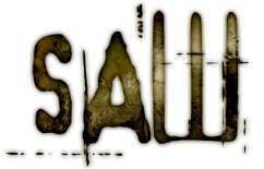
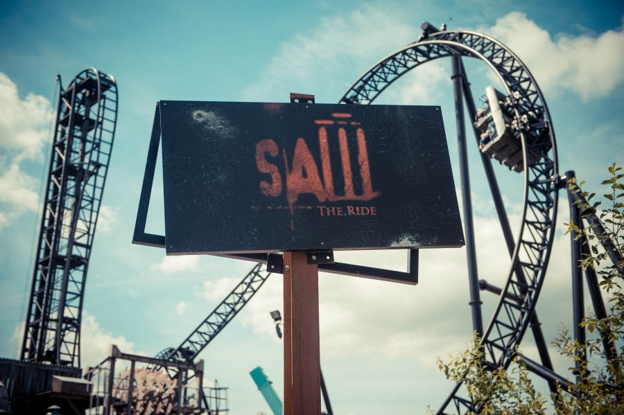
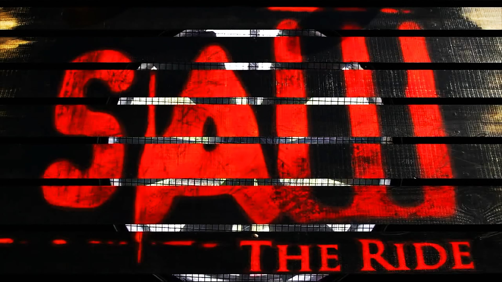
Saw – The Ride is a Gerstlauer Euro-Fighter roller coaster located at Thorpe Park in the United Kingdom. Designed by Gerstlauer and British designer John Wardley, the roller coaster opened to the public on 14 March 2009. It was billed as "the world’s first ever horror movie-themed rollercoaster" and was marketed with the slogan "Face your Fears" by Lionsgate and Twisted Pictures. This was the world's first horror movie themed rollercoster, making it one of SAW's brand identity.
|

RESTAURANT
|
|
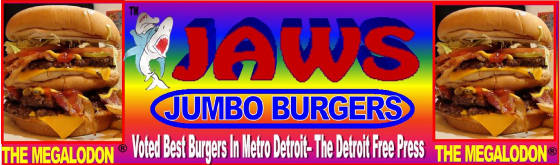
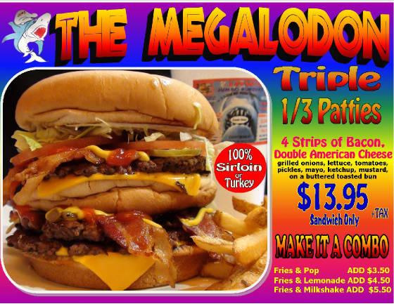
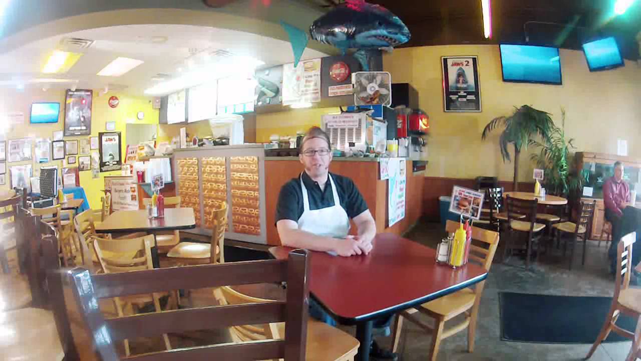
Since January of 2005 JAWS JUMBO BURGERS is a movie tribute restaurant in Farmington Hills, Michigan. This burger restaurant feeds gigantic appetites with fresh ingredients. The restaurant is rated 4.7 out of 5 stars and is quite well known around its area. "The restaurant is clean, and the atmosphere is unsophisticated. The “Jaws” concept is toothy. The food is the equivalent to a 1950's style burger joint."
CONTINUITY IN OUR PRODUCTS
MARVEL STUDIOS:LOGO
|
This logo is used in all Marvel related movies is very iconic as it was featured in Marvel comics before and became a well known logo. This logo is constant in anything Marvel, showing continuity in products and brand identity. The logo's intro features the logo over layed on various Marvel comics panels flickering down. The intro highlights exactly Marvel studios produce, making it clear who their demographic is.
|
|
|
ESCAPE STUDIOS LOGO
|
|
|
Our logo is an identity brand that links all our products together. Our logo is shown on our Magazine, Poster, Trailer and Website showing that they all link together. The use of a logo is effective as it is able to promote our future products due to our symbol being on it. Upon creating our logo we decided that we wanted a simple logo that is able to portray and link with the name of our team. We settled on making our logo looks like a maze with the initials of the name, we also created an intro for it as well.
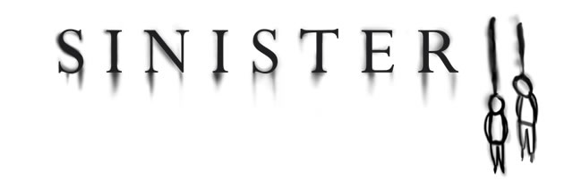
SINISTER: TITLE AND TYPOGRAPHY
|
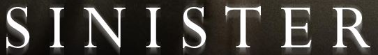
The font displayed in all of Sinister's products is bold and creepy and plays on the title "Sinister", highlighting the supernatural theme of the movie. There is a smudged shadow behind almost resembling smudged blood, creating an unsettling atmosphere which links to the theme of the movie. The Typography remains constant for all products of Sinister even the captions in the trailer are similar to it.
|
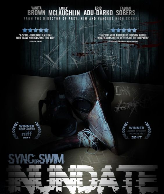
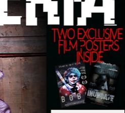
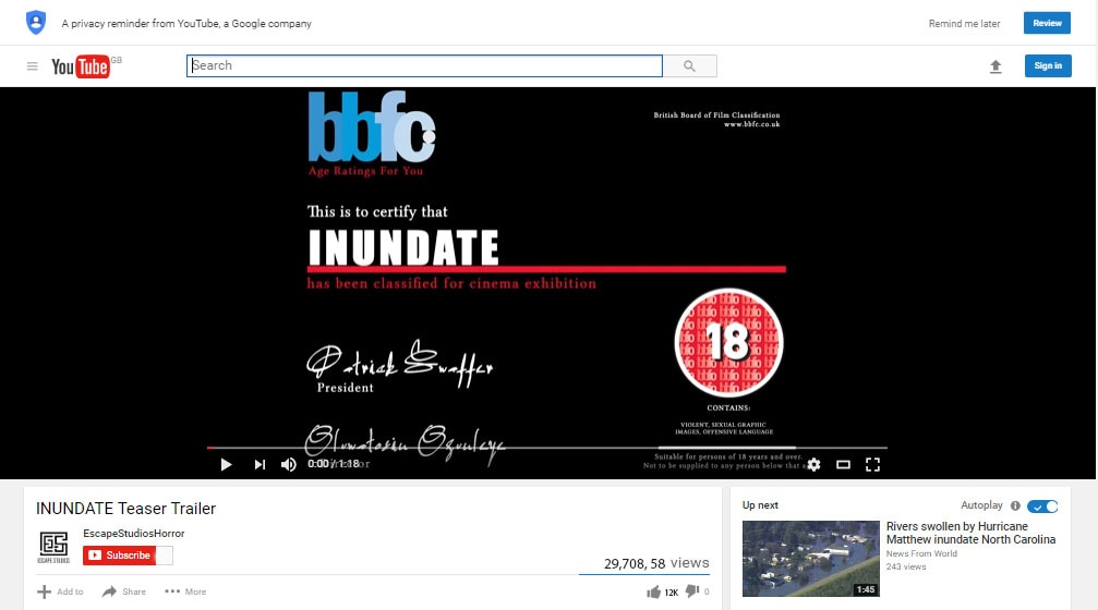
INUNDATE TITLE AND TYPOGRAPHY
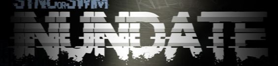
Poster
|
Magazine
|

Trailer
The font for Inundate is an edited " insert font name here" where we made it look glitched due to our theme being about the deep web. Our title remains constant in terms of the fonts used but it can change in colour and texture as seen in the trailer. Furthermore, for the trailer the typography of the captions were different fonts but the glitched theme remains constant.
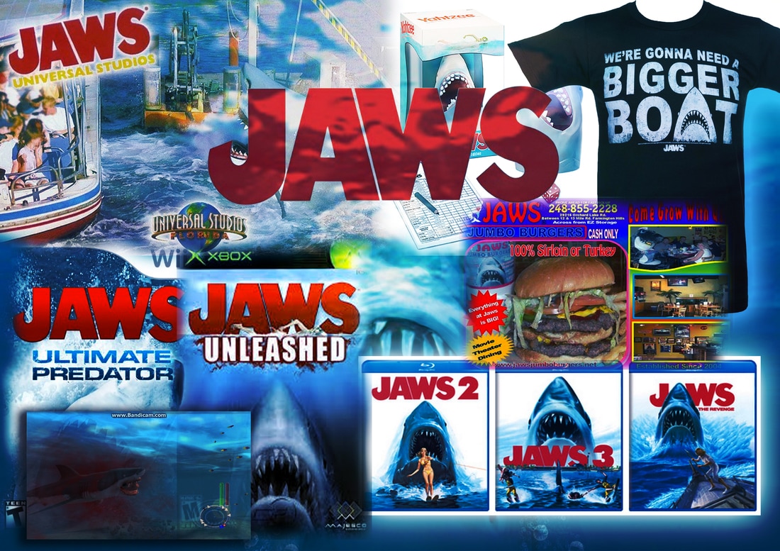
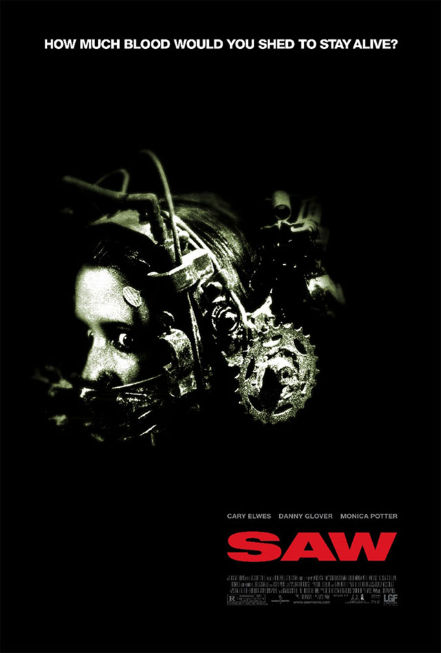
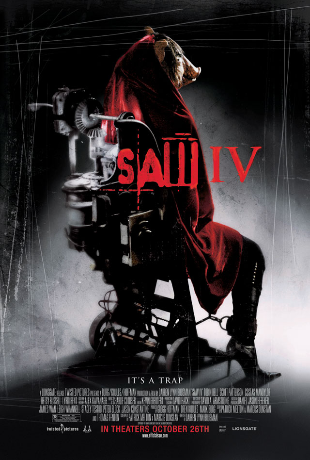
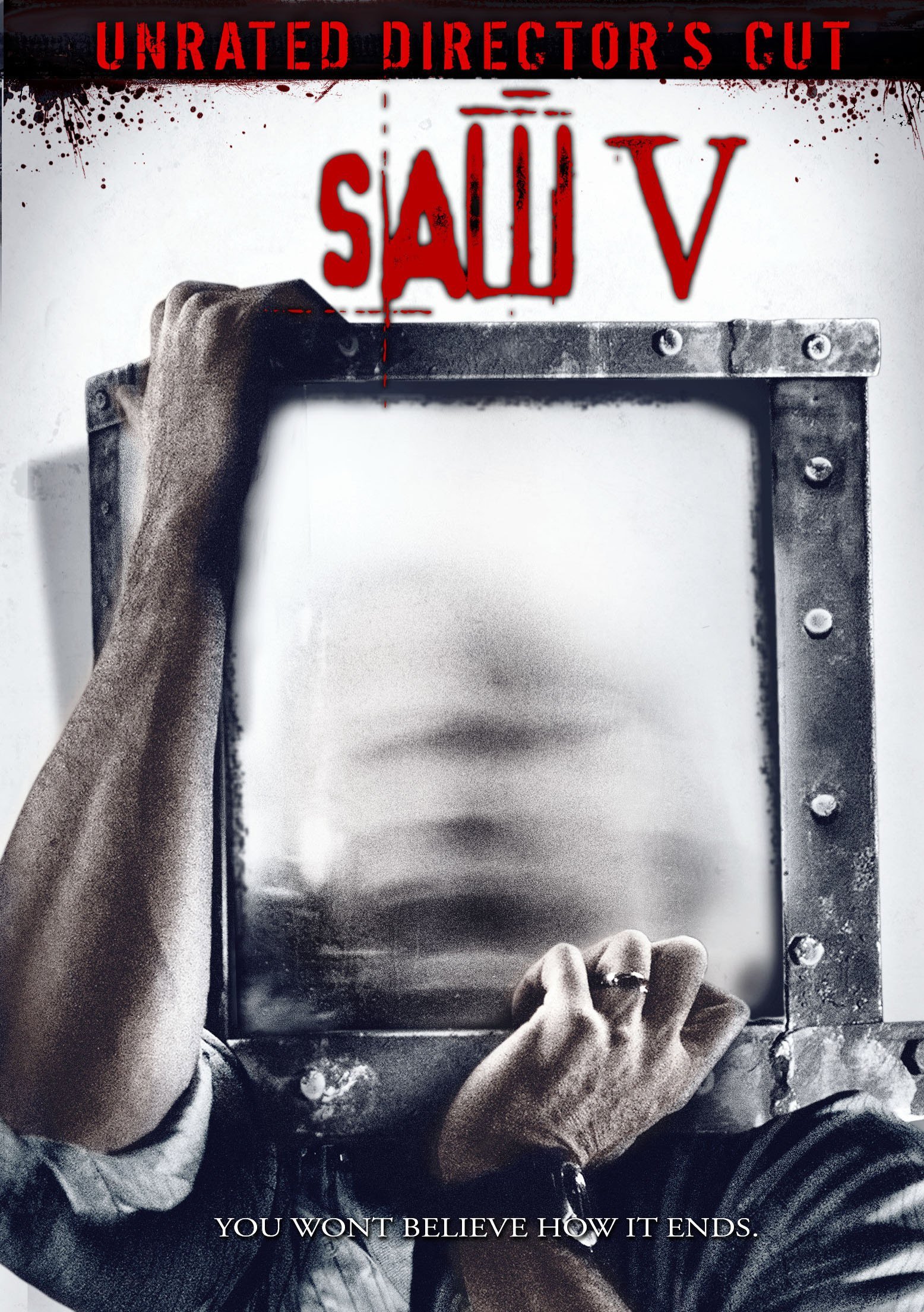
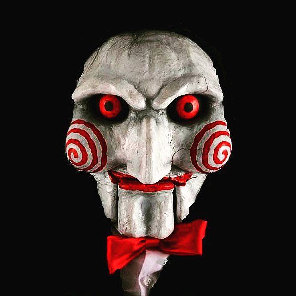
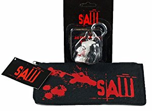
SAW :COLOUR SCHEME

|
|
|
|
The 3 main colours used within the SAW franchise is red, white and black, which is also the exact colour scheme for the main antagonist "Jigsaw". Although the SAW franchise has an alternative colour scheme, red, white and black are mostly used for its products and merchandise, showing continuity. These 3 colours compliment with each other nicely as they encourage the colour red to stand out more compared to the 2 colours. The colour scheme is used on many posters and promotional images and even theme park billboards and console skins.
|
|
INUNDATE COLOUR SCHEME

|
|
|
|
Inundate's colour scheme consists of blue, white and black which is mainly dominant in our poster and magazine. The colour blue was the colour we wanted to stand out more due to the theme of the deep web and drowning. We managed to achieve this by not overusing the colour blue, thus making it stand out when with the black and white. Our trailer has a tint of blue in it, thus keeping the colours and theme consistent with our 3 products, making the colours constant is effective because it allows the audience to establish a link between our products making it easily distinguishable.
|
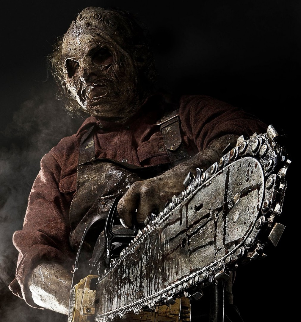
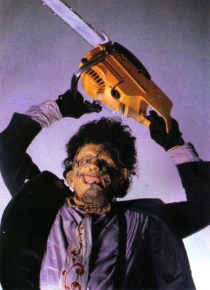
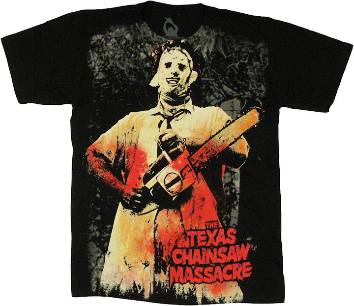
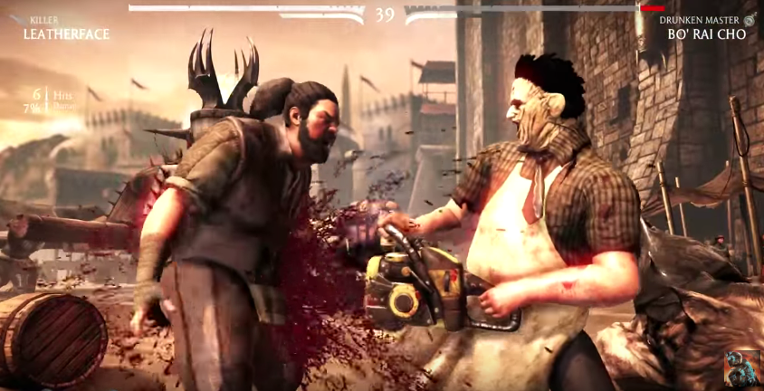
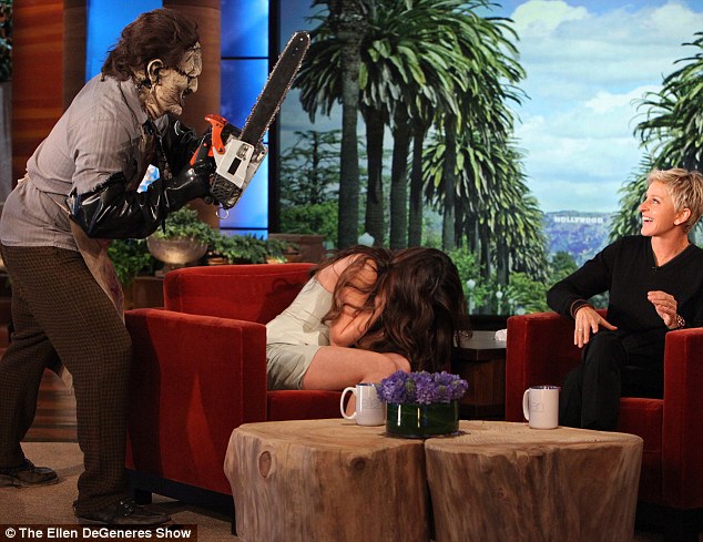
CHAINSAW MASSACRE :ANTAGONIST
|
|
|
|
|
Leatherface is a character in The Texas Chainsaw Massacre horror-film series and its spin-offs. He wears masks made of human skin and engages in murder and cannibalism, alongside his inbred family. An antagonist can highlight brand identity and continuity if executed well, Leatherface is a great example as he is not only an iconic figure in his movie, but in the horror genre in general. Him and he's iconic chainsaw are the face of texas chainsaw massacre and are present in all merchandise and promotional medium related to it. Leatherface has also made a cameo in games such as Mortal Kombat and been shown in chat shows. All of this establish a connection and link between products, showing brand identity.
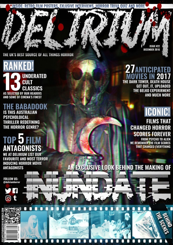
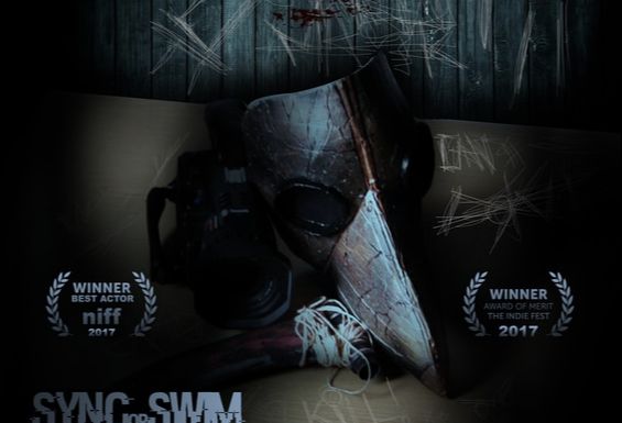
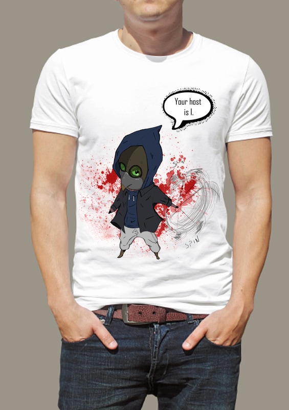
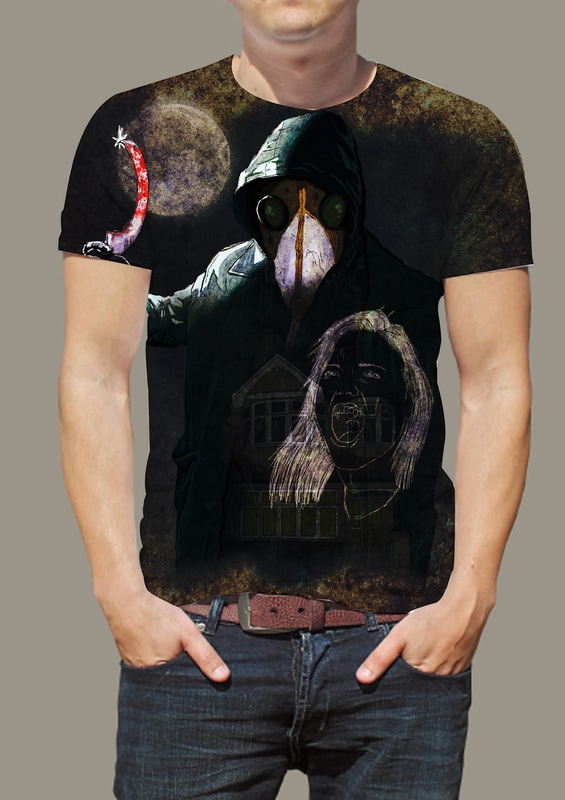
INUNDATE ANTAGONIST
Poster
|
Magazine
|
Our antagonist in Utopia's magazine
|
Trailer
|
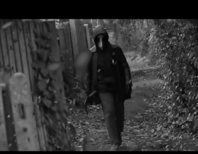
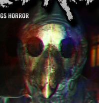
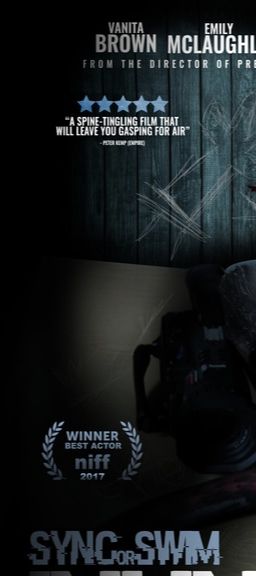
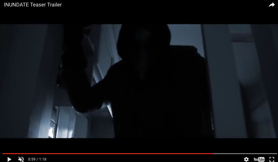
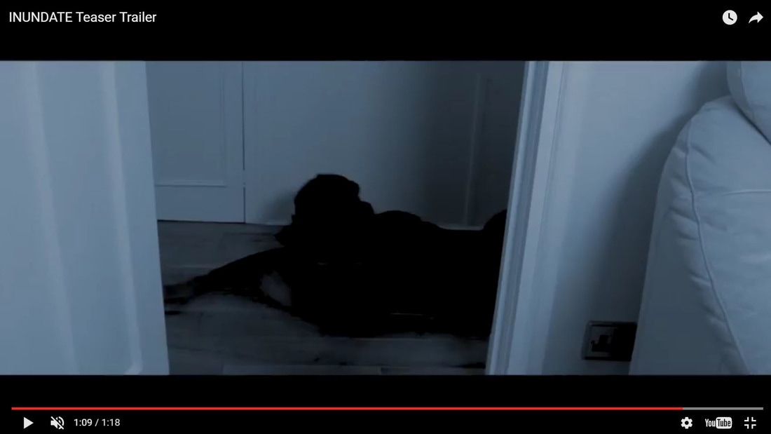
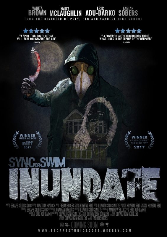
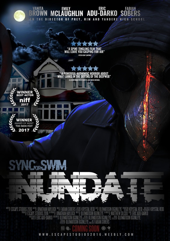
Our main antagonist "HOST" is featured in all of our products with his iconic mask and weapon showing continuity due to these symbols that distinguish him from the rest. Due to the fact that our sub genre was slasher, we made sure that he was featured in all of our products due to the antagonist being the most relevant in slashers. Our antagonist is represented in our poster through his mask, sickle and camera that he uses to stream, these 3 props are significant to him as it represents him as a whole. On the magazine HOST is seen wearing his mask and holding his sickle in a threatening manner, in addition the effect over him makes it look like he has been filmed by someone and is going to end that person's life. The magazine captures how sinister HOST which is portrayed through his weapon and him looking directly at the audience. In our trailer we show quick but clear shots of HOST so that the audiences are at least familiar with his body language and presence. In addition, we didn't want to reveal too much about him to keep him in the shadows to our viewers. |
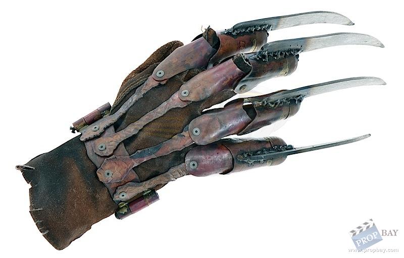
NIGHTMARE AT ELM STREET :PROPS
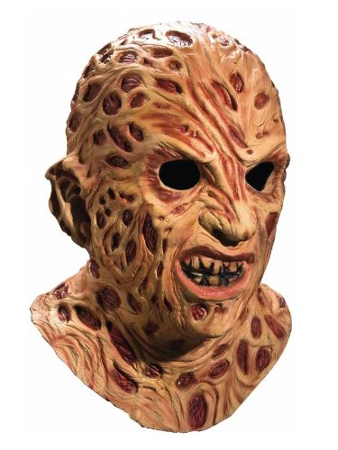
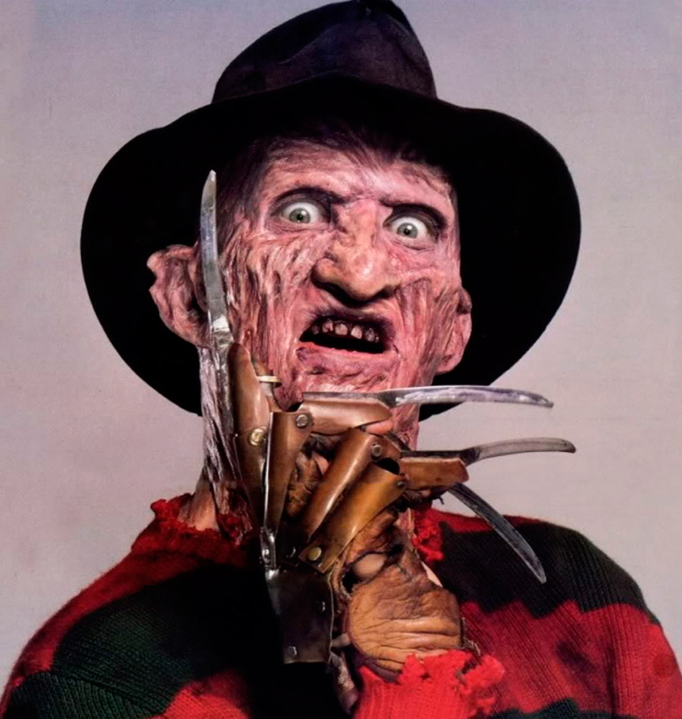
Freddy Kreugar from NIGHTMARE AT ELM STREET is made up of various props that makes him easier to identify. A burnt face mask is worn by the actor to portray Freddy's actual face, it is unpleasing to look at and can generates fear to his victims. Freddy's iconic weapon is a claw like glove which he uses to eliminate his victims. His weapon is personal to him due to him maling it himself, the weapon could be a reflection of himself. Freddy also wears a hat which conceals the upper half of his face, making his appearance annonymous. These props have been consistent in all NIGHTMARE AT ELM STREET related things as they define Freddy.
|
|

|
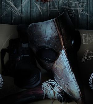
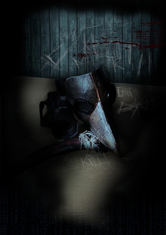
INUNDATE PROPS
|
|
|
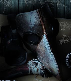
The props featured in all 3 of our products consist of the plague doctor's mask and the sickle which are the iconic props of HOST. The mask is generally used to conceal the identity of the person behind it which connotes fear, as in fear of the unknown. Our antagonist wears a plague doctor's mask which were worn by doctors who treated people with the plague. We specifically chose this kind of mask to generate a sense of irony due to the fact that our antagonist does not save lives but the exact opposite. The mask is seen in all 3 of our products because it is our antagonist's identity which is Inundate's brand identity. HOST's iconic sickle is also featured in all 3 of our products as it highlights his masculinity and is an extension to his arm, meaning it is apart of him.
THE WITCH :LIGHTING
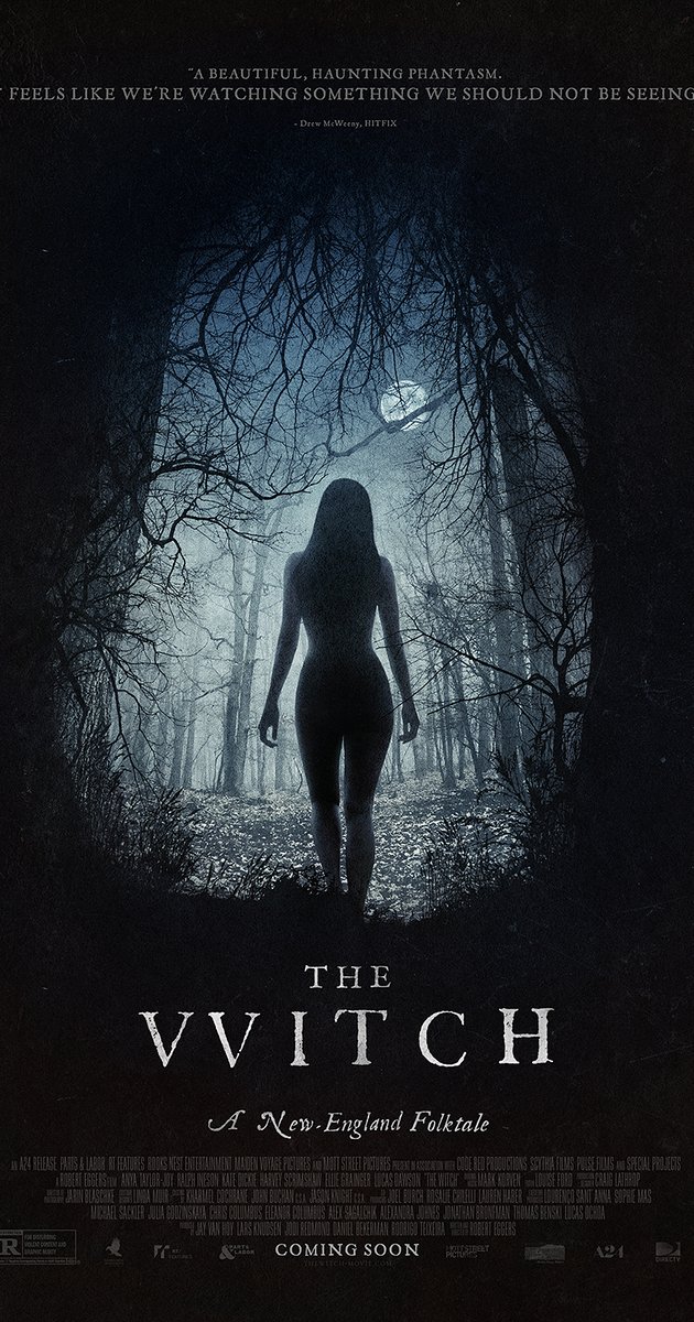
|
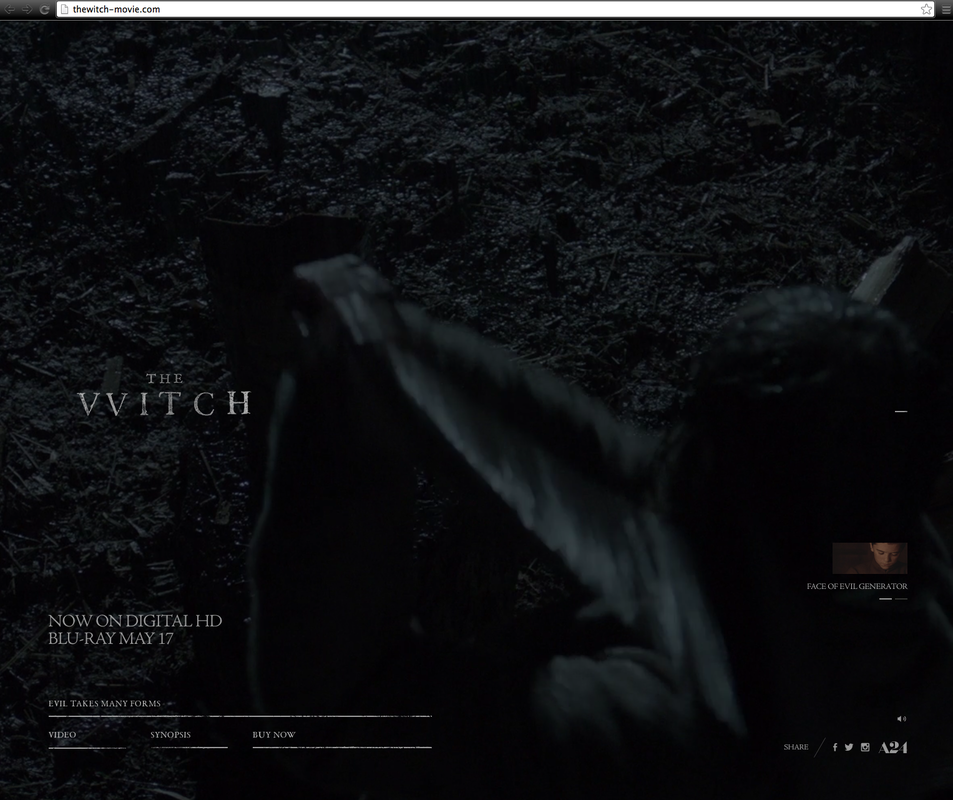
|
The lighting in The Witch is constant in almost all of its products. With the constant use of dark lighting with occasionally tints of blue, The Witch stabilizes continuity even through different mediums. The lighting in the poster is low key lighting so low that everything appears in a silhouette form. High key lighting is presented as blue light which is seen in the poster balancing out the dark. The official website keeps the lighting the same with tints of blue, establishing a link between the 2 products. The trailer also remains consistent with this form of lighting .
INUNDATE LIGHTING
|
|
|
|
|
The Lighting in INUNDATE is an important factor as it links with our colour scheme, theme and genre. The lighting used in all 3 products are low key lighting with a tint of blue light. This is the one of the main aspects in our poster as it creates the impression of our antagonist lurking in the shadows. The magazine's lighting isn't exactly low, however the tints of blue are evident. Our trailer starts with with a high key lighting which suddenly becomes low key when the antagonist is revealed, highlighting the disequilibrium. Our trailer is also consistent with the blue tint, establishing continuity and brand identity within our 3 products.
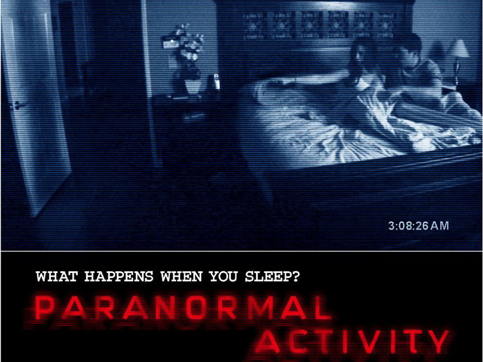
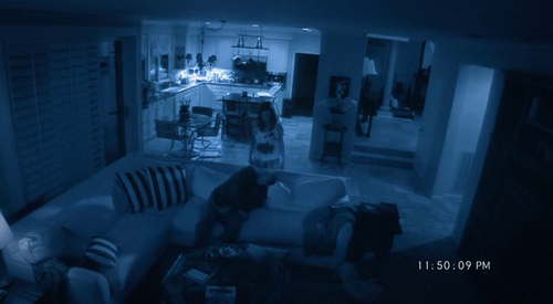
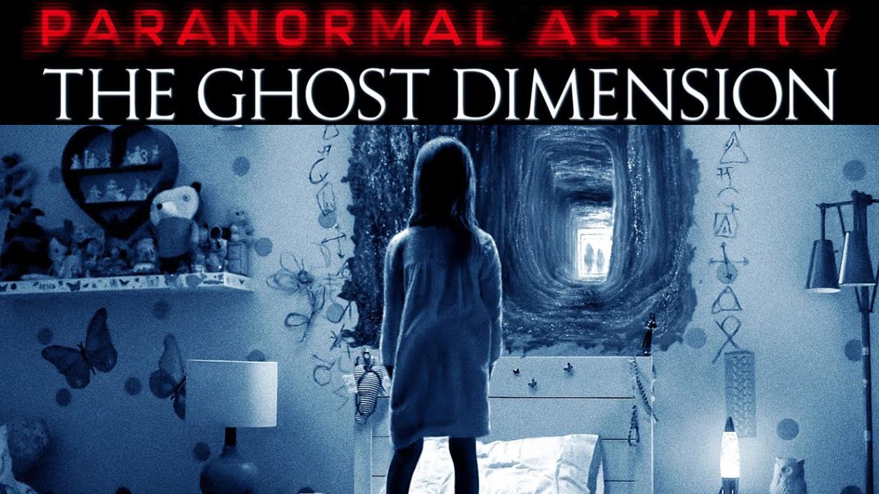
PARANORMAL ACTIVITY:SETTING
|
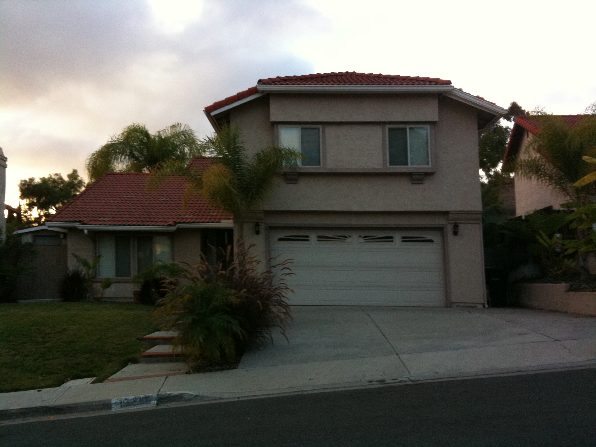
PARANORMAL ACTIVITY takes place in the home of the protagonist as they are haunted by an evil presence. The setting remains constant through all their products and sequeals , making it easier for audiences to recognise the movie. On all 3 paranormal activity posters, the huse serves as the main image as it has become an icon to the series, thus establishing its identity brand.
|
|
|
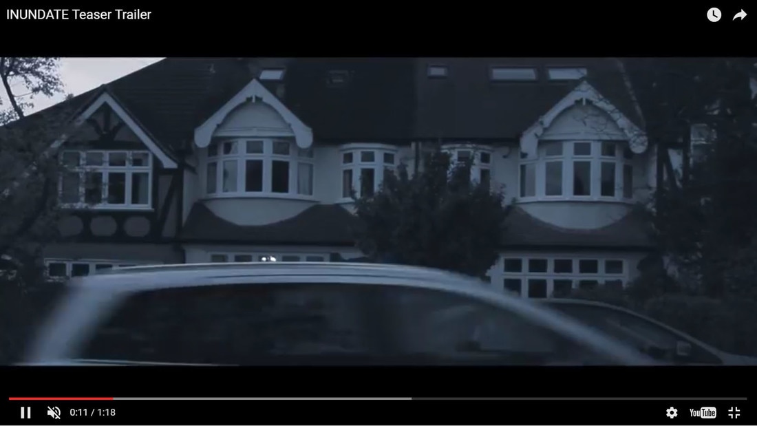
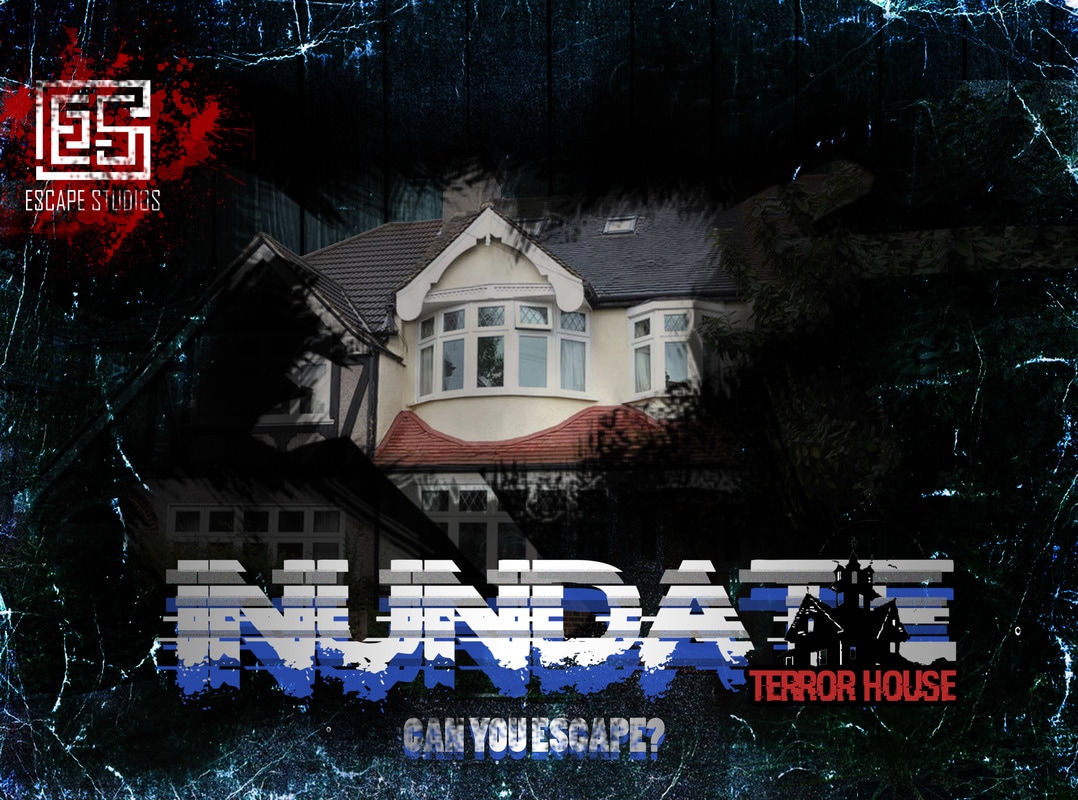
INUNDATE SETTING
|
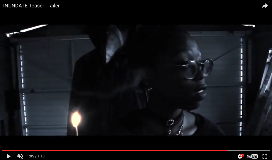
INUNDATE is set in the house of the Protagonist, this is evident throughout the entirety of our trailer and magazine where the host is outside of our protagonist's house. This highlights the contiunity of these products. We chose the home as the setting due to the home connoting saftey and comfort, which becomes the opposite due to the invasion of HOST.
|
|
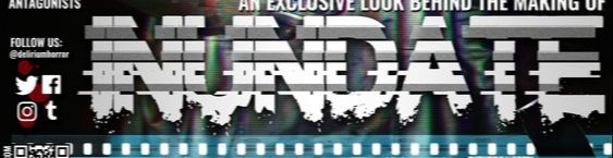
CROSS MEDIA CONVERGENCE: INUNDATE'S VISUAL PRODUCTS
In this part of the Evaluation we are going to create a range of visual products in oder to highlight the brand identity & motif found in our 3 products.
PUBLIC PROMOTION
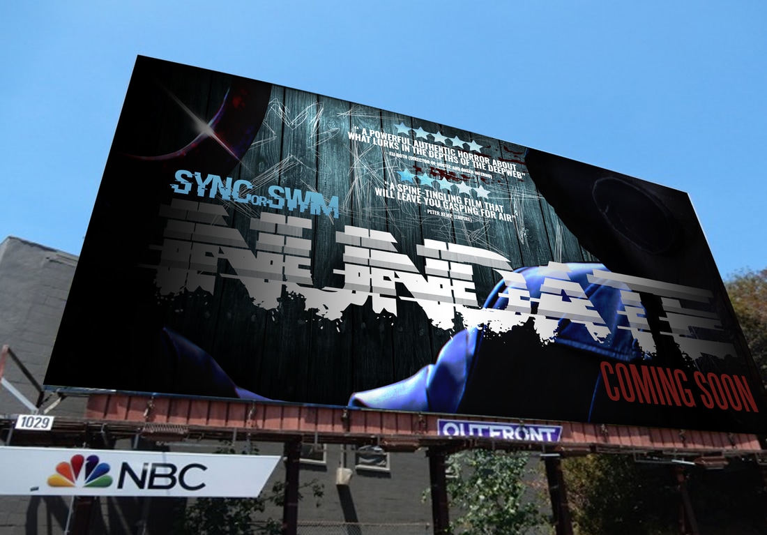
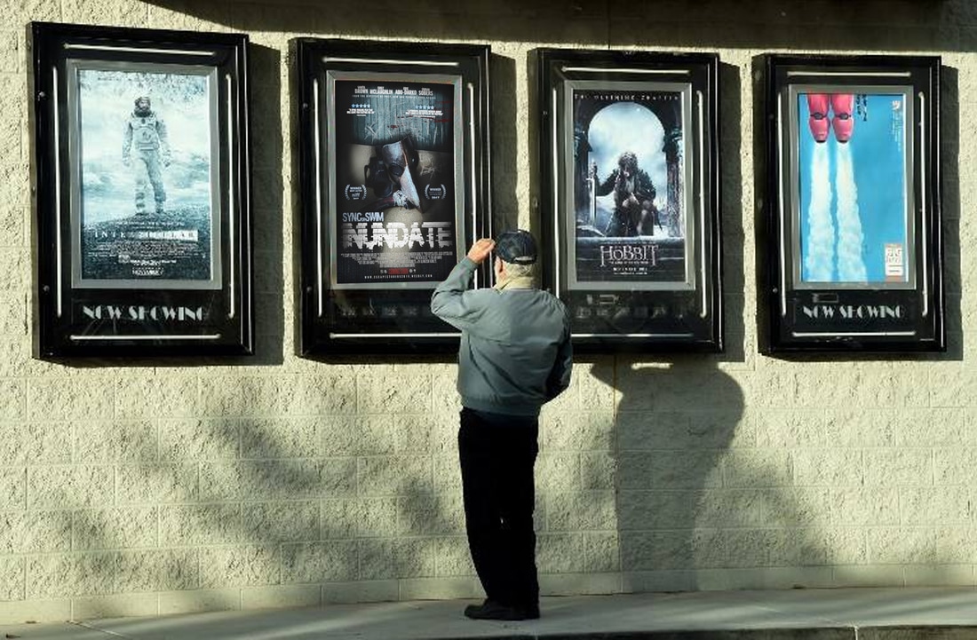
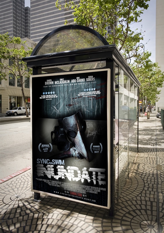
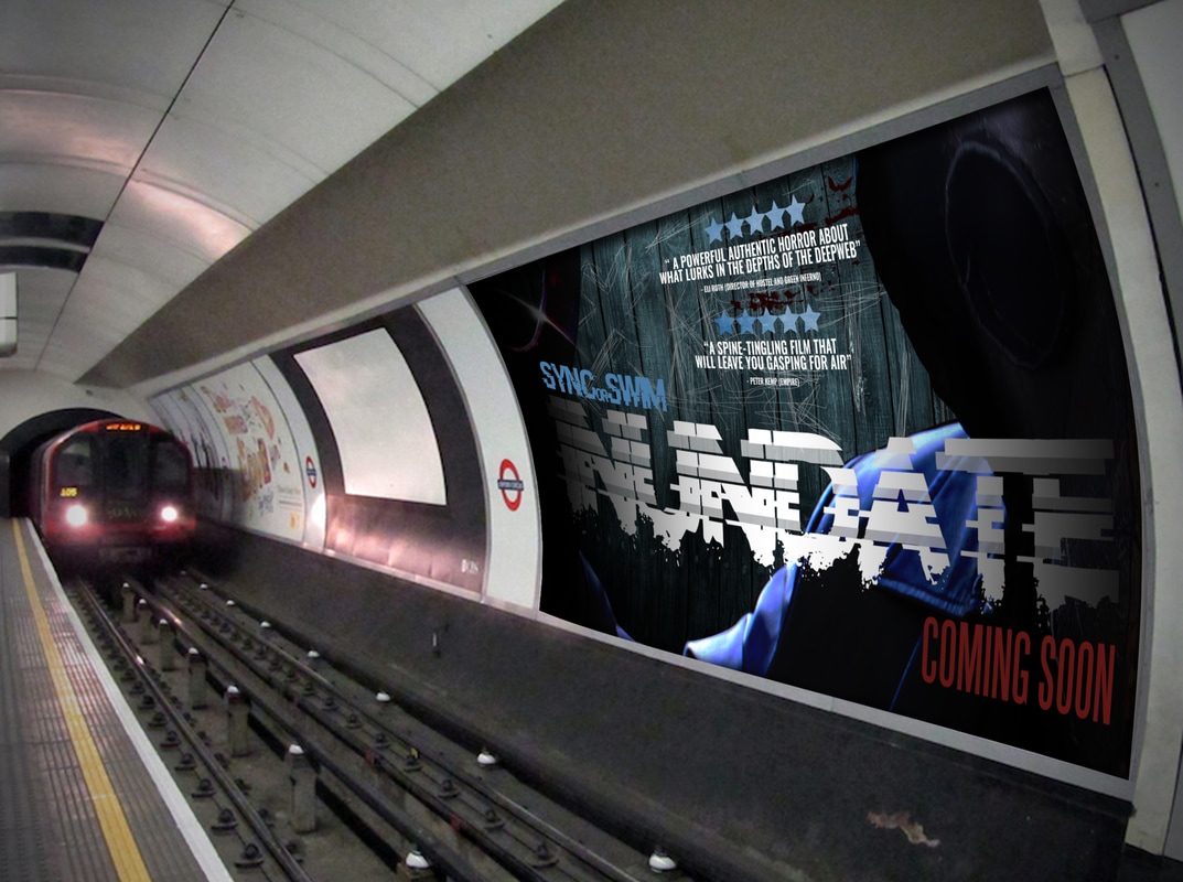
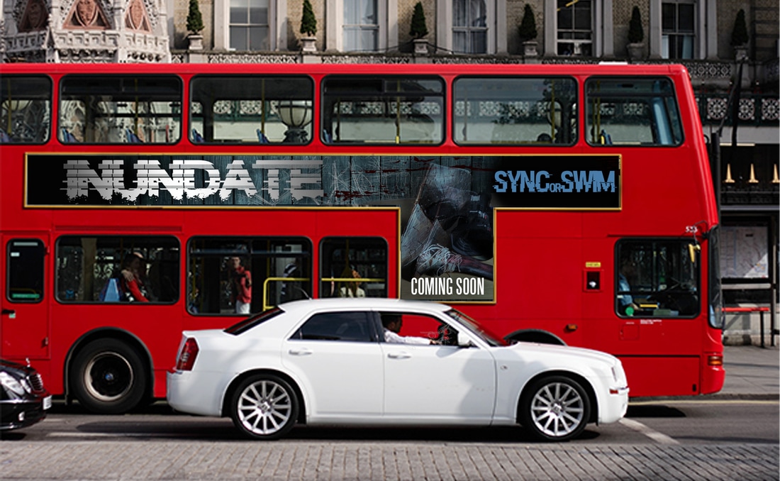
To promote INUNDATE we used the conventional way of public advertising. We displayed the poster on billboards, bus stops and buses to increase the awareness of our identity brand. This is effective as they are visible to the eyes of the public due to them being presented outside.
|
|
|
|
ALTERNATIVE POSTERS
We created 2 alternative posters for INUNDATE to have different form of recognition, as well as to further promote our film and visual identity.
|
|
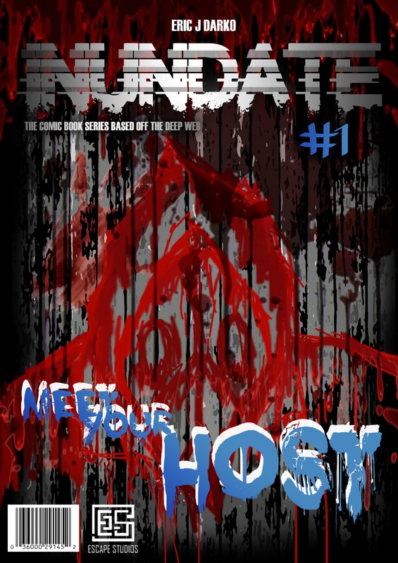
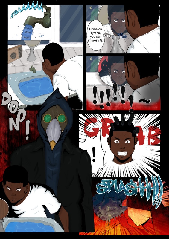
COMIC BOOK
We created a comic book series to appeal to comic book fans who might be attracted to the book and become fans of the movie. The comic book tells the story of the original movie and prequel and sequel.
|
|
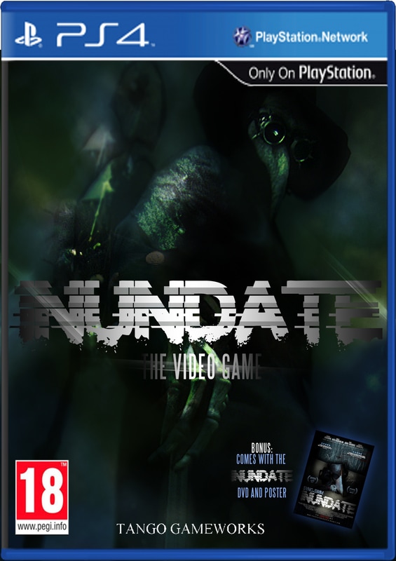
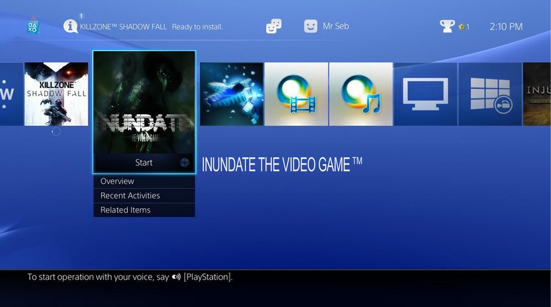
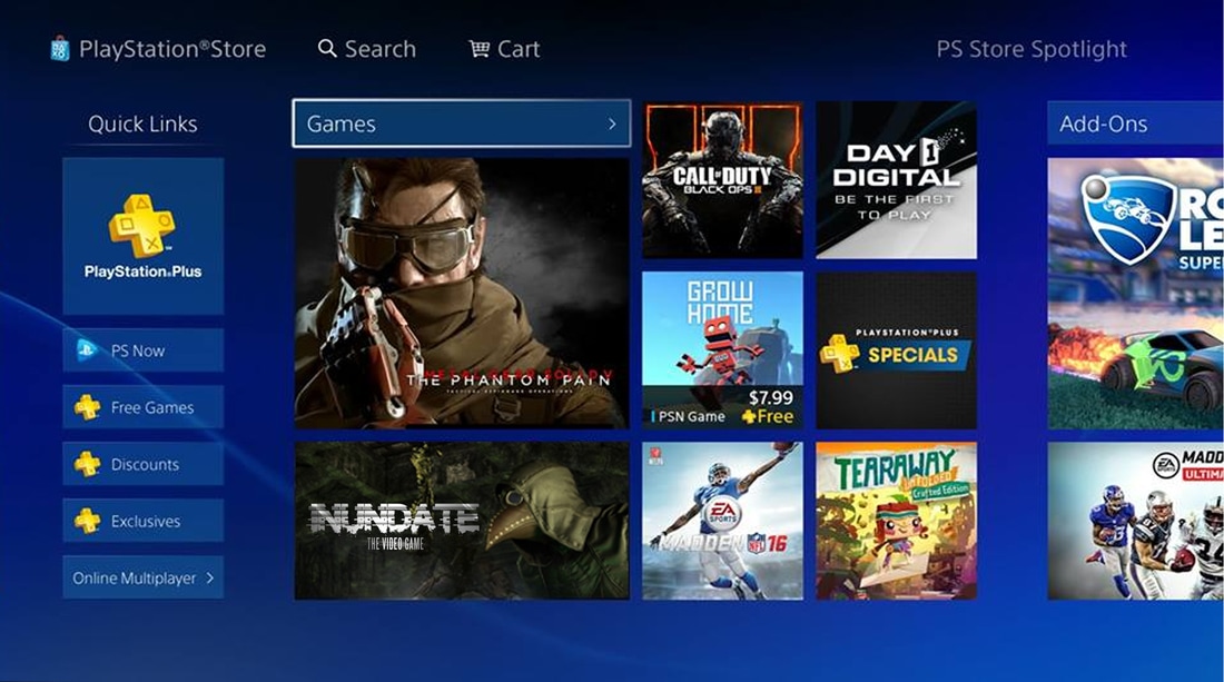
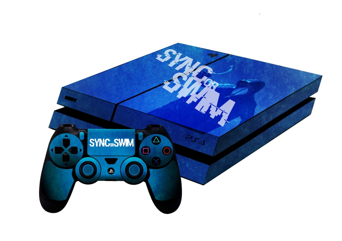
VIDEO GAME AND SKINS
INUNDATE has a video game exclusive to Playstation 4 where you can either re-tell the story of the movie through the eyes of the protagonist or antagonist. The reason for this is so that we appeal to gamers, increaing the awareness of the movie with from different platforms. We also created skins for the Playstation 4 and controller for merchandise.
|
|
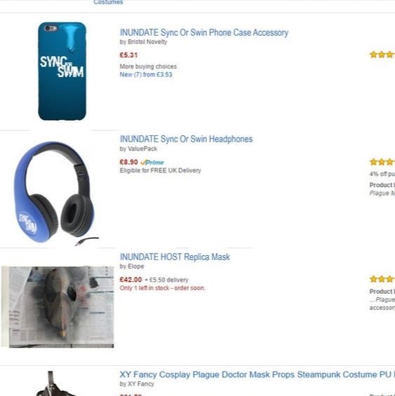
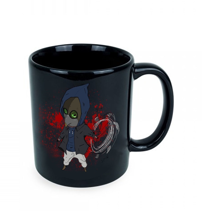
MERCHANDISE
Merchandise was created for fans of INUNDATE, These would range from T-shirts, to phone cases and to mugs. Our colour scheme is consisted throughout all these products, showing continuity and identity brand.
|
|
|
|
|
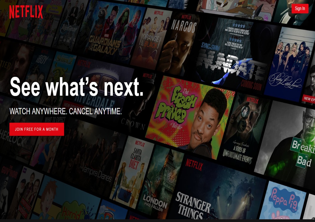
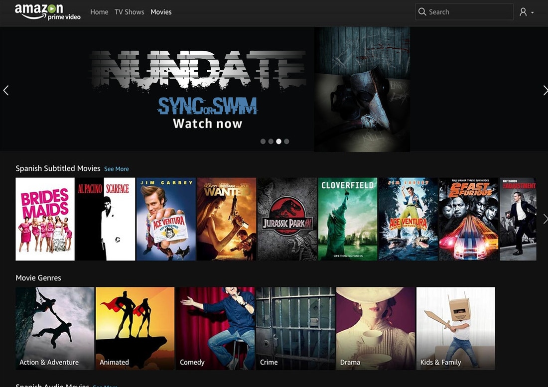
Media streaming platforms
We decided a good way to release INUNDATE to multiple media streaming platforms such as Netflix and Amazon Prime. By doing this, it will create an enhanced viewing experience for the viewers and appeal to those who enjoy movies in the comfort of their own home.
|
|
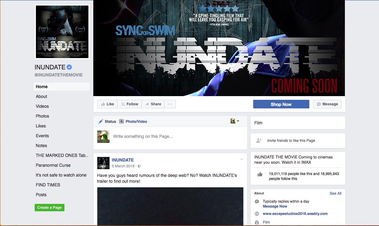
SOCIAL MEDIA SITES
We created a Facebook, Twitter and Youtube pages to reach out to those active on these social media sites. There being an account for the movie establishes it's brand identity.
|
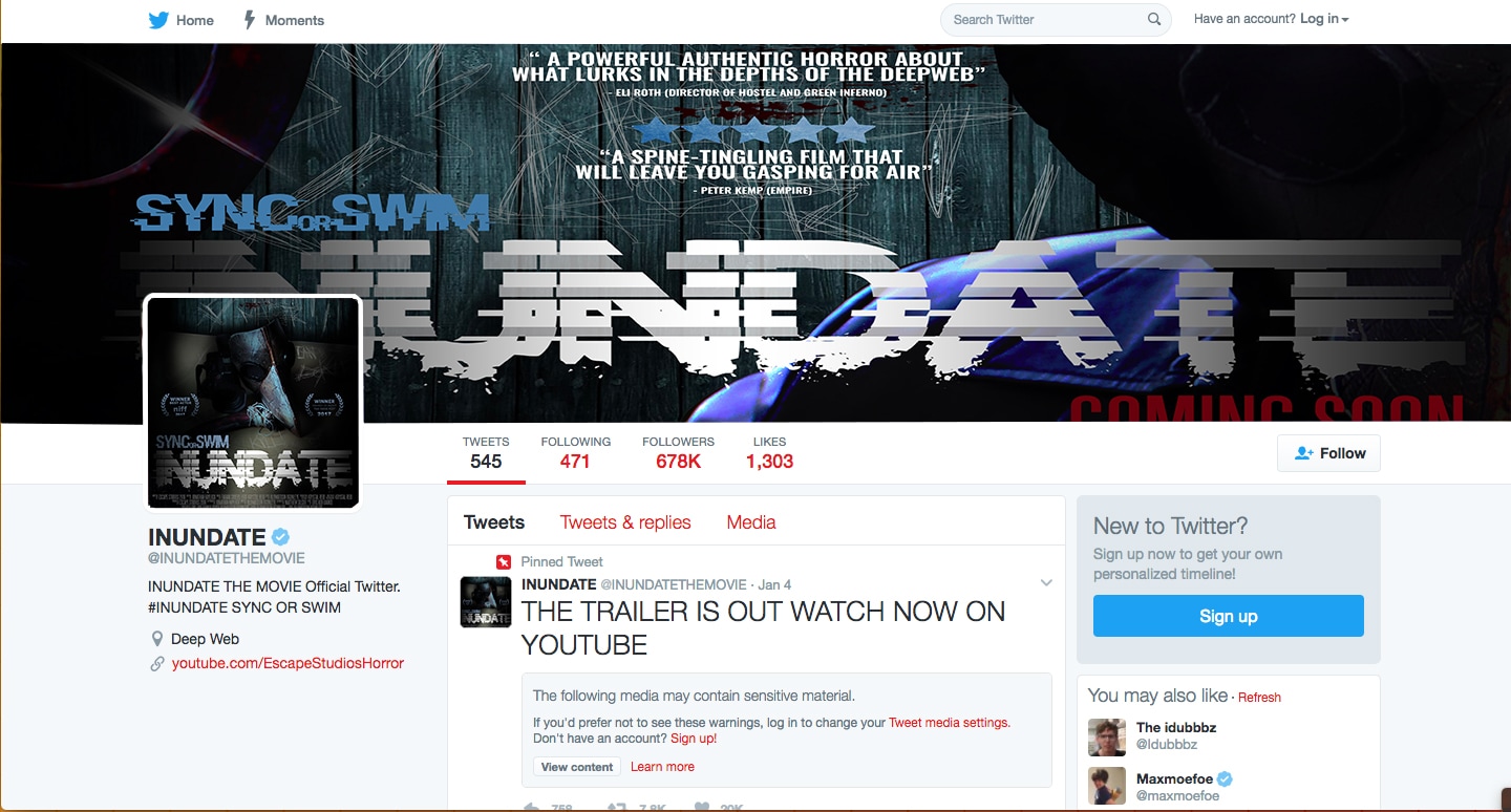
|
|
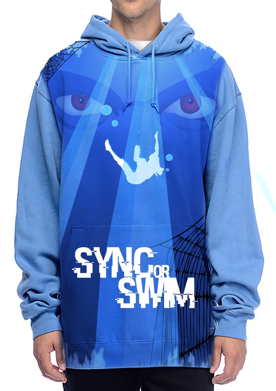
ATTRACTION/ EVENT
|
Once every couple months, an event/game will be held where participate will have the opportunity to live the movie in an active game form where participate are required to escape a house without being captured by the 3 HOST. Players can invite friends and hope to escape to win a prize.
|
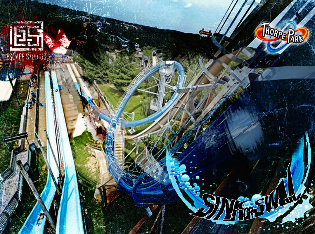
SINK OR SWIM is a water slide attraction available at Thorpe Park. A 1,975 feet long water slide, it's either you sink or swim.
|
|
|
CONCLUSION
In conclusion, I believe that we were able to develop and establish an identity brand effectively using cross media convergence and continuity within our 3 products. Our 3 products compliment each other extremely well as they are all consistent with colour, font and theme- creating recognition among the audience thus giving us an identity, In terms of further promoting INUNDATE's brand identity, we have worked with multiple cross media platforms and created products with recognizable elements of continuity and theme. We feel certain that the use of merchandise and products are effective in terms of raising awareness of our movie and Escape Studios, our products are also able to capture the eyes of our main demographic and many other group of people.
