
ON THIS PAGE, YOU WILL FIND ALL THE STAGES OF OUR TEAM DECIDING ON THE BEST POSSIBLE LAYOUT FOR OUR MAGAZINE FRONT COVER AND OUR MOVIE POSTER. WE ALSO DO EXTENSIVE RESEARCH ON WHAT MAKES A SUCCESSFUL COVER AND POSTER BY LOOKING AT EXISTING PRODUCTS. YOU'LL ALSO FIND OUR DRAWN DRAFTS THAT WE WILL USE AS A TEMPLATE FOR OUR FINAL PIECES. ALONG WITH THAT WE'VE ALSO DONE A FEW TEST SHOTS TO PRACTISE MANIPULATING LIGHTING AND EXPERIMENTING WITH VARIOUS POSES COULD USE ON OUR PIECES.
POSTER RESEARCH
REAL MEDIA TEXTS
In this section you will find our research into various existing horror movie posters and the steps we took when deciding on how to structure ours.
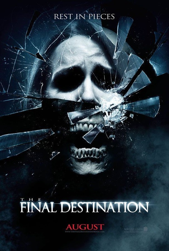
We like this poster for Final Destination because of the way the image has been presented. The glass depicts a woman who could be a protagonist and as the glass breaks, we see a skull which connotes her inevitable death. This poster alone tells us that this movie is full of people dying in very graphic ways due to it's strong imagery. We would like to be able to communicate our movie's ideals through our use of imagery as well as this poster does.
|
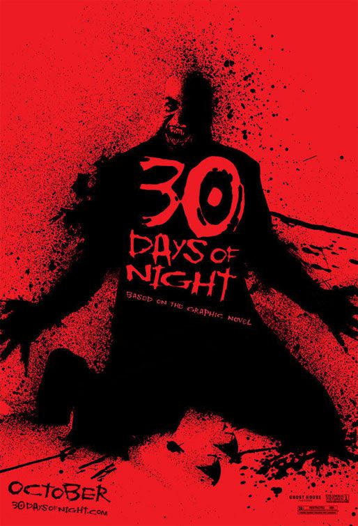
This poster bold use of colour is what attracted us to it. This poster for 30 Days of Night goes for a different approach to a standard horror movie poster by instead editing it down to two strong colours. This effect works especially well considering that 30 Days of Night is a vampire movie. The use of the colour red connotes the vampire's thirst for blood and tells the viewer that they can expect a vast amount of bloodshed before even seeing the trailer.
|
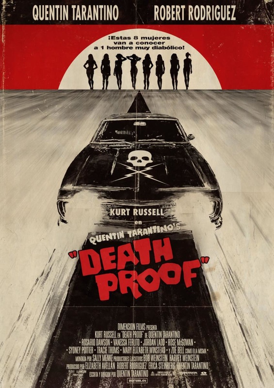
We chose this poster because we were drawn to the retro theme of the poster. This is something that we've noticed quite a few posters have tried but only a few have successfully created it. We also really like the use of the black & white with the red highlighting the sky and the film title.
|
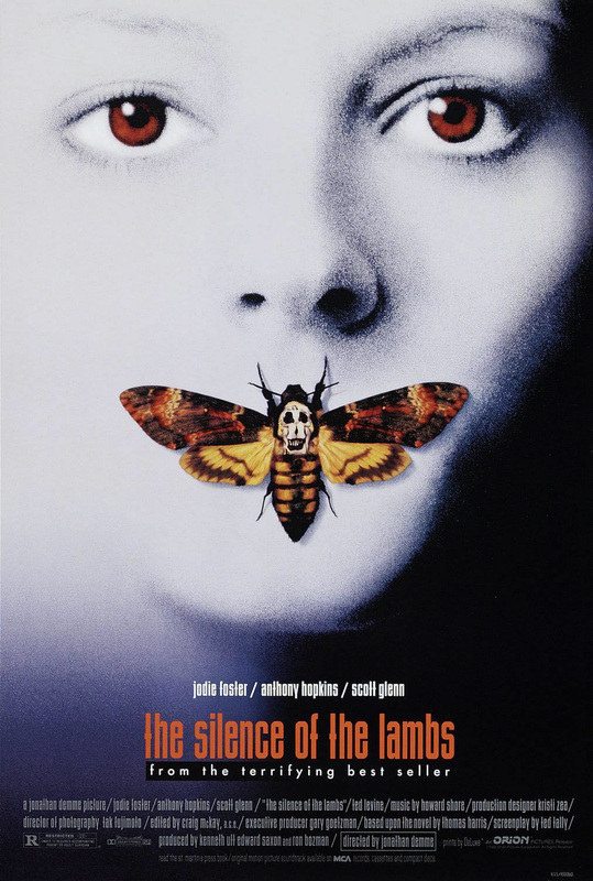
This poser caught our eye because of it's use of colour. The photo is black and white with a slight blue tint. The figure's eyes have also been tinted red along with the moth being in full colour. This creates an eerie atmosphere which we would like to create with our poster.
|
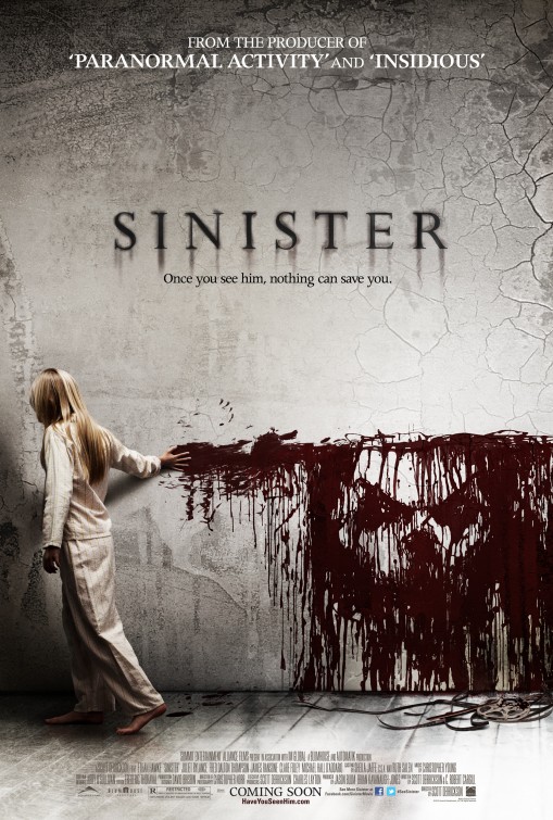
We like the main image in this poster as instead of having the main focus in the center, it's slightly off center which is a technique not used in modern horror posters often. We also love the fact that the blood splatter on the wall (which seems to be originating from the girl) creates the face of the film's antagonist.
|
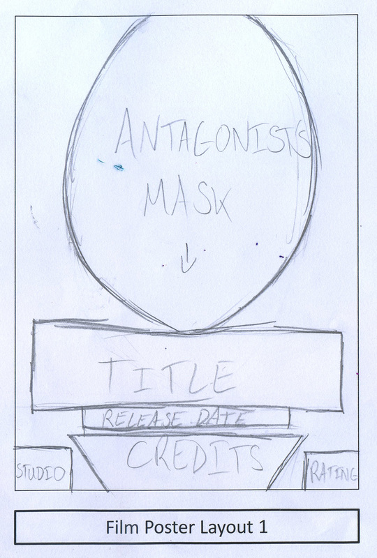
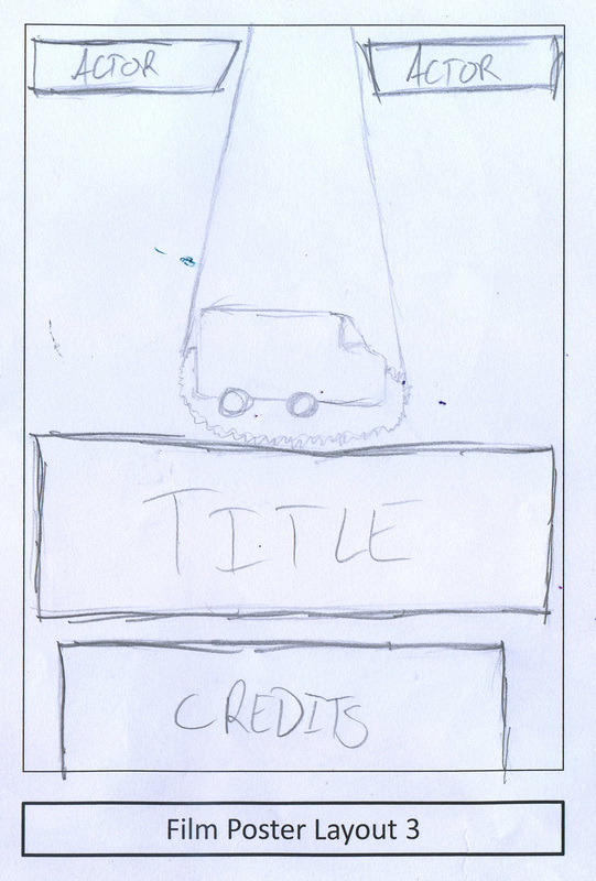
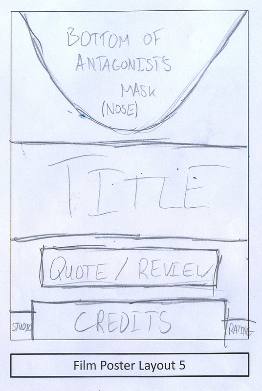
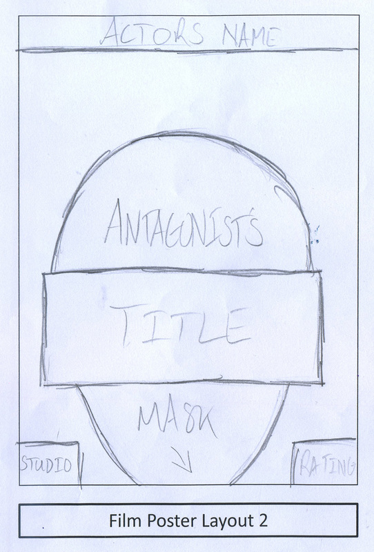
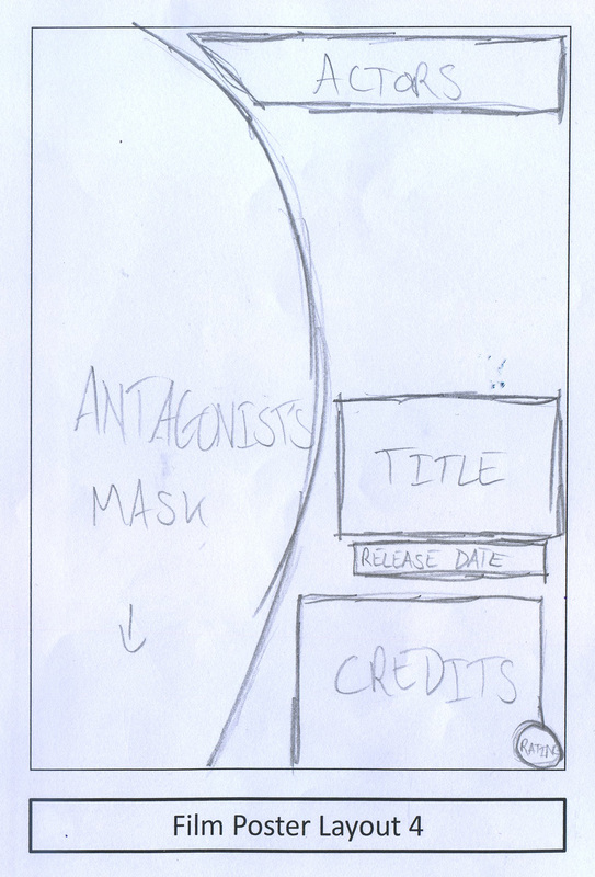
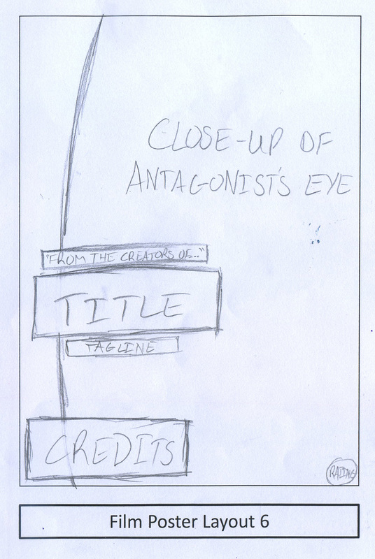
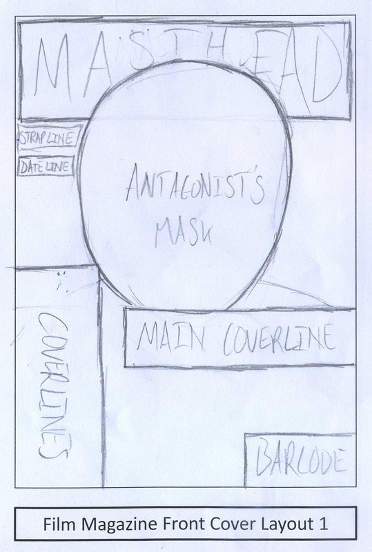
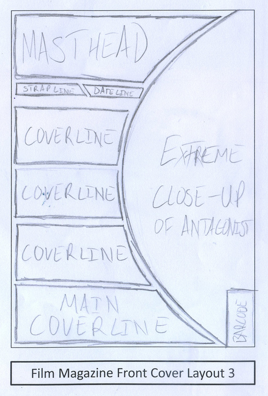
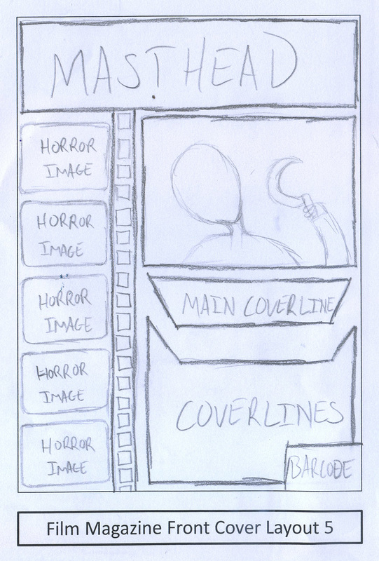
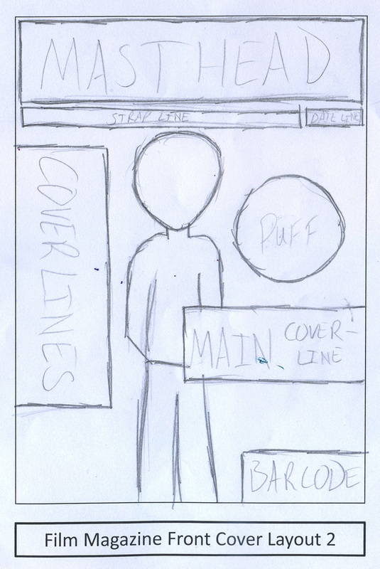
DRAWN DRAFTS
These are the drafts that we have conjured up to reference in the production of our horror movie poster.
|
|
DIGITAL DRAFTS
These are the digital drafts we created based on our drawn drafts. These function as a more accurate layout of how our poster will look.
|
|
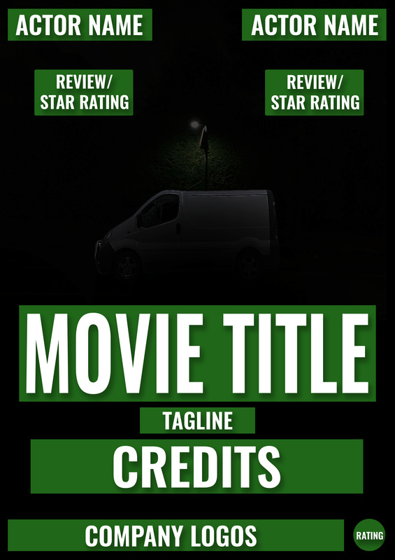
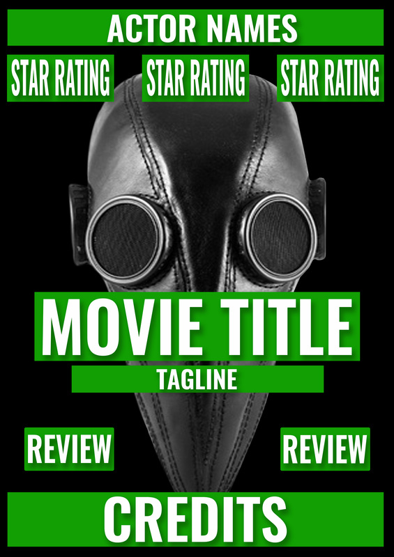
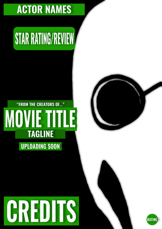
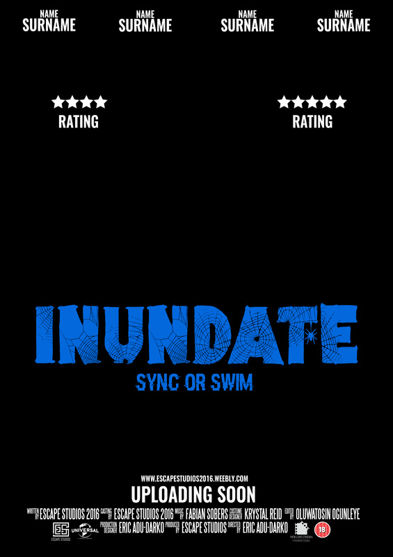
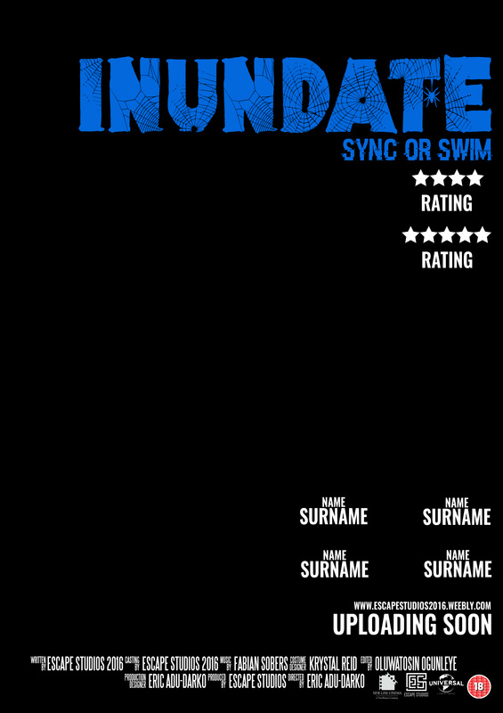
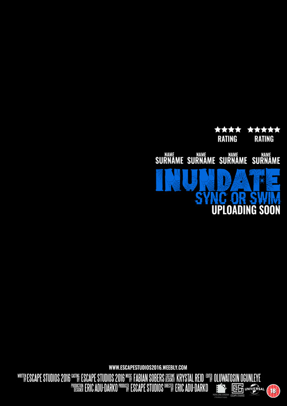
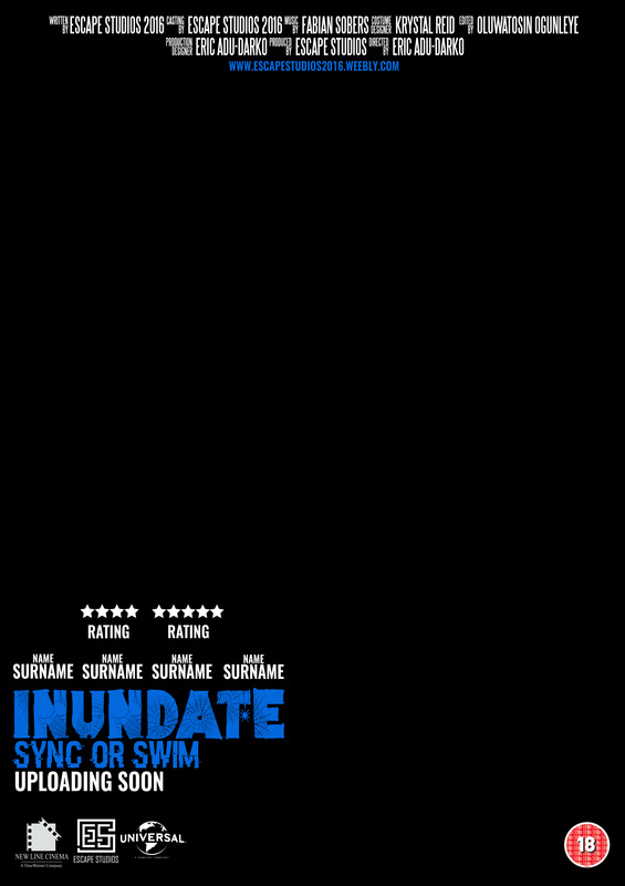
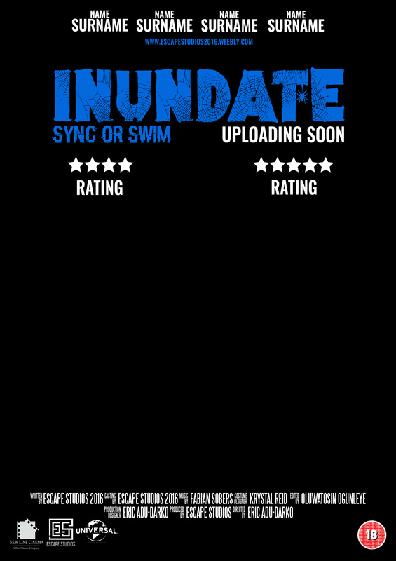
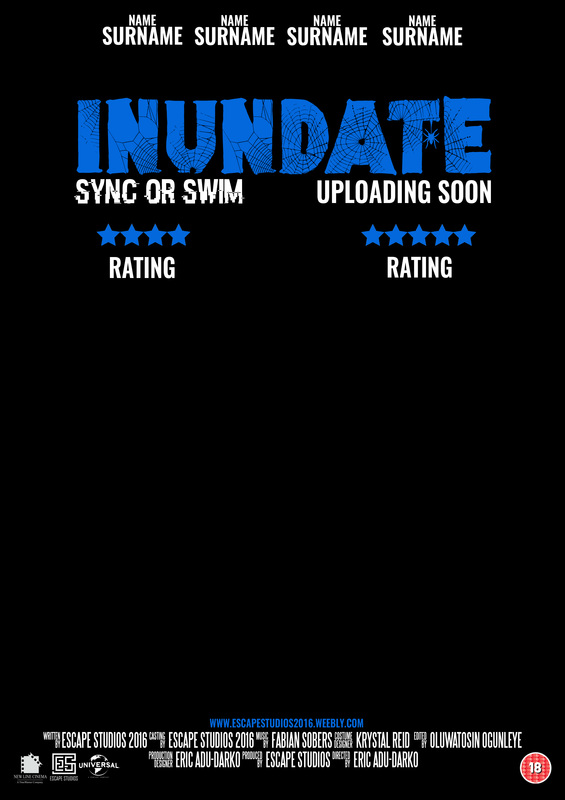
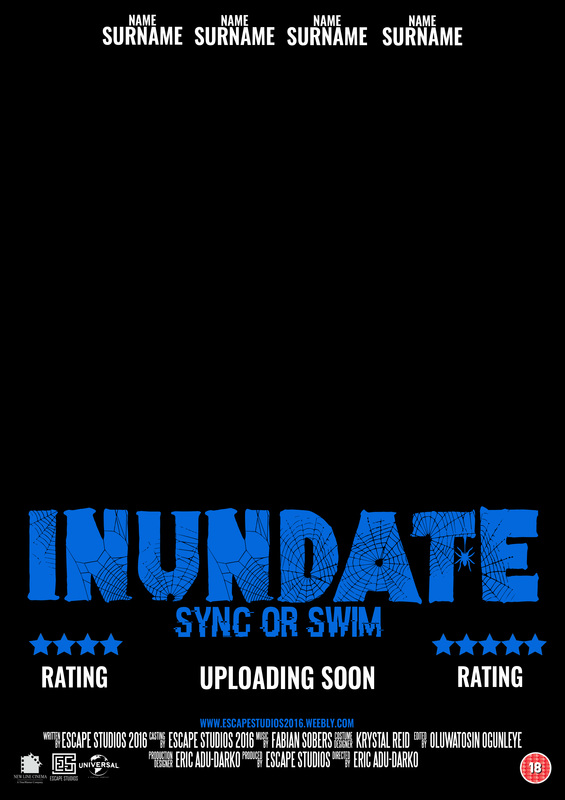
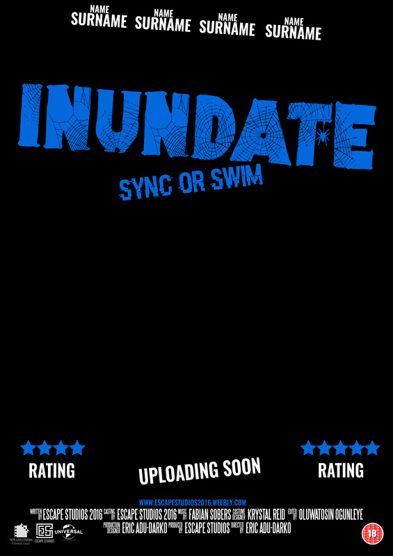
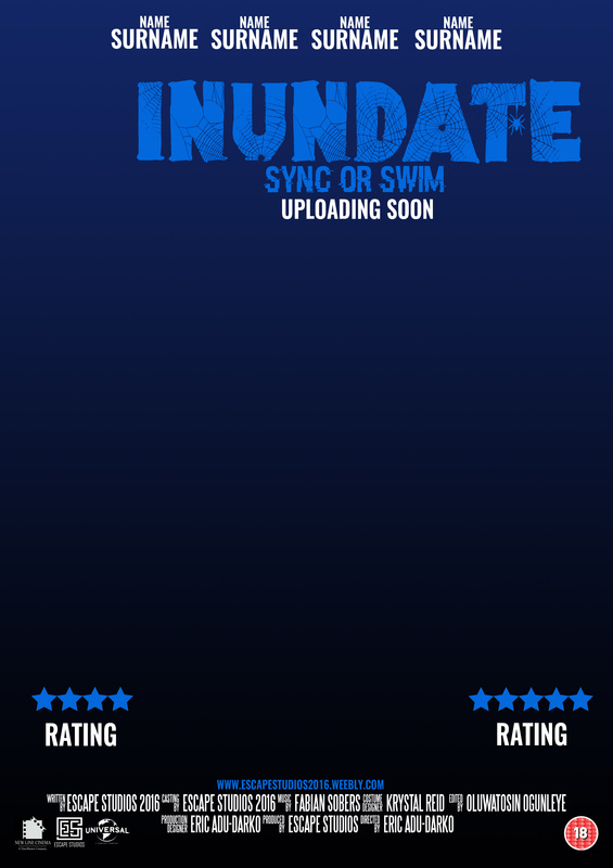
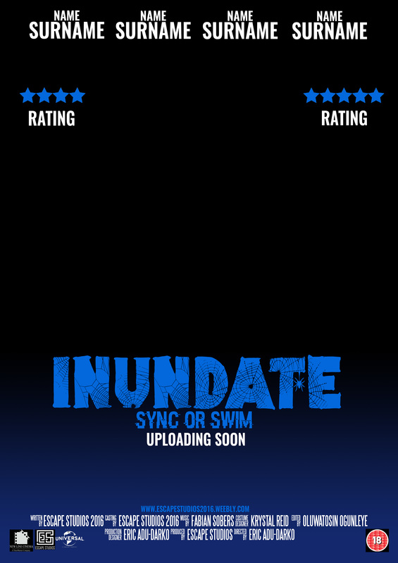
TYPOGRAPHY DRAFTS
We wanted to take our digital drafts even further so we designed some typography drafts. These contain most of the conventions that will be on our actual poster and we have written out most of what will be on there including the title and the credits. We also used some existing companies as a place holder until we design our own and replace them with our own companies.
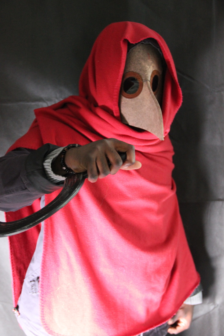
TEST SHOTS
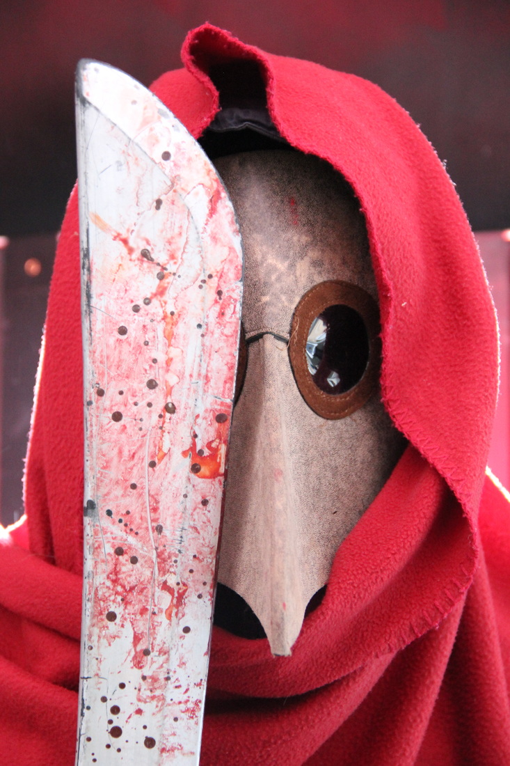
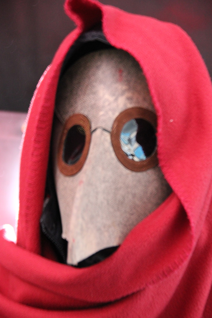
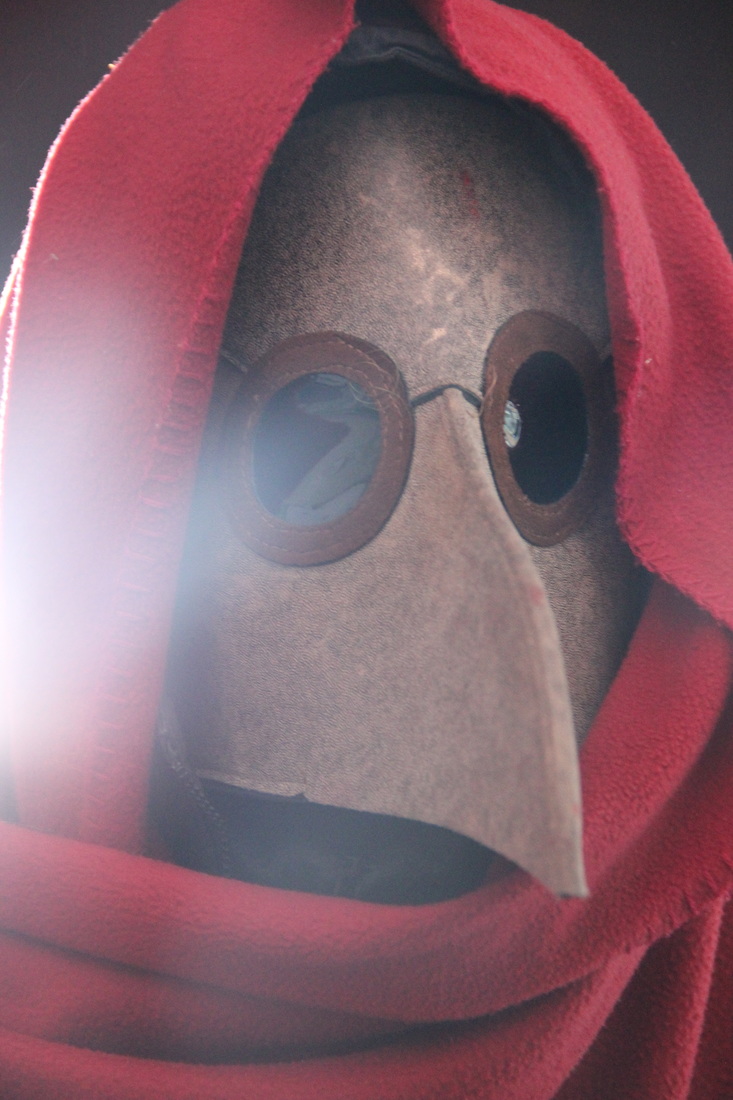
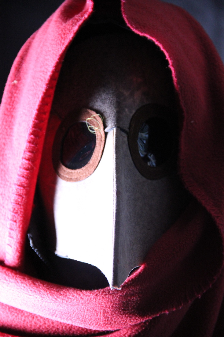
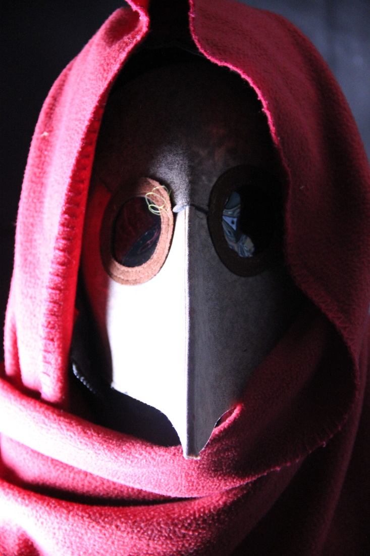
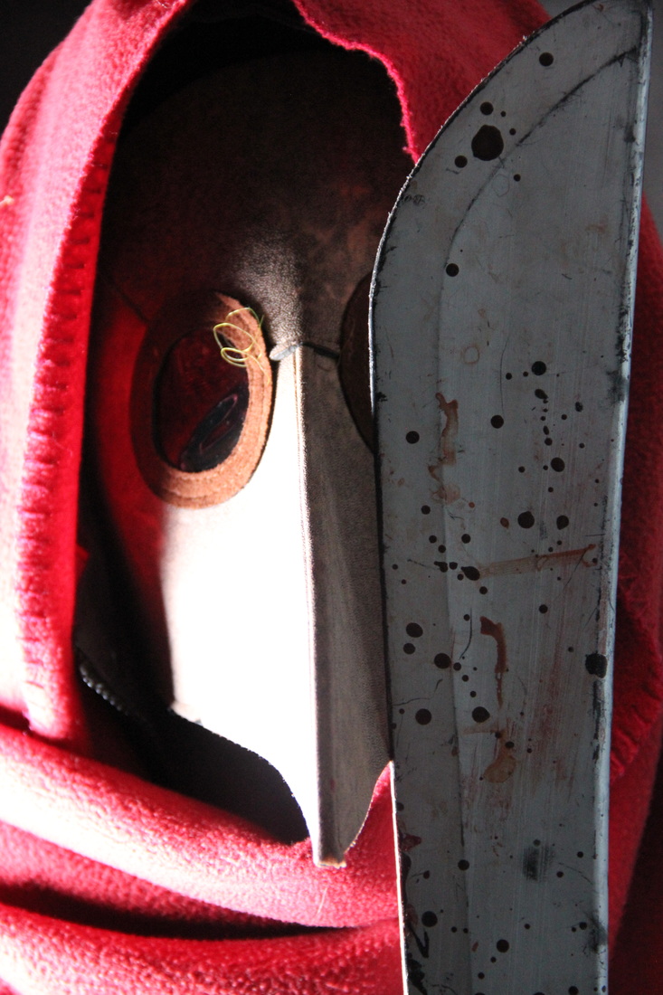
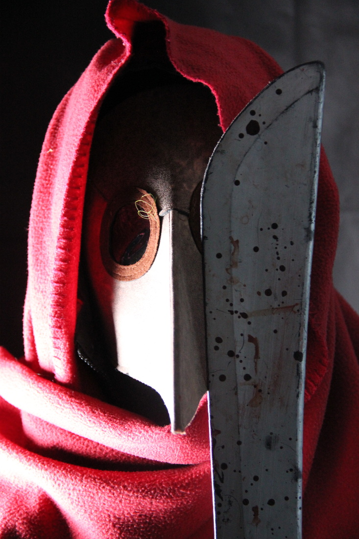
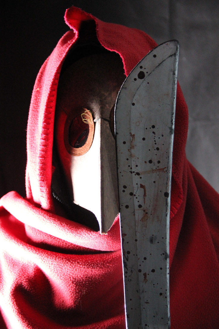
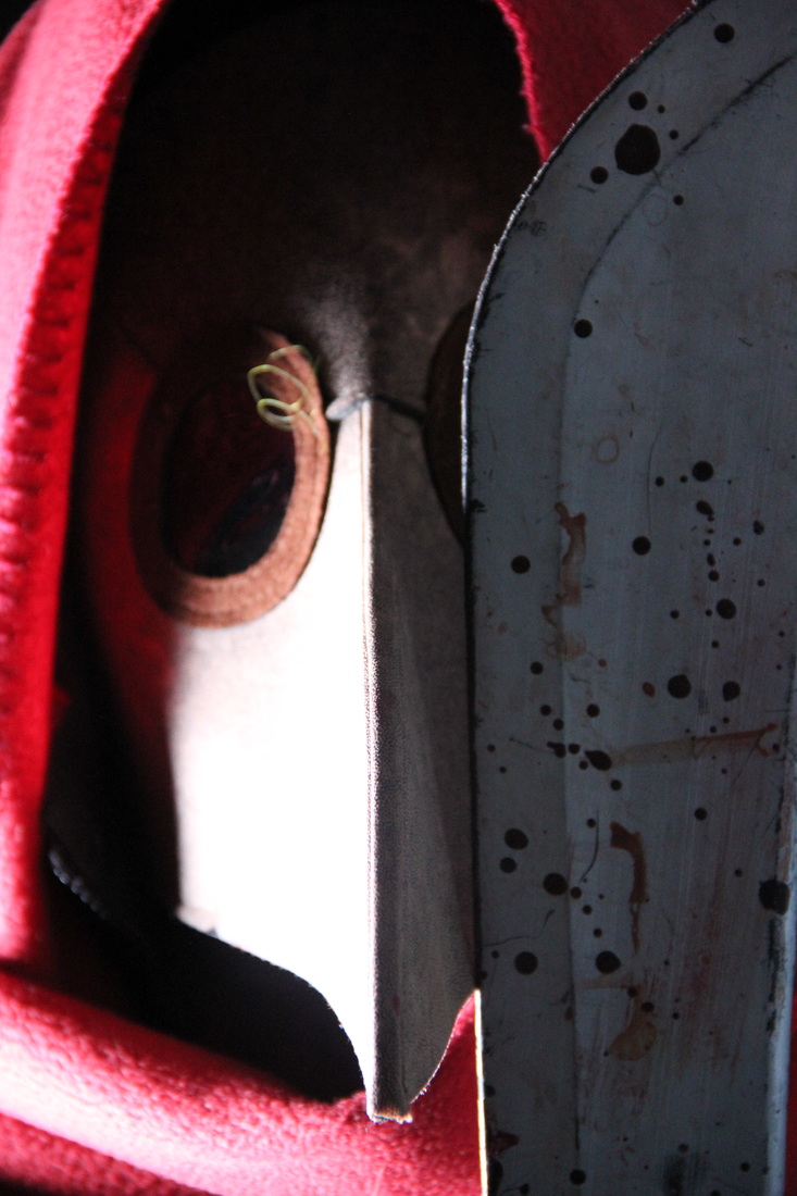
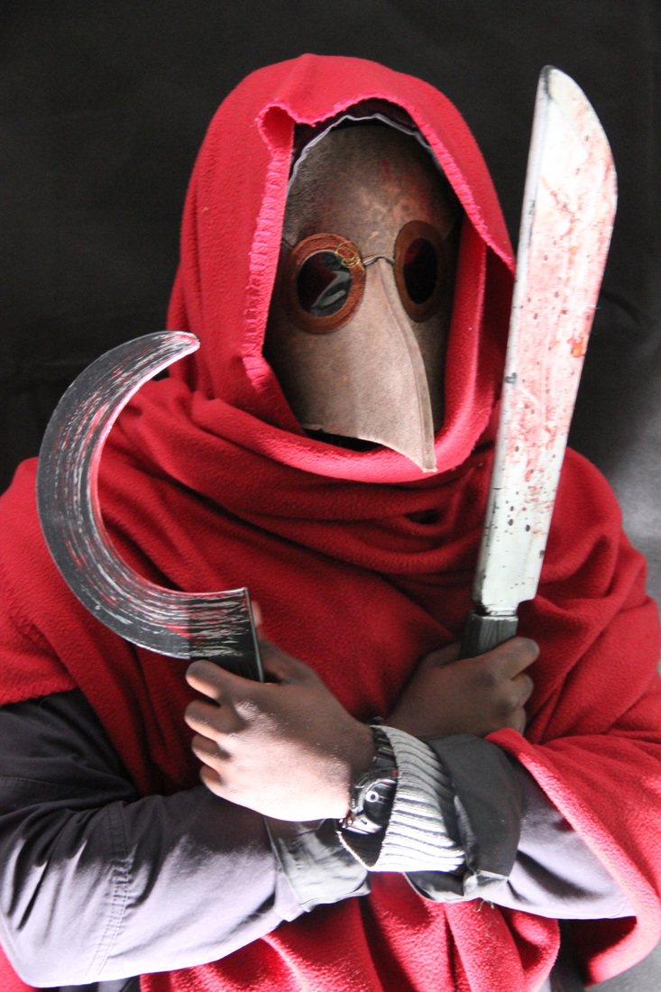
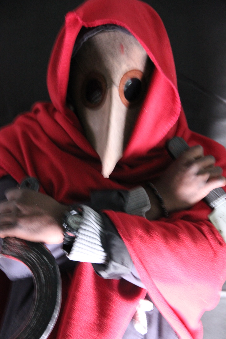
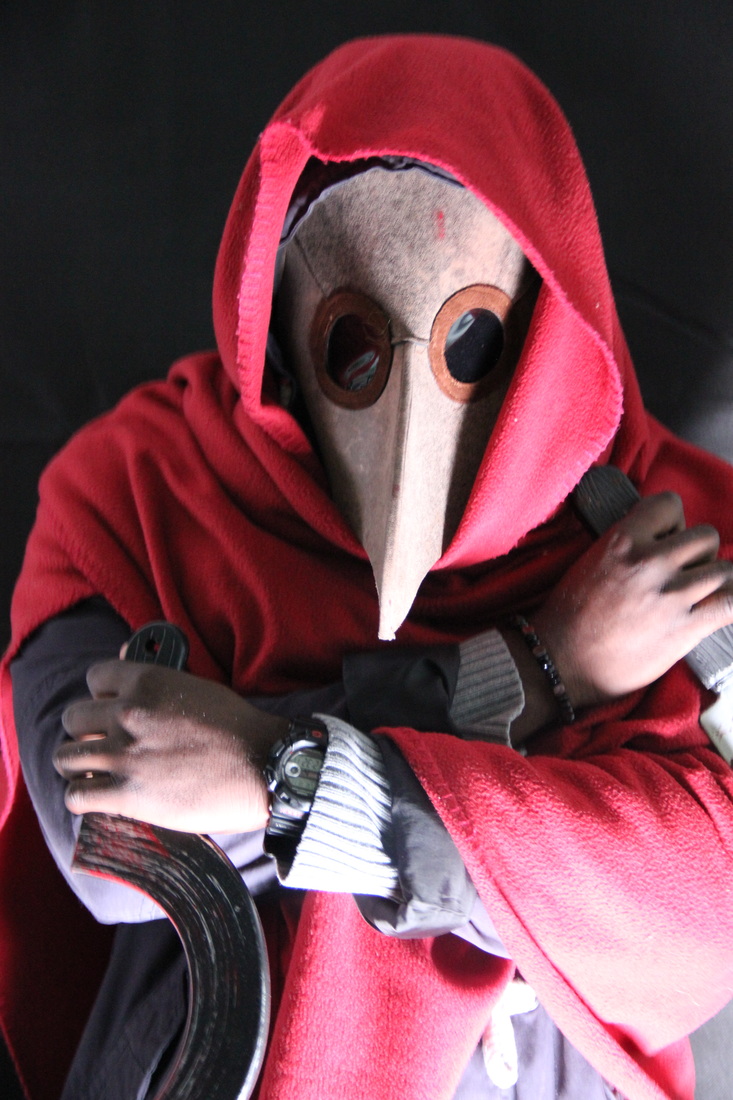
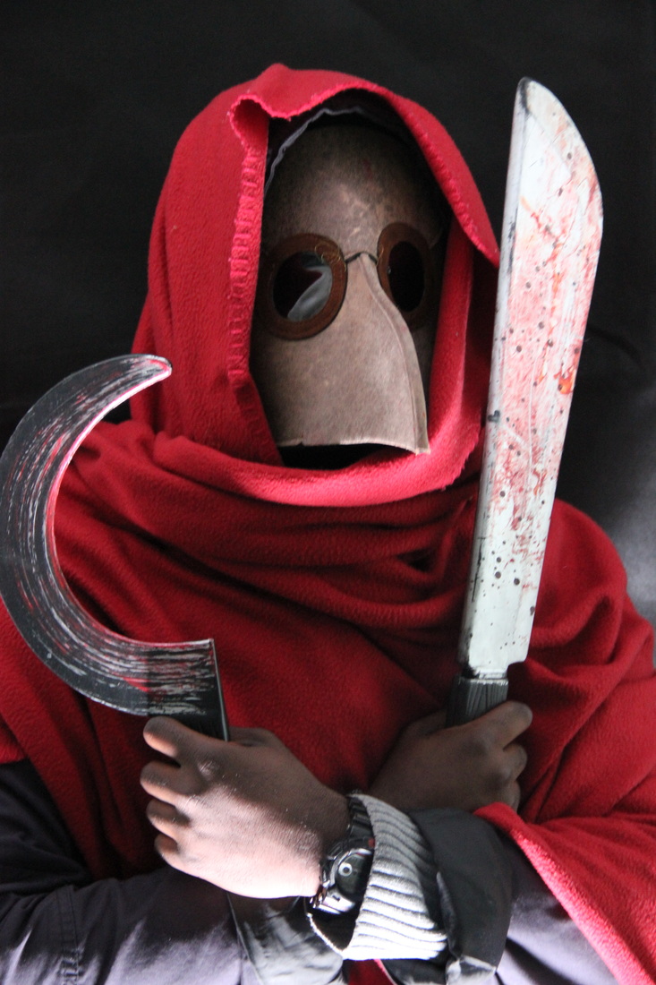
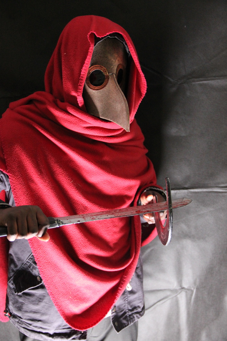
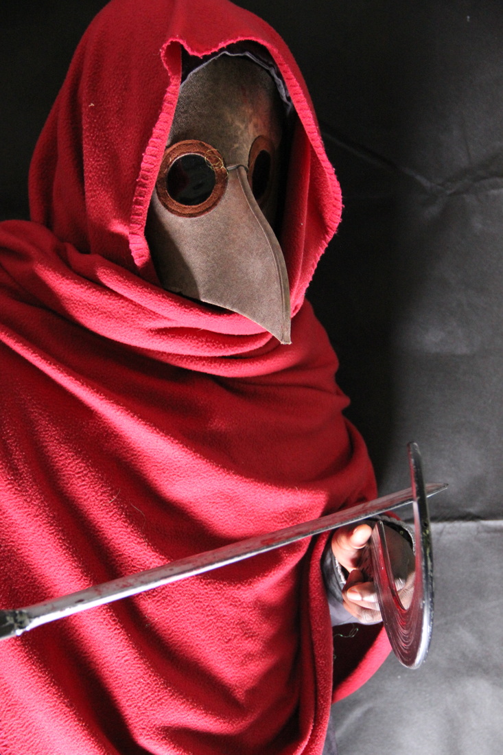
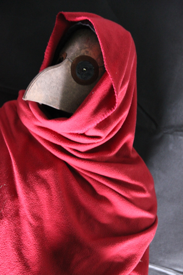
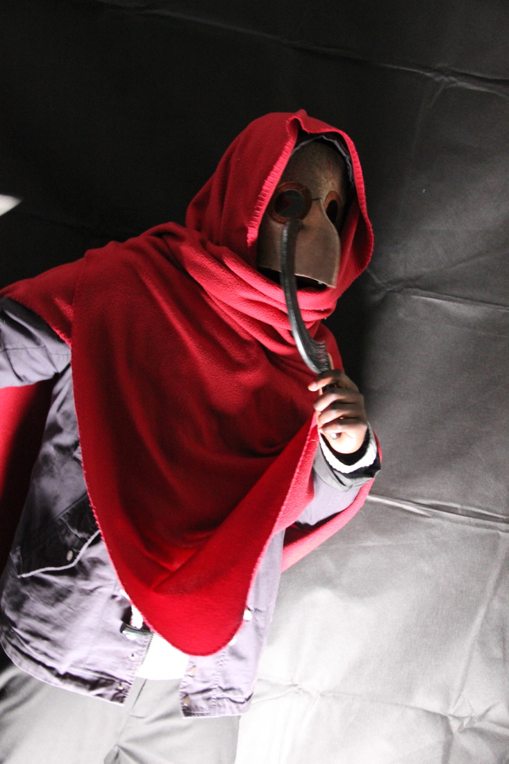
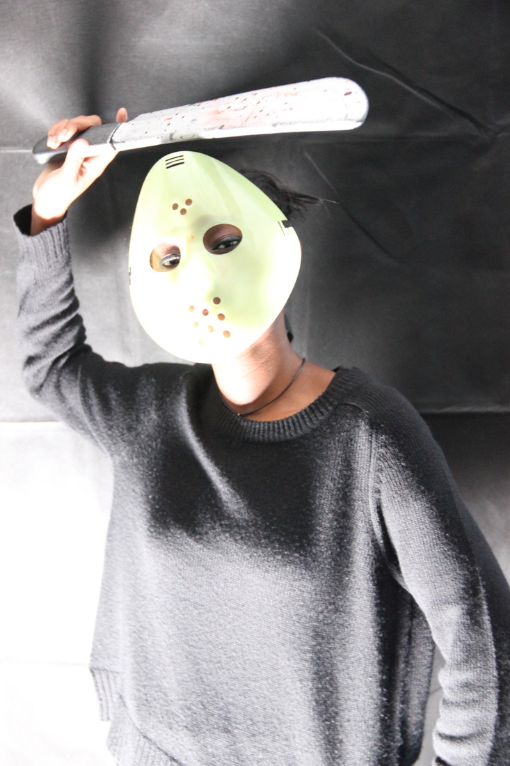
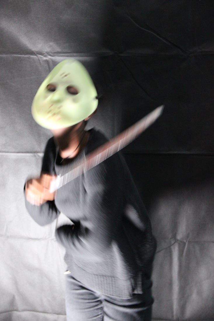
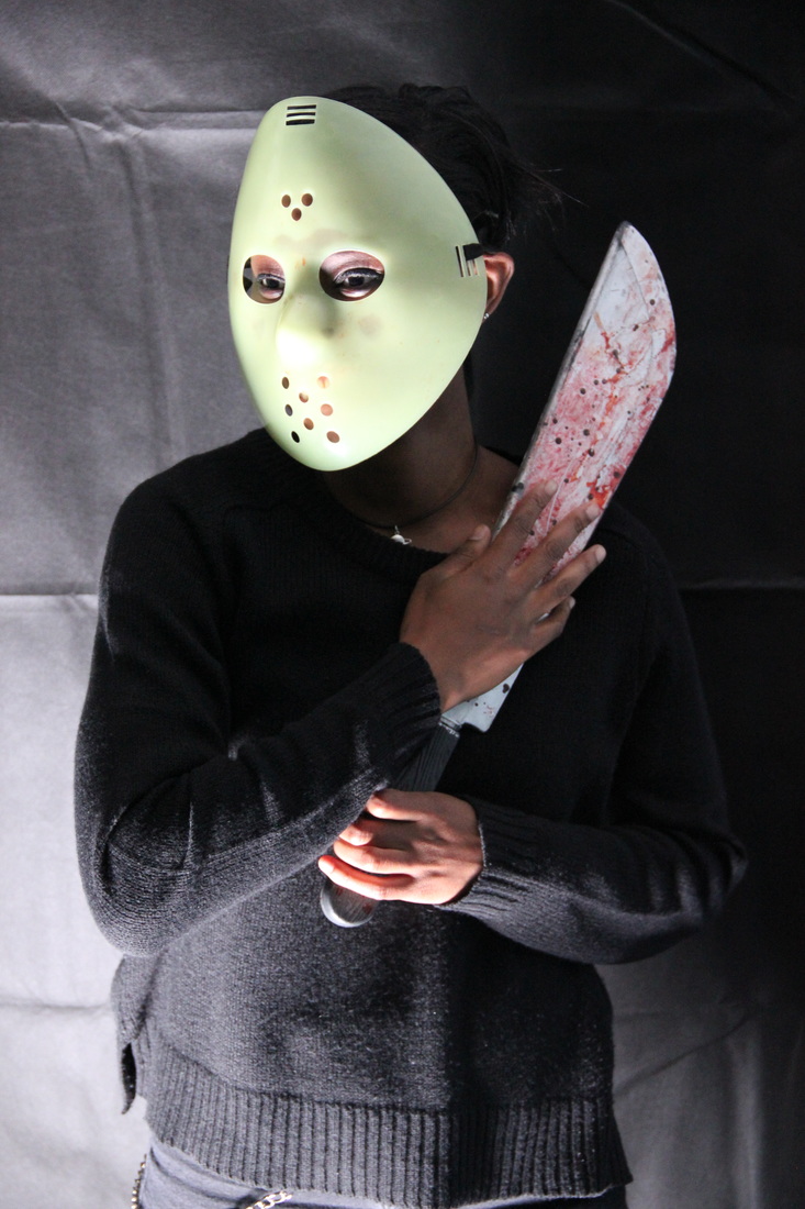
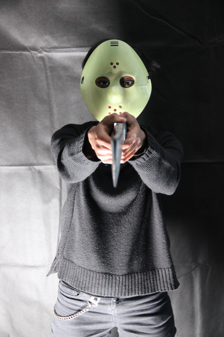
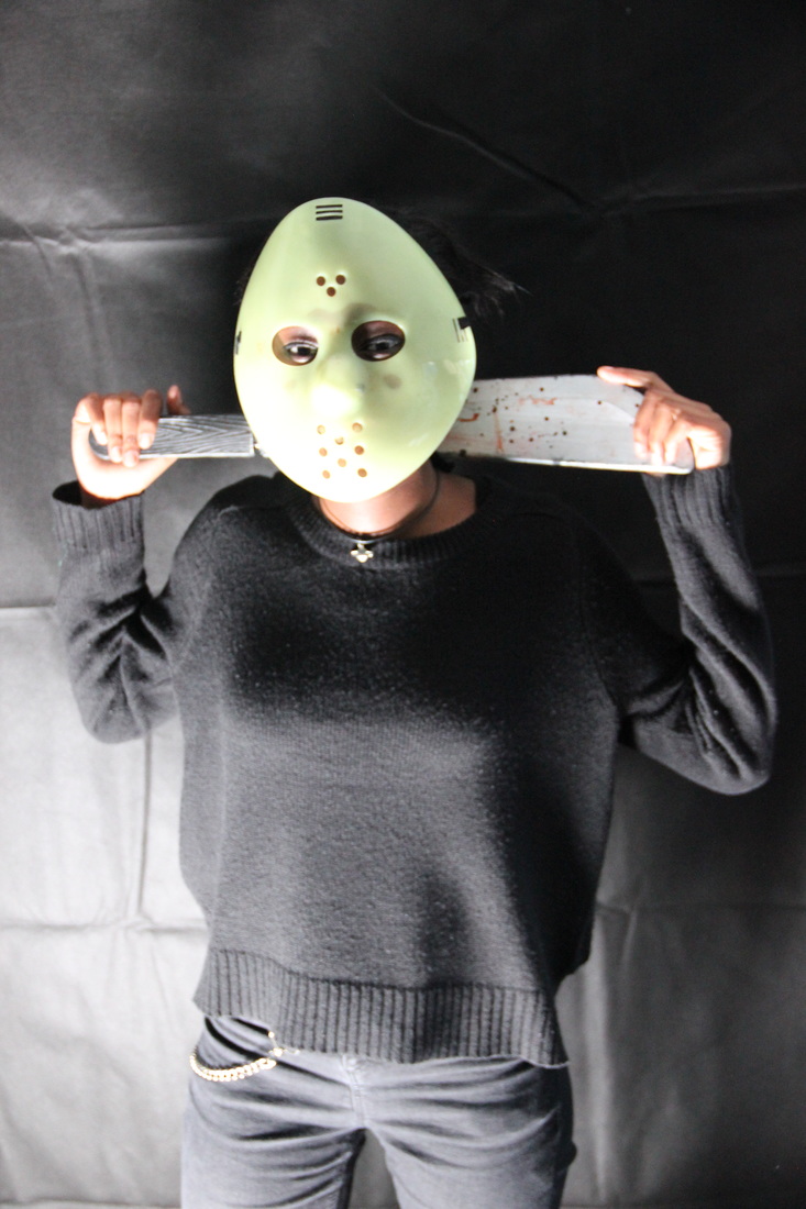
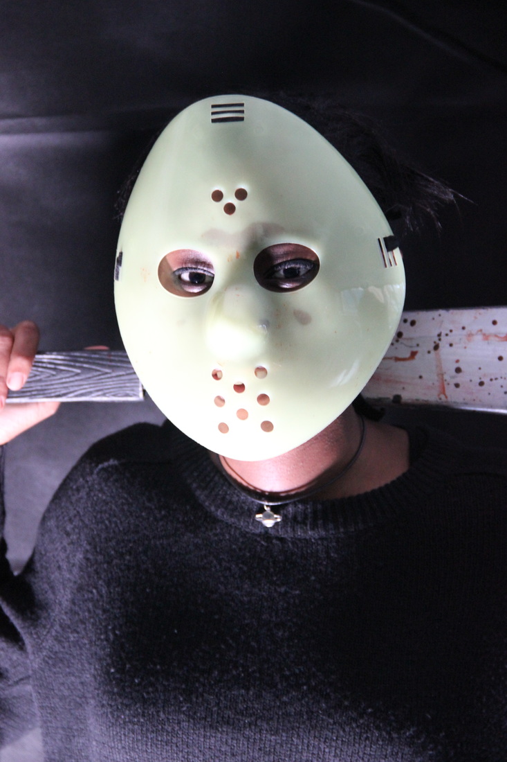
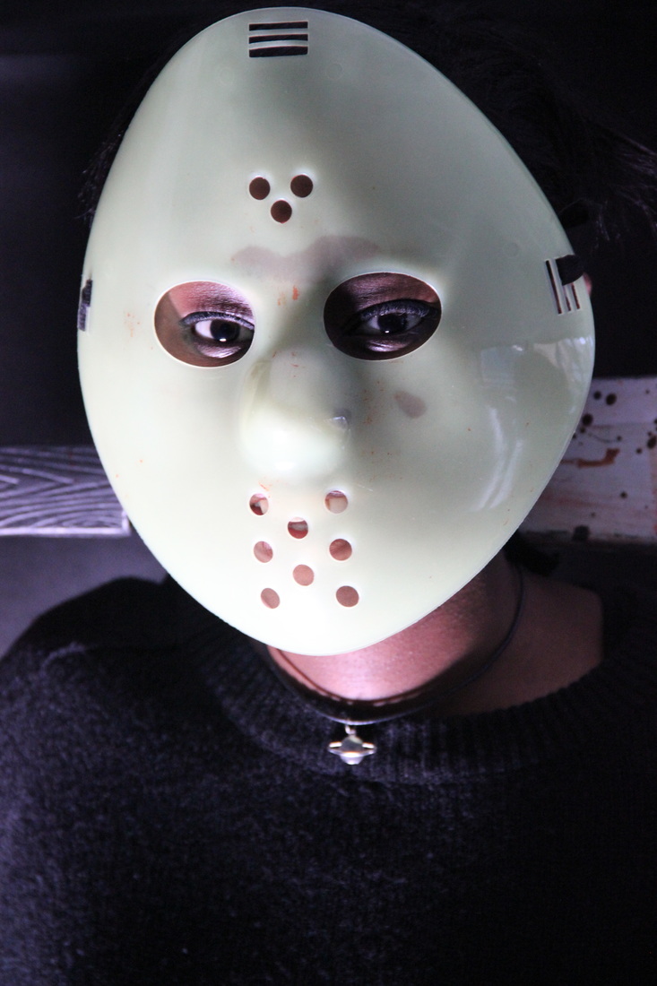
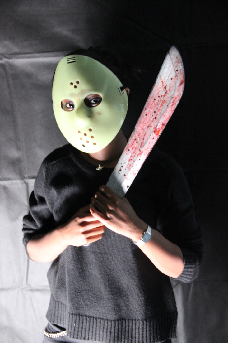
We decided to take some test shots for our poster. We decided that the best poses for our front cover would be either an extreme close up or a mid shot and both depicting the antagonist. This led us to coming up with two different poses of which our antagonist would change slightly and we would capture from various angles and with different lighting.
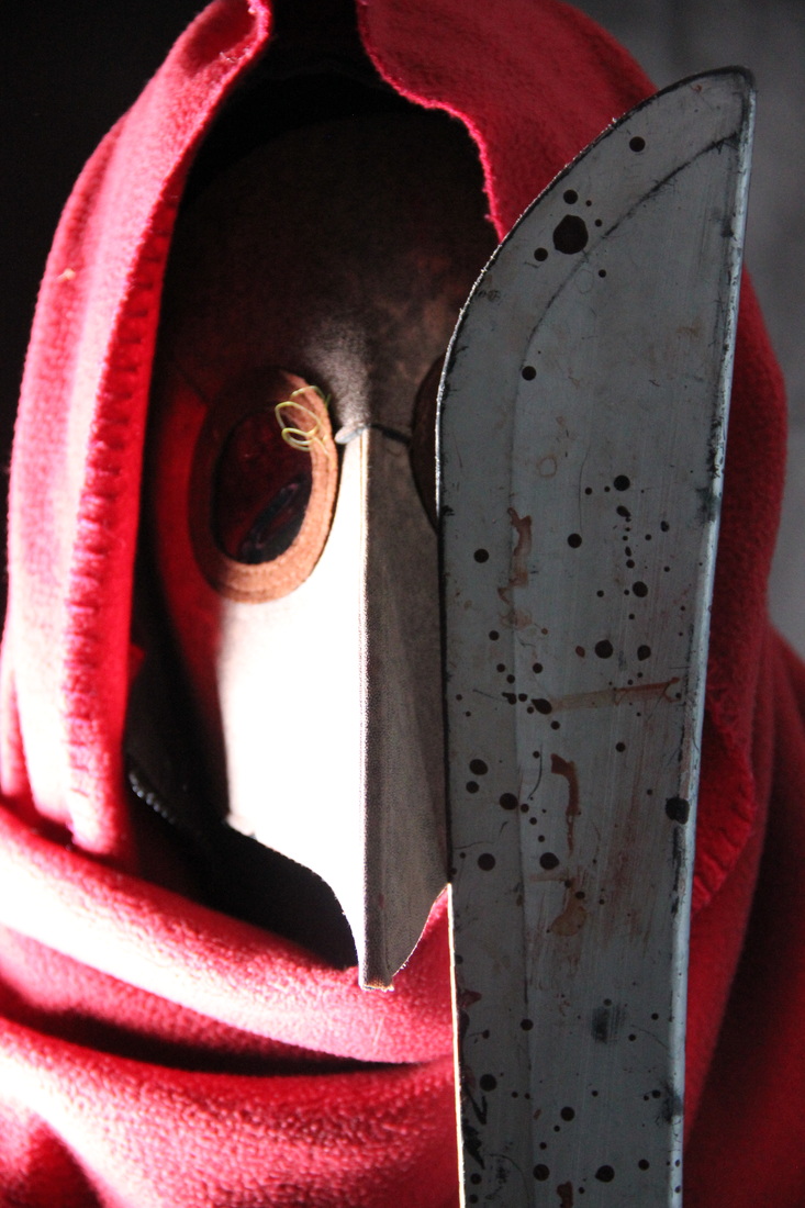
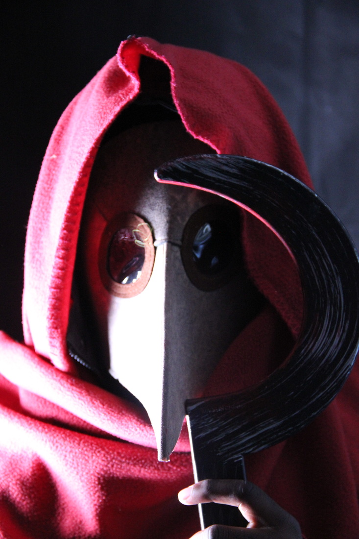
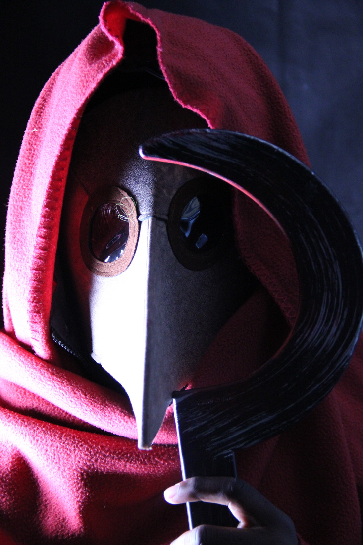
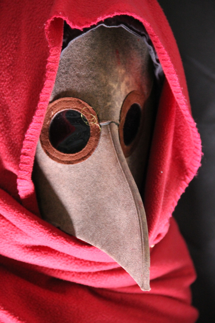
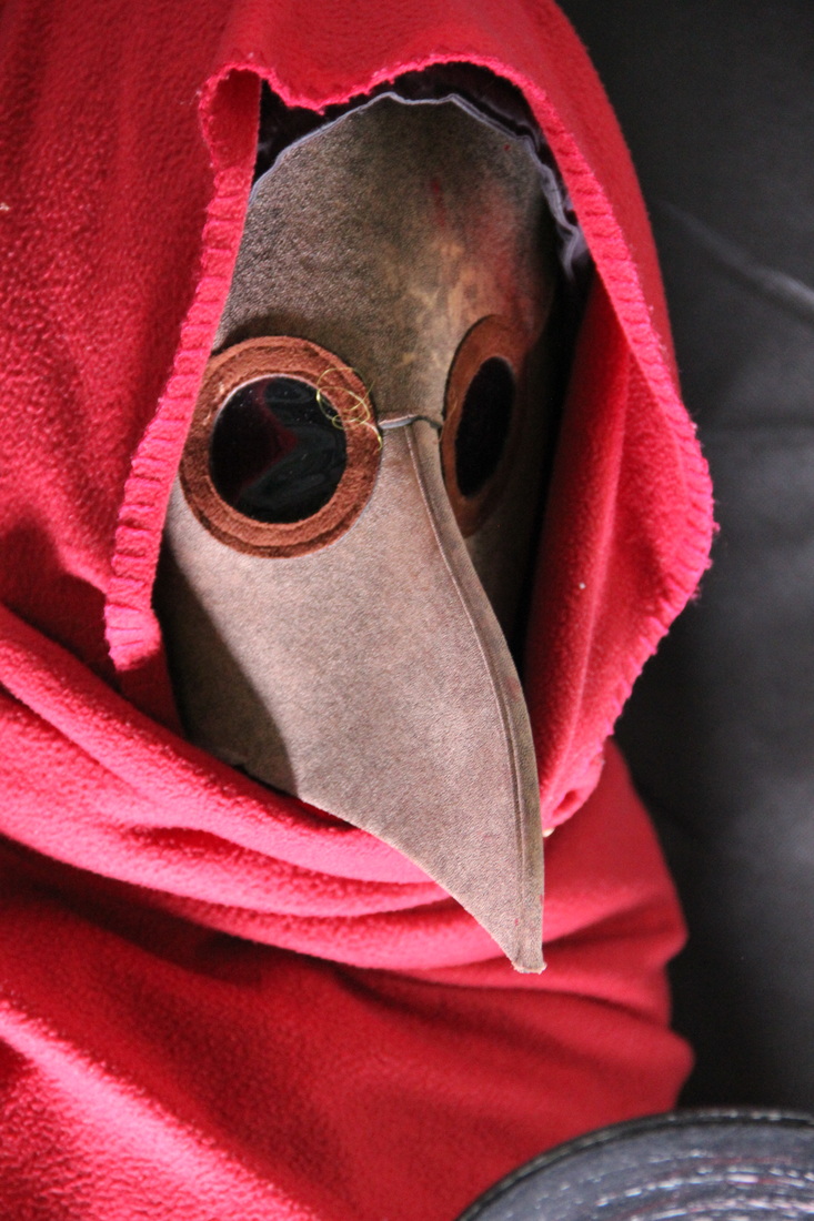
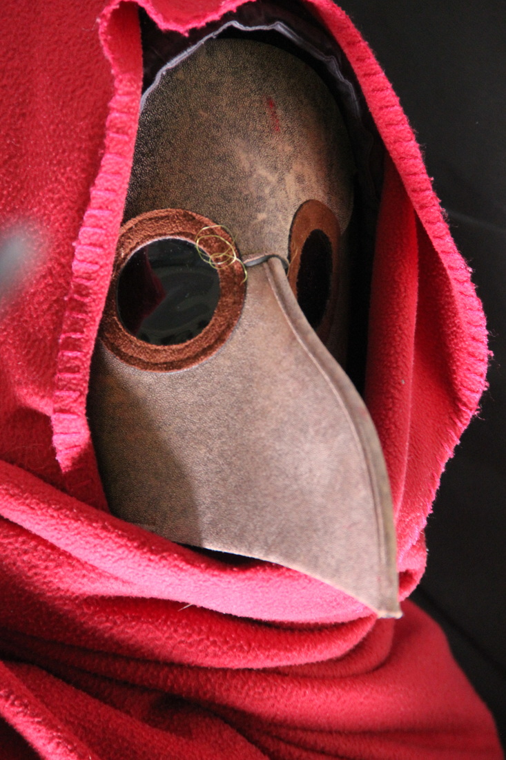
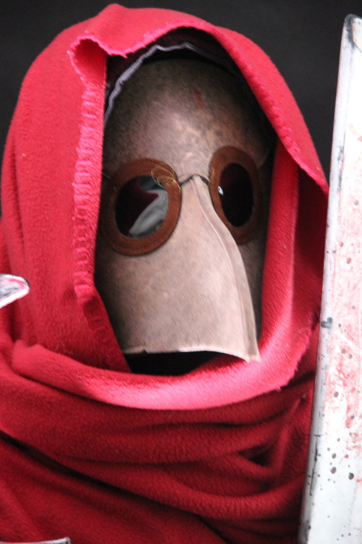
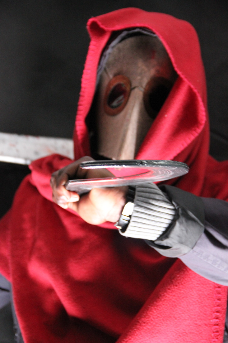
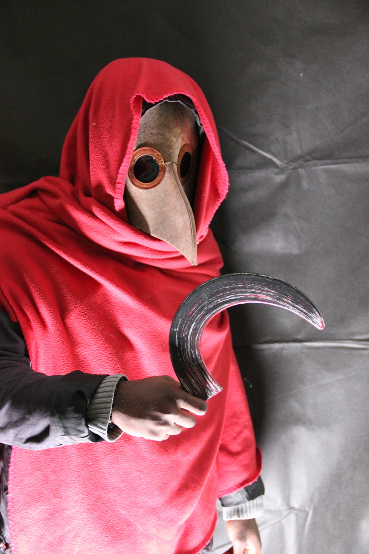
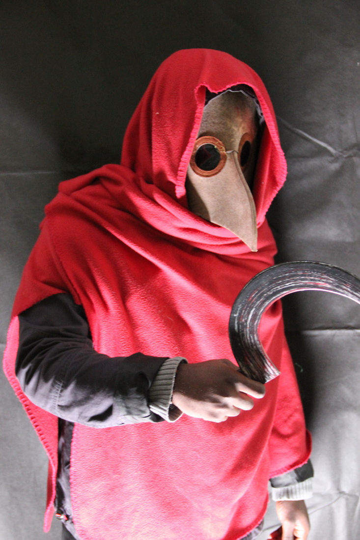
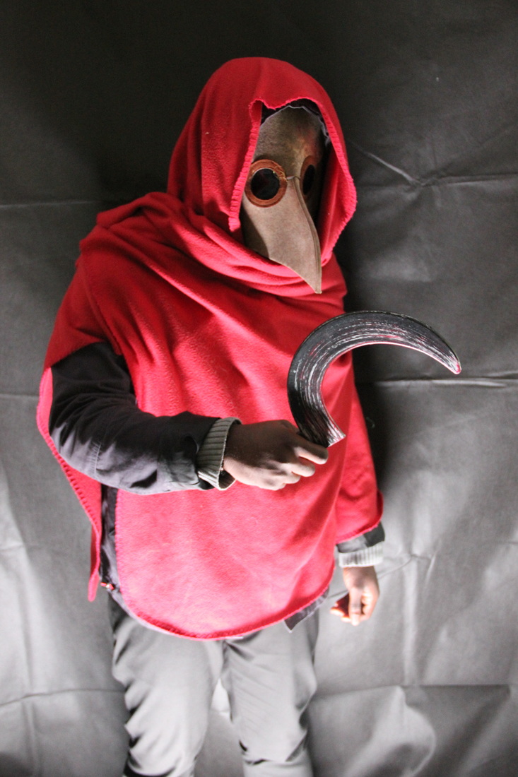
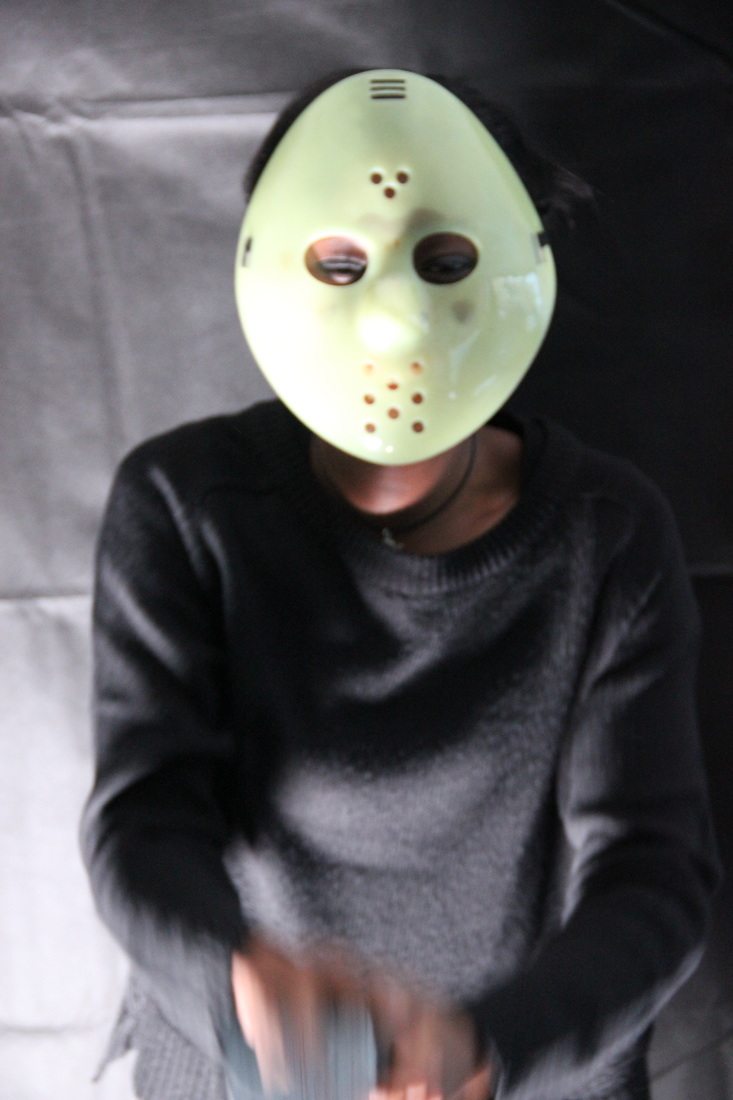
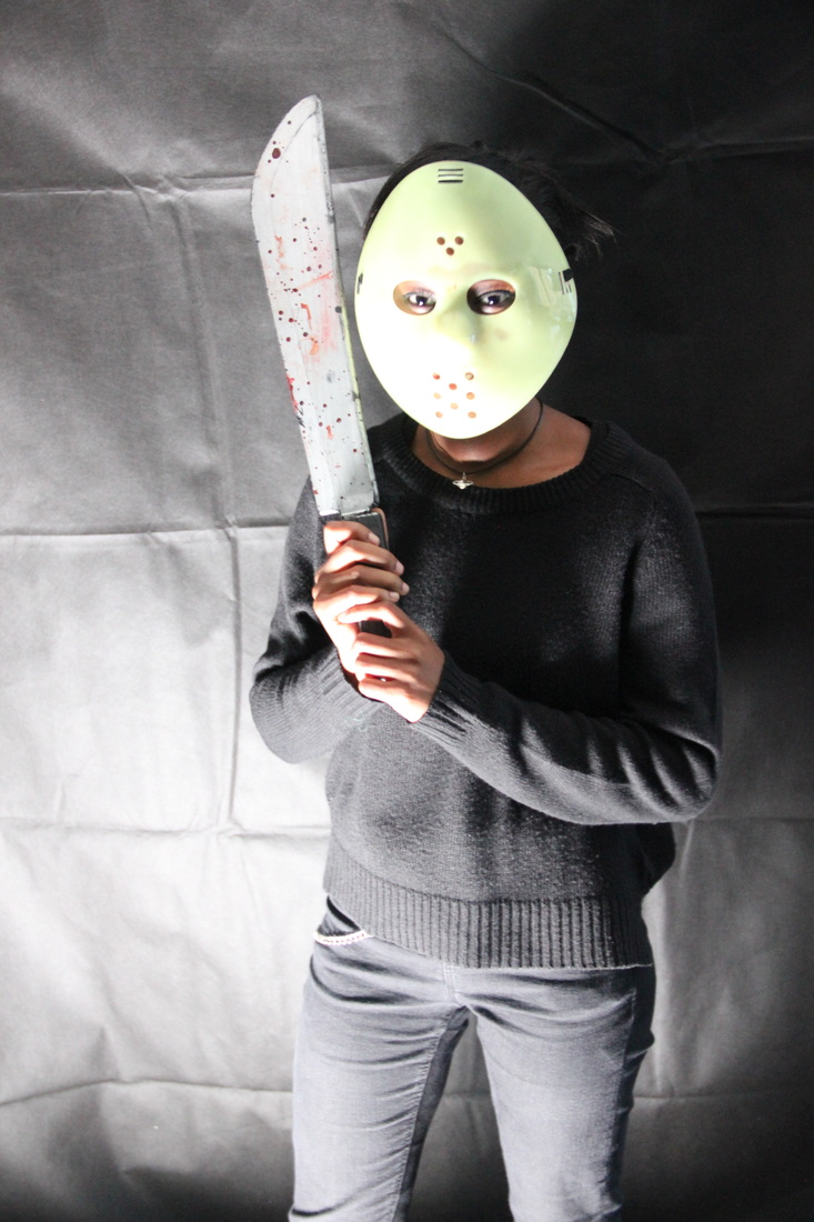
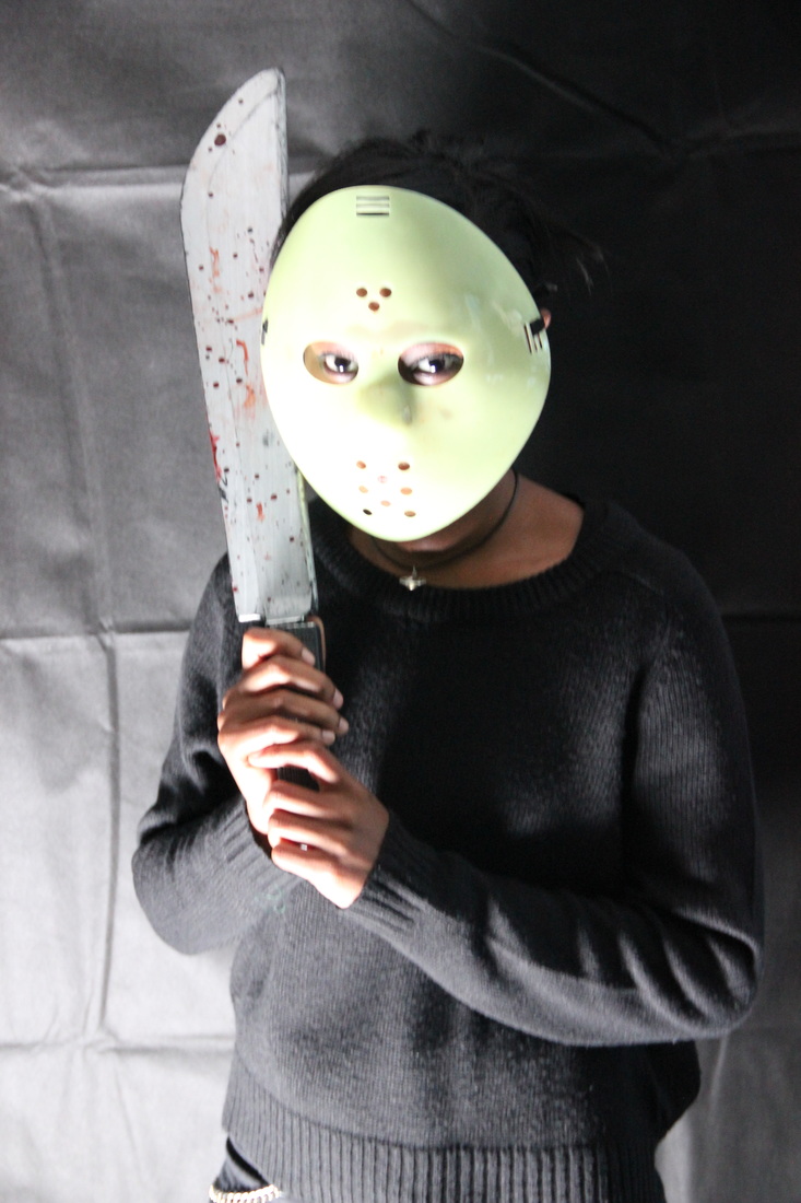
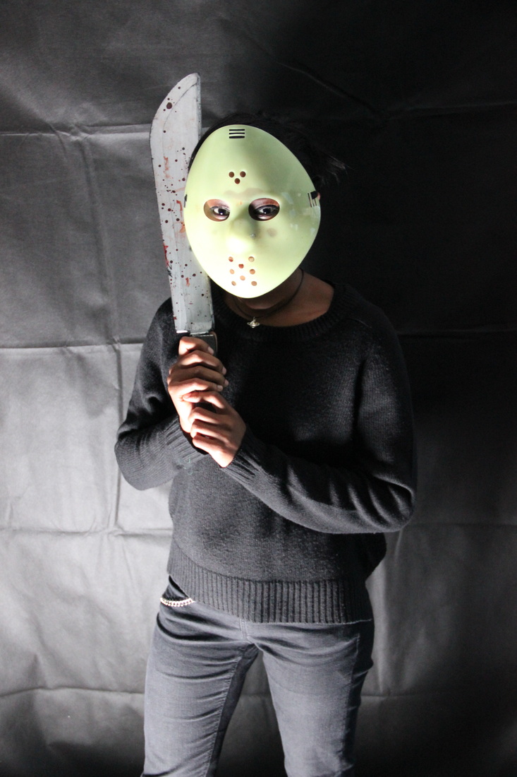
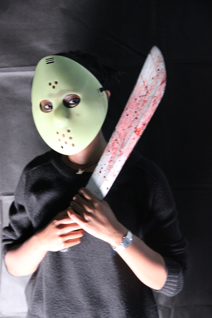
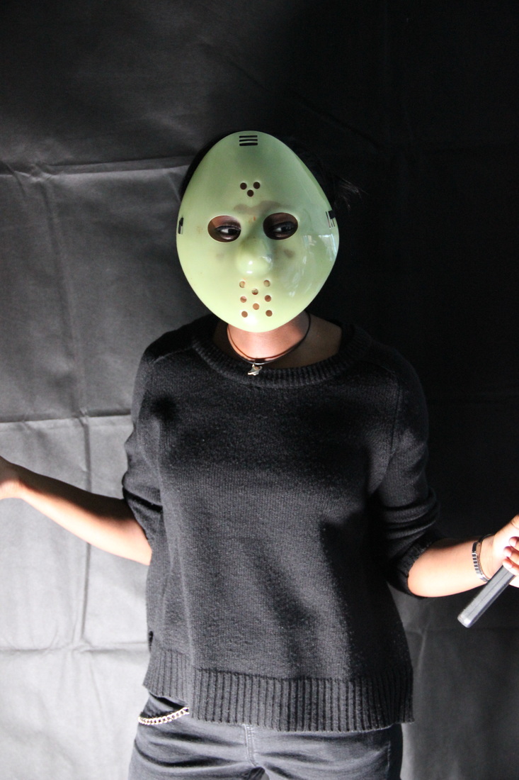
POSE #1 - Extreme Close-upWe chose an extreme close-up because we felt it best captures the antagonist's character while still keeping a good amount of the antagonist hidden. We also found that changing the direction of the lighting was very effective when placed at the side of the antagonist. When done correctly, it makes half of the antagonist's mask look lit up and the other half very dark. We also decided to try changing the shutter speed of the camera. We slowed it down a bit and made slight movements to try to capture motion blur. While doing this we also caught a sun flare-like effect which we thought was very interesting and mood it creates is quite intriguing. These techniques are very effective as they create a feeling of suspense as the antagonist looks very mysterious. When the weapon is implemented, it becomes more aggressive and sinister.
PHOTOS WE LIKE
PHOTOS WE DISLIKE
|
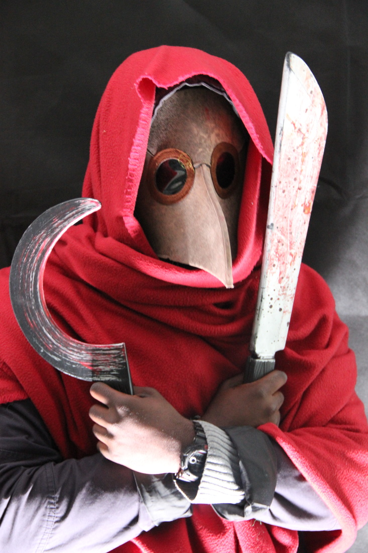
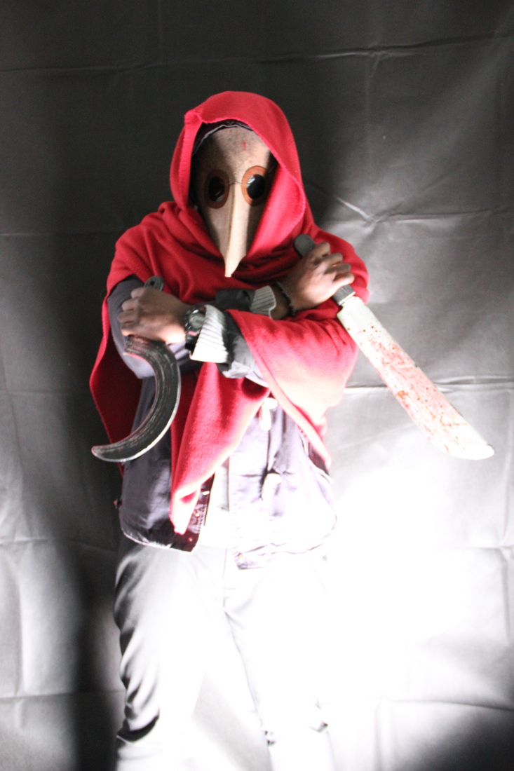
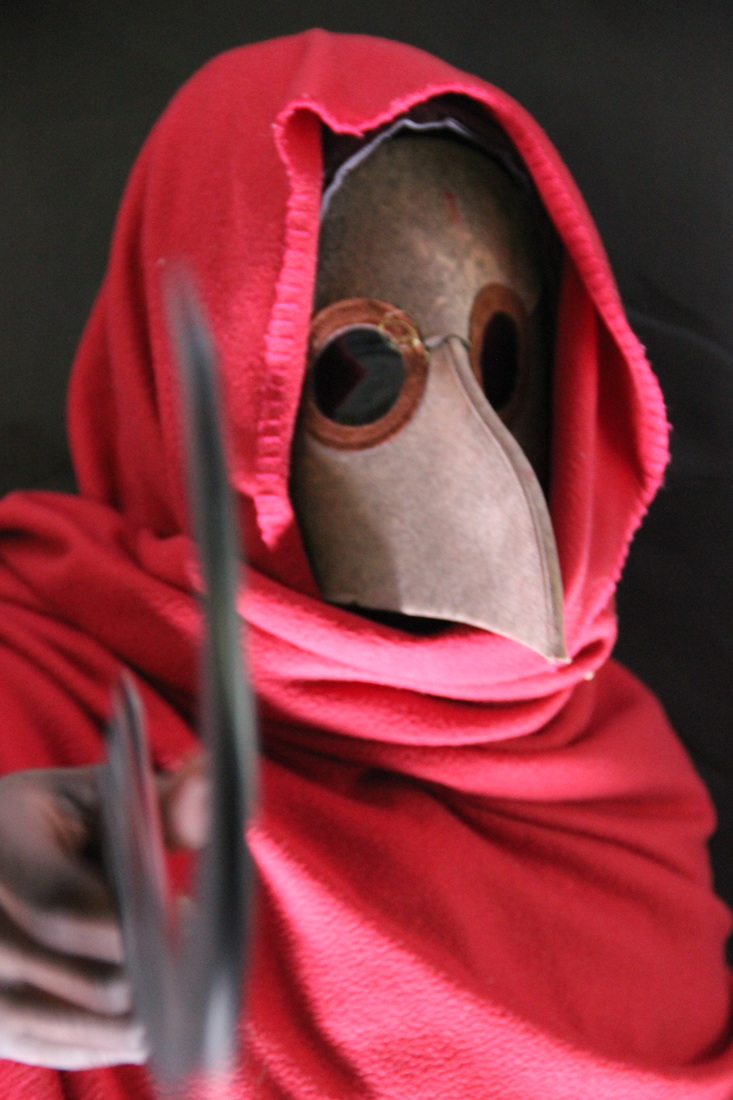
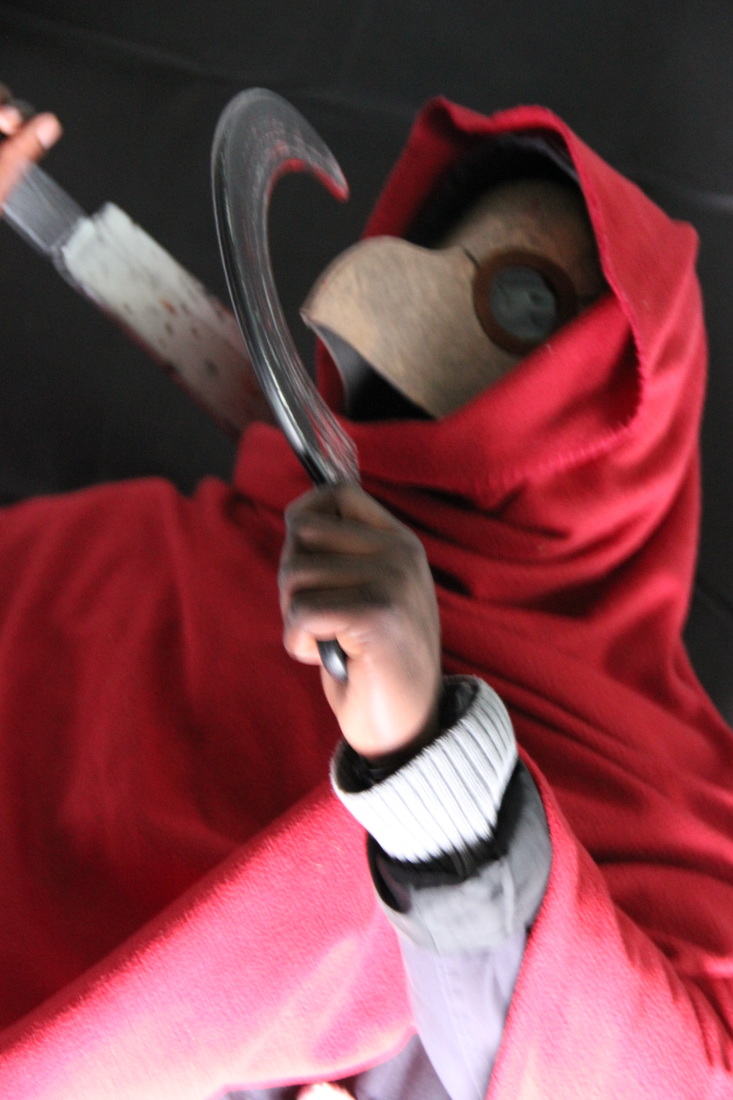
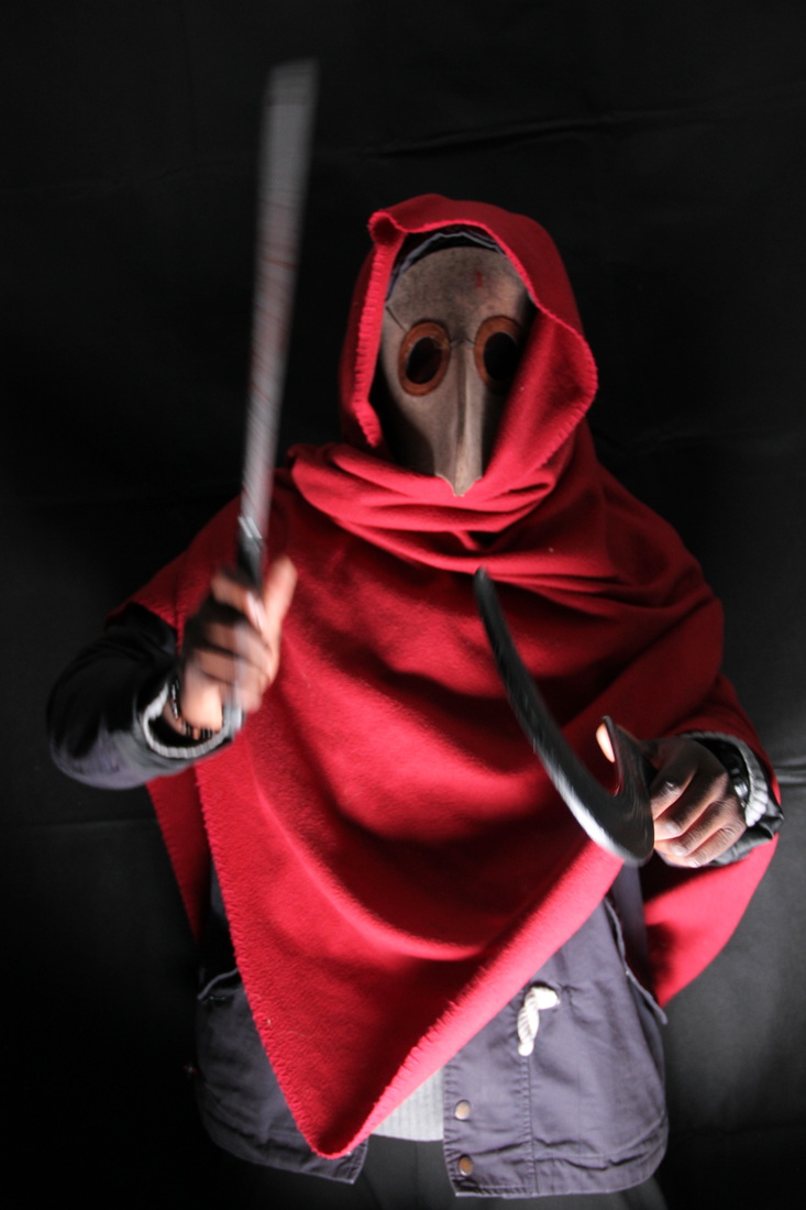
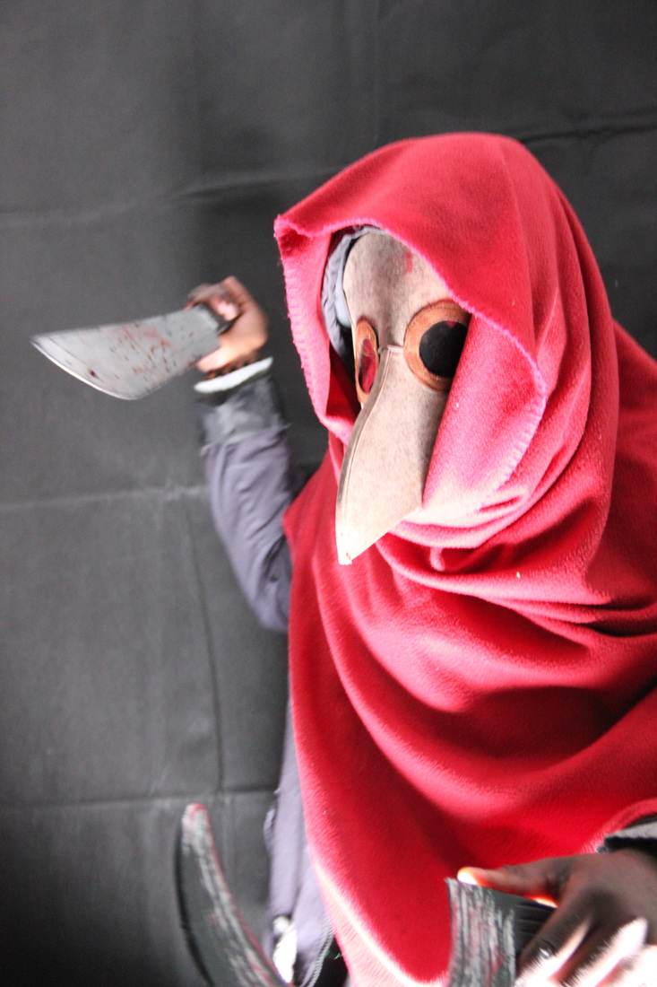
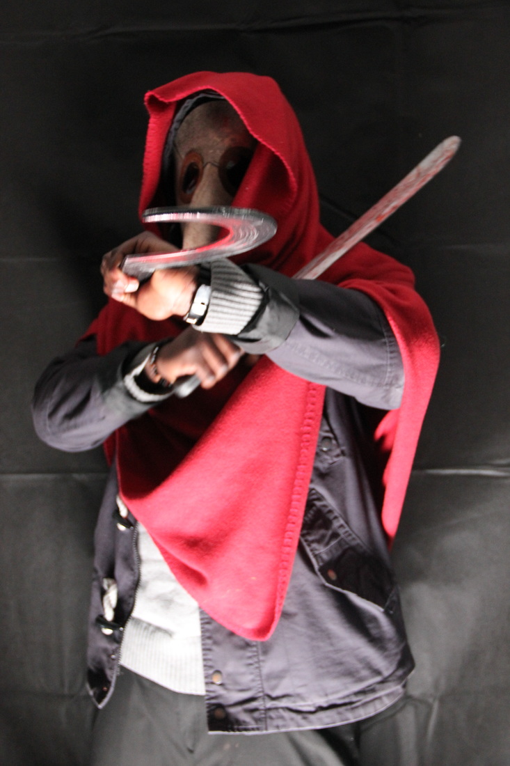
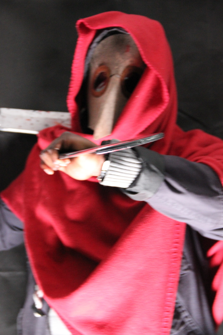
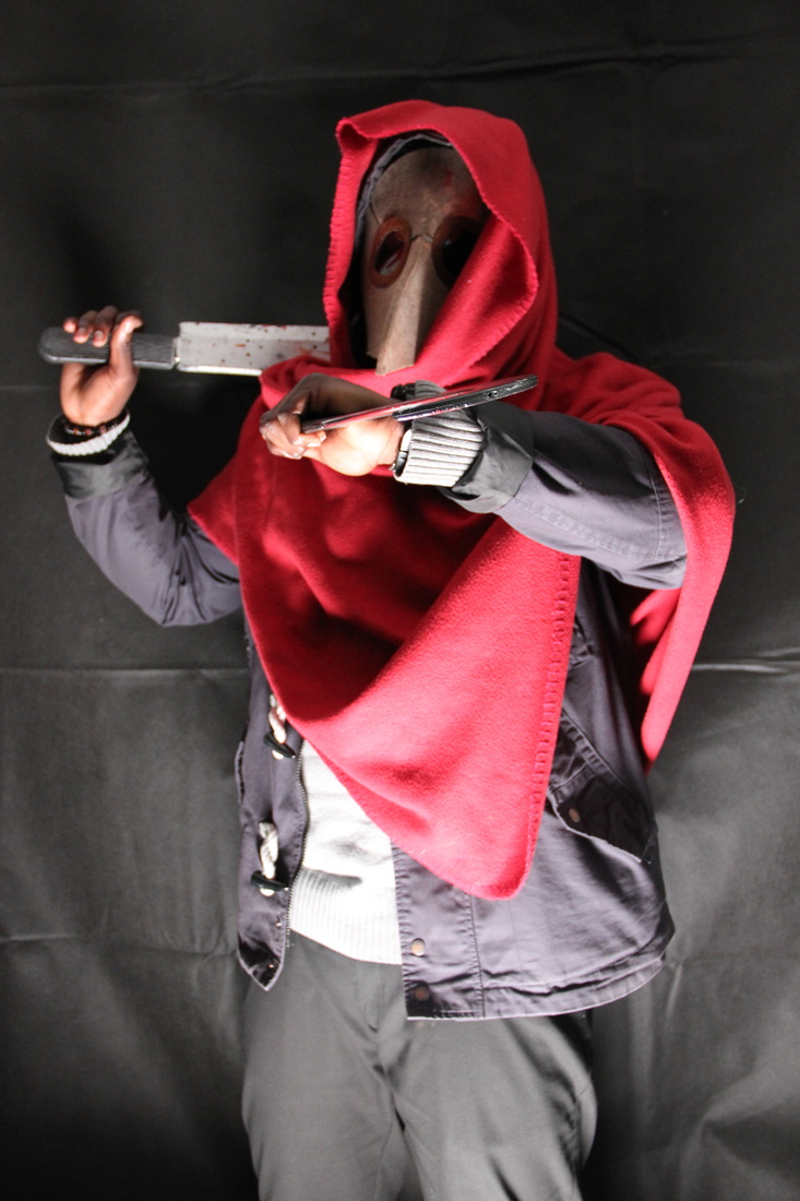
POSE #2 - Mid ShotWe decided to make our second pose a mid shot as it allows our antagonist to show more of themselves in terms of their weapons of choice and their costume. This gives the audience more insight into the antagonist and what they can expect to see from the movie. For these shots, we also decided to manipulate lighting to give us the ability to play with the shadows that will be created. We put the light in front of the antagonist but below them so it shone upwards onto their mask. We did this to create a shadow on the character's mask with their hood. We also tried slowing down the shutter speed to make capture motion blur. This works well if we were to add a glitch-like effect to the image and distort it further.
PHOTOS WE LIKE
PHOTOS WE DISLIKE
|


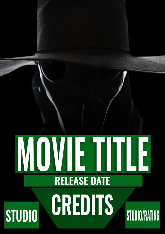
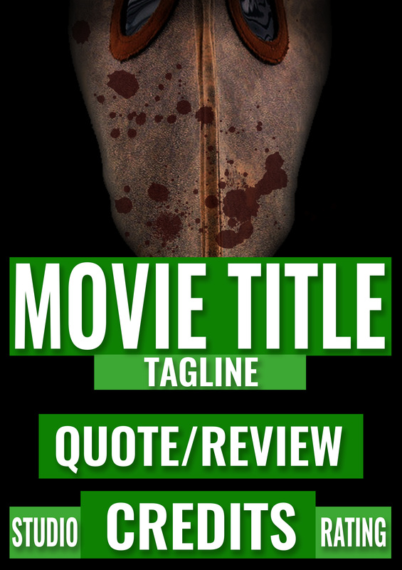
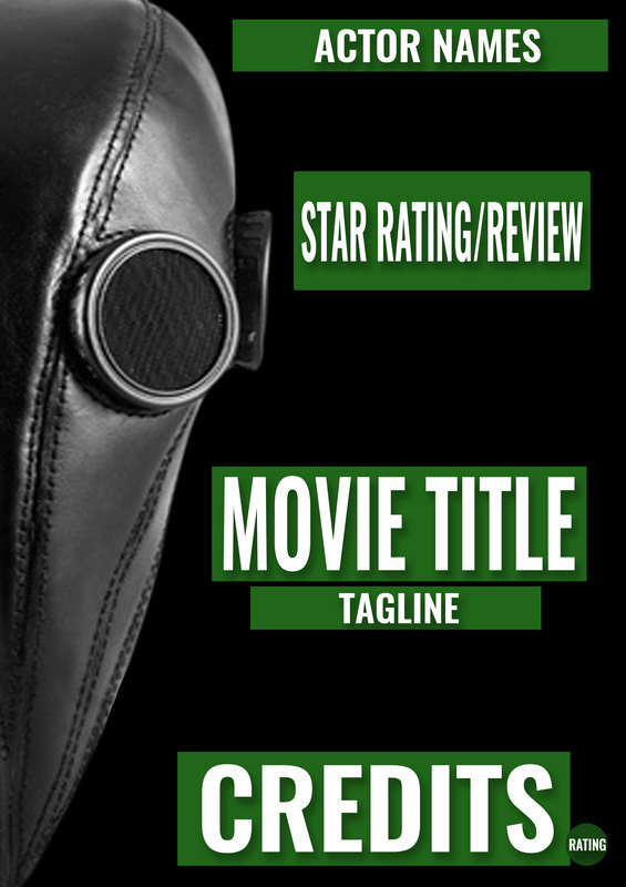
FINAL DRAFTS
After we created our typography drafts, we decided to try putting one of our test shots into the draft to simulate what our final poster would look like. Since we had two different poses, we made two final drafts using one of our favourite images from each pose.
POSE #1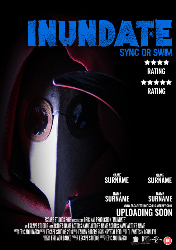
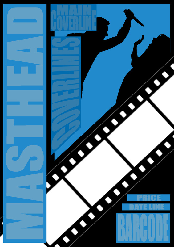
For this draft, we used the close up of our antagonist and chose one of the best poster layouts for the photo. We decided that it would look interesting if the antagonist slowly faded out into the black background. Personally, I am very fond of this draft as the lighting used on the antagonist's mask is perfect as it also highlights their weapon even if only a little bit.
|
POSE #2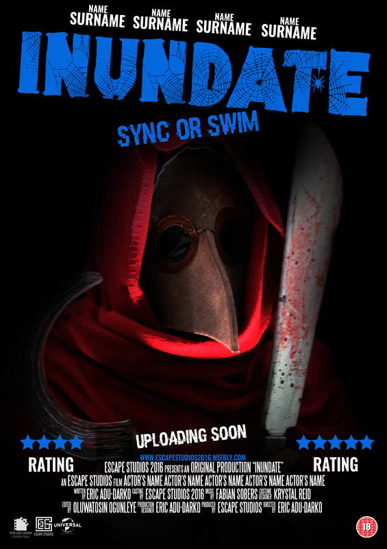
We used the mid-shot pose for this draft as it gave us the opportunity to use a layout that wouldn't work very well if the image was a close up. By this we mean we were able to us a draft that was as heavy with font at the top as it is at the bottom. My favourite thing about this draft is the flow and well distributed weight in terms of the typography and image placement.
|
MAGAZINE FRONT COVER RESEARCH
REAL MEDIA TEXTS
In this section you'll find our research into existing horror magazines and the things we find most interesting about them. These is important as it gives us ideas for the different things we can do on our magazine to make it better.
The layout of the coverlines is what attracted us to this magazine cover. Instead of having the coverlines laid out around the main image on the cover, this magazine instead kept them all to one side which make the magazine look different from others. We like this idea and think it would be effective to implement this kind of layout on our magazine front cover.
|
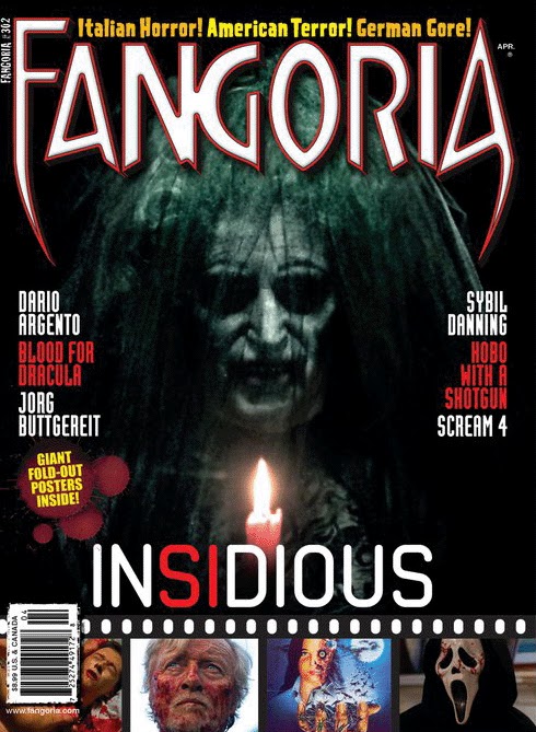
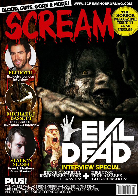
This magazine's use of a film reel depicting images from other horror movies drew us to this magazine. The use of this makes it immediately clear that this is a magazine pertaining to movies and the main image tells us that the genre of said movies is horror. This makes it very clear to the viewer what this magazine is which we feel makes this magazine effective.
|
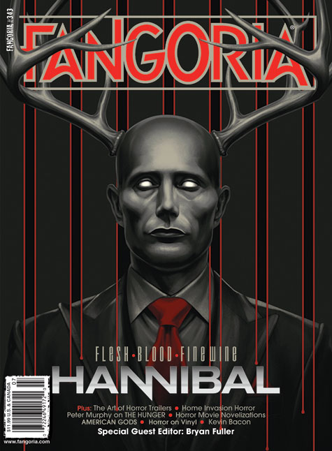
We like this poster because of the way the main image has been edited. Originally, it was just a photo of the actor but through editing, it has become an eerie creature complete with antlers and wide, vacant eyes.
|
We like this magazine a lot because of the colour scheme that is used.; The contrast between the main image and the masthead's colours is interesting and helps catch the readers attention.
|
We chose this magazine cover because we are very fond of the art style that is being exhibited on the main image. The character depicted looks like that of a cartoon which is something you don't see often in horror magazines.
|
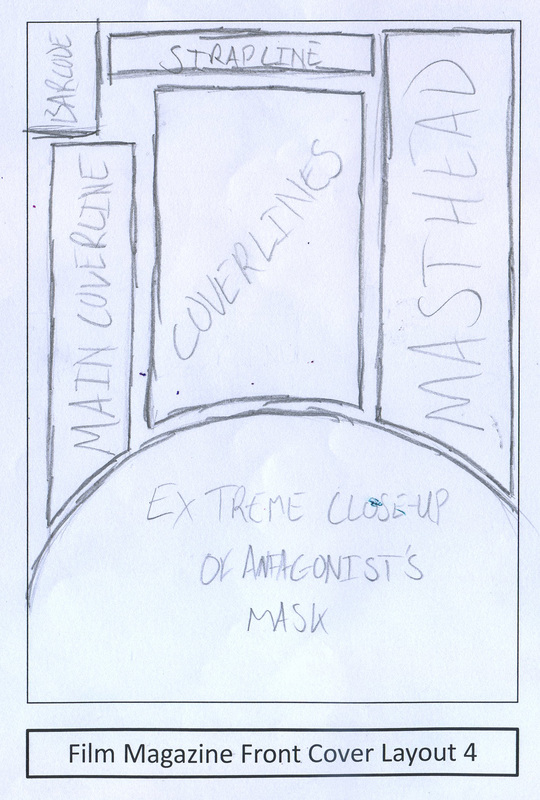
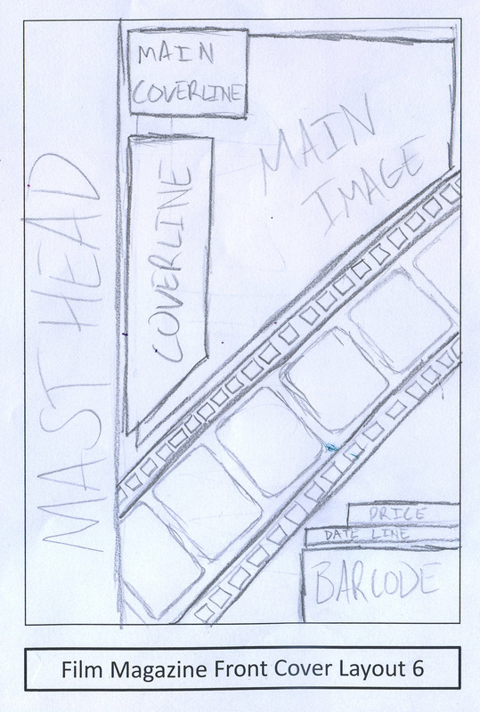
DRAWN DRAFTS
These are the drafts that we have designed aid us in deciding on our final horror magazine front cover
|
|
DIGITAL DRAFTS
These are the digital drafts we created based on our drawn drafts. These function as a more accurate layout of how our ideas for our magazine cover will look.
|
|
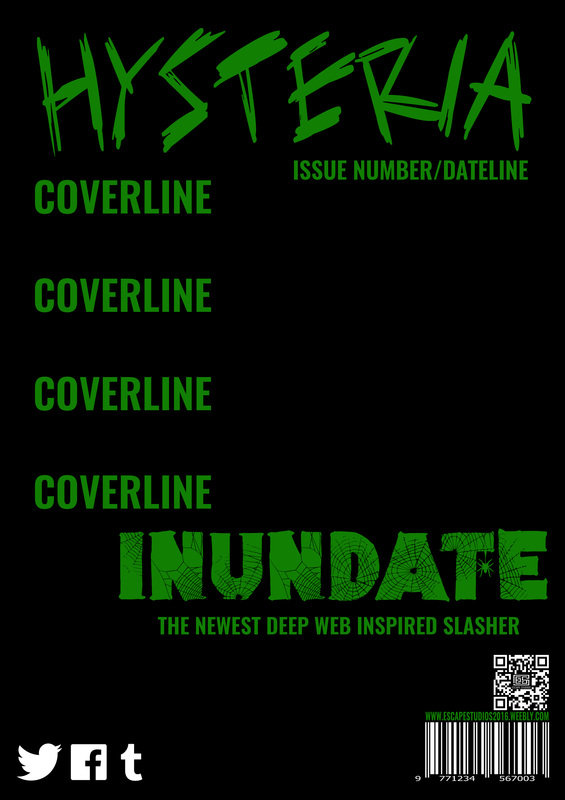
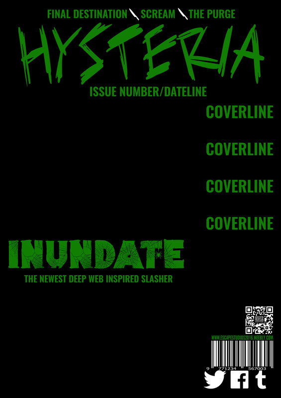
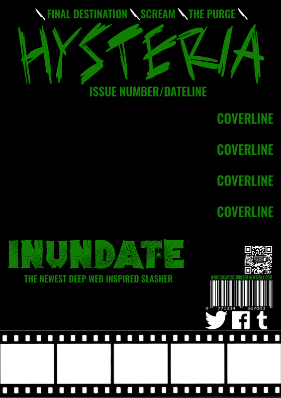
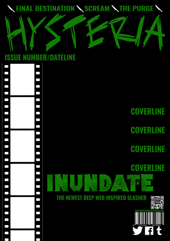
TYPOGRAPHY DRAFTS
Here we have created some drafts that include the typography that we will be using on our final magazine. We have however left out the coverlines as we are still deciding which coverlines would be best for our magazine. Most of the coverlines include a film strip as we very much like the idea of having one on our magazine to hold all of our coverline-related images.
TEST SHOTS
We also took some test shots for out front cover using various props. We tried a wider variety of poses for these shots compared to the poster test shots as the magazine is more likely use multiple images instead of just a single image. We also took some photos of another character that we could use on the front cover as we have allocated space for secondary images in the film strips on the page.
Pose #1 - Close-UpWe took a few extreme close-up shots. These show the antagonist's mask in full detail giving the audience an up close & personal look at 'The Host'.
PHOTOS WE LIKE
We like this photo because of the way the antagonist has been shot. The camera is slightly above the antagonist making it possible to capture this interesting angle.
PHOTOS WE DISLIKE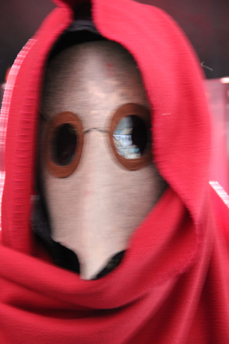
This shot is simply too out of focus to use as a main image. We could however use it as an example of a motion blur experiment for when we take our official photos.
|
Pose #2 - Action ShotWe also took some action shots depicting the antagonist mid-attack. This gives the audience a good idea of exactly how 'The Host' prefers to kill people.
PHOTOS WE LIKE
Thought this photo is out of focus, we like the idea of capturing motion blur on the antagonist's weapons. We also like the canted angle that this shot utilises.
PHOTOS WE DISLIKE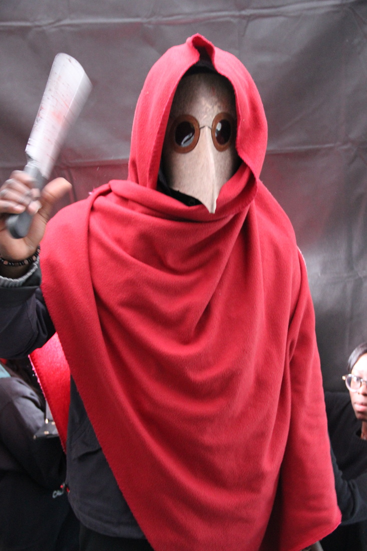
The lighting in this shot is not very good as it lights up both the antagonist and the background which detracts from the eerie atmosphere we are creating.
|
Pose #3 - Mid ShotHere we took a series of mid-shots showing the antagonist holding his iconic weapon. This shows 'The Host' prefers to torture his victims instead of just killing them.
PHOTOS WE LIKE
This canted angle shot is also one of our favourites as it adds to the theme of confusion and anarchy. The lighting is also interesting as it only partially lights the mask.
PHOTOS WE DISLIKE
The canted angle of this shot isn't very successful as it cuts out too much of the antagonist. The lighting isn't too good either as it is too strong against the background.
|
Coverline ImagesWe decided to take a few photos of another character to put on our front cover as we inserted the film strip as a place to insert images of other horror movies for star power.
PHOTOS WE LIKE
For our other photos, we decided that we liked this one the most as the pose that the person is doing is creative. The mask also matches the hidden face of the antagonist.
PHOTOS WE DISLIKE
Not only is this shot out of focus but the pose that the antagonist is holding doesn't help to sell the 'horror' image. Instead it come across as a satirical piece.
|


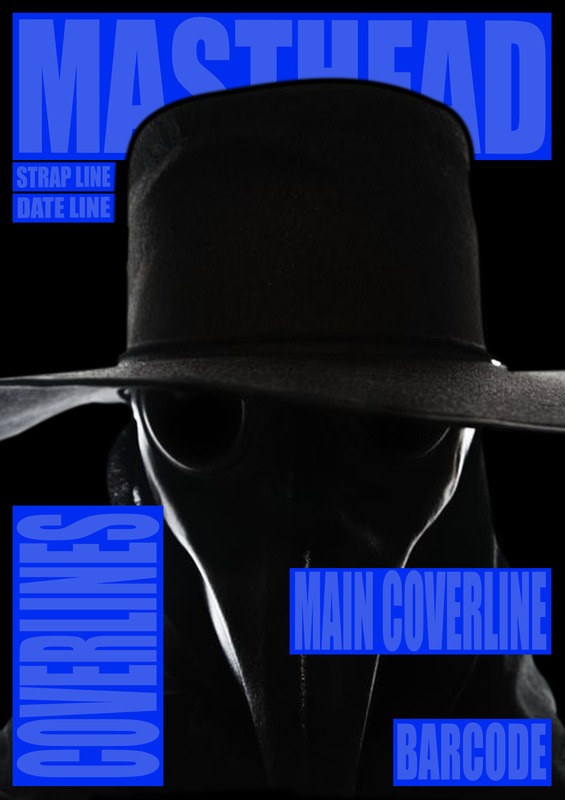
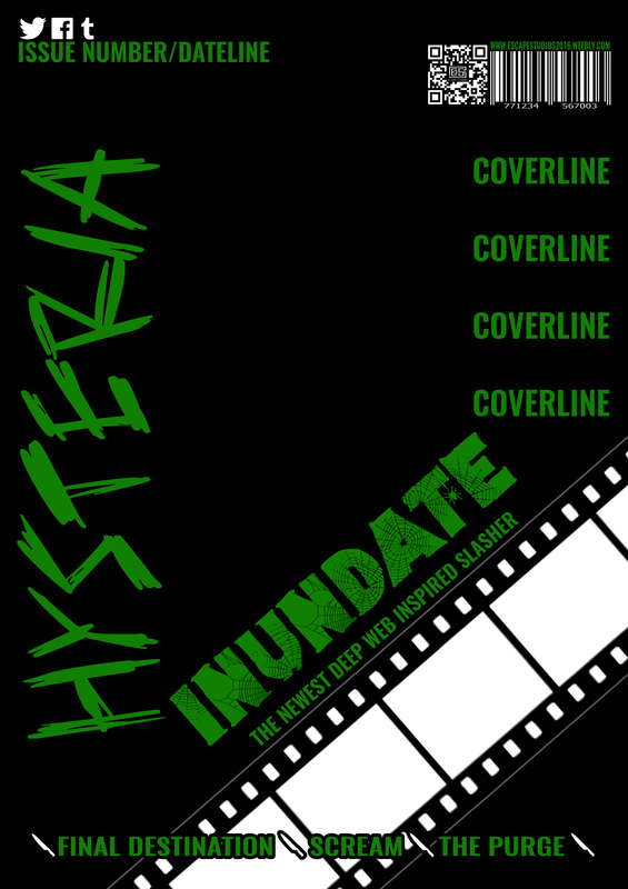
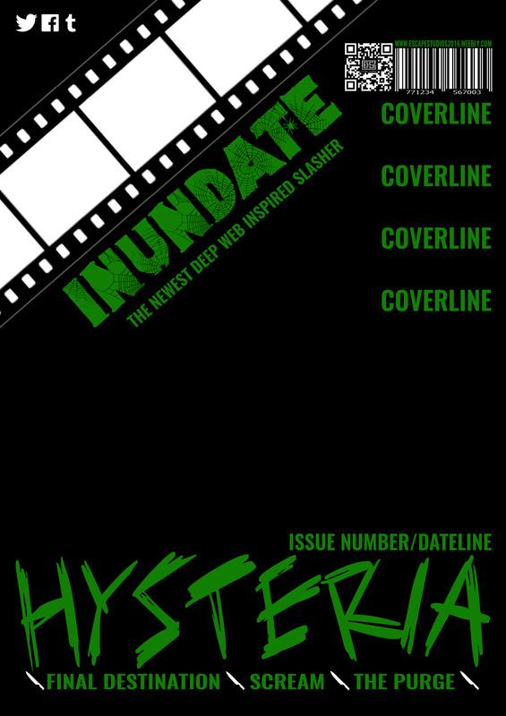
FINAL DRAFTS
After creating our typography drafts, we decided to create some drafts in which we implement the test photos we took into the layout of the magazine front cover. This is similar to the final drafts that we made for our horror poster but the magazine final drafts will contain much more images due to the film strip that we implemented on the front cover.
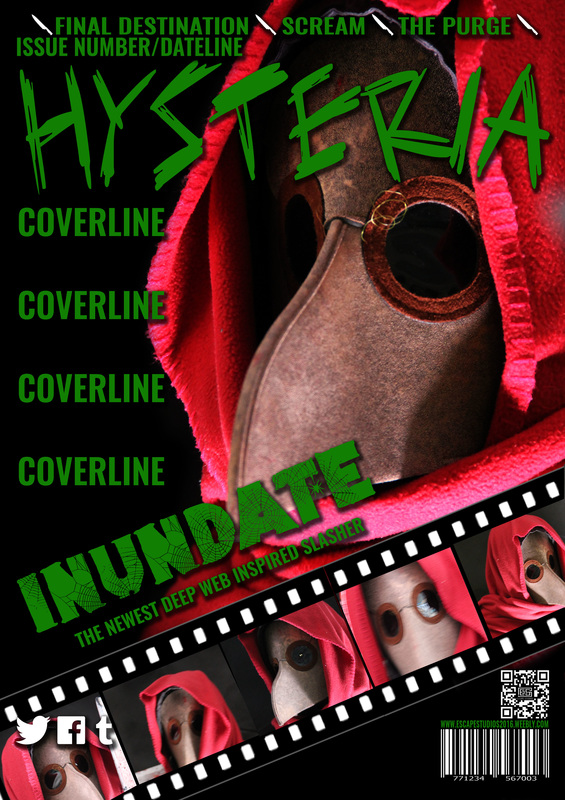
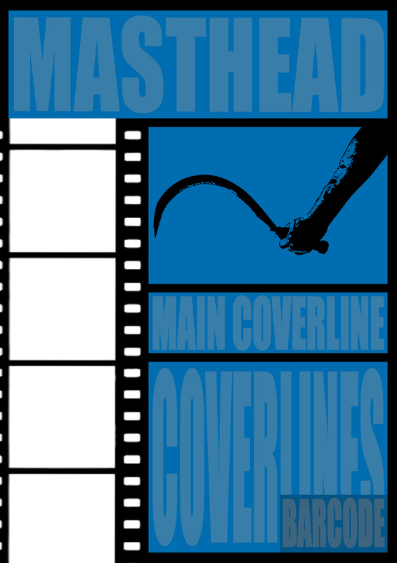
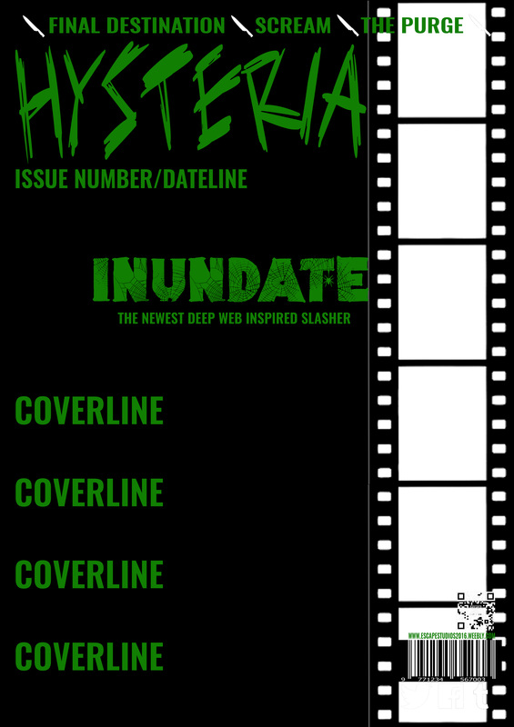
In this draft, we decided to use multiple photos of our film's main antagonist which were taken from various angles. These photos are also placed on a film strip which stretches diagonally across the bottom of the page. We also decided to layer the the magazine's social media links on top of the film strip instead of moving them to another part of the page.
|
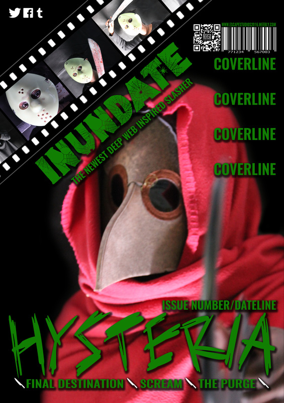
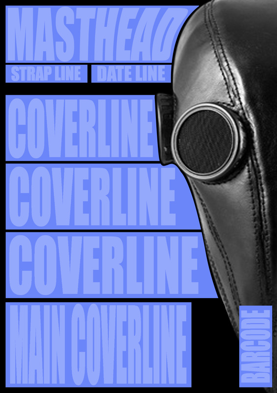
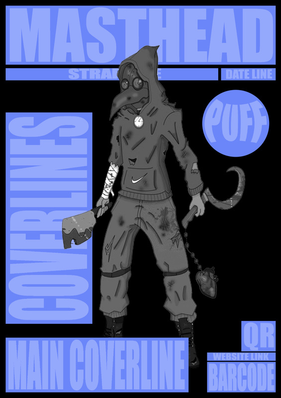
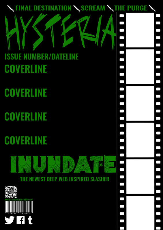
For this draft, we used a slightly different layout to the first draft. We moved the magazine's masthead to the bottom of page and put the film strip in the top left corner of the cover. We also decided to change the layout of the barcode and QR code slightly. We also decided that this layout would be best if the photo is a mid/close up or an action shot being conducted by the antagonist.
|
